
UI for WPF
WPF StepProgressBar
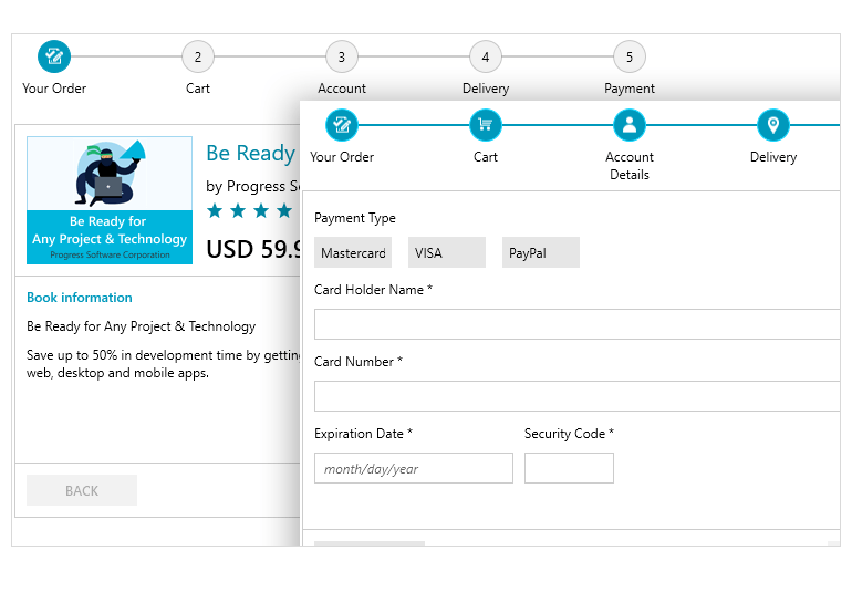
- The Telerik WPF StepProgressBar control allows you to visualize and guide your end-users through complex, multi-step processes .
- Part of the Telerik UI for WPF library along with 165+ professionally-designed UI controls.
- Includes support, documentation, demos, virtual classrooms, Visual Studio Extensions and more!

-
Full-featured StepProgressBar for WPF Applications
The Telerik StepProgressBar control allows you to easily visualize your WPF application's complex and lengthy process. Visualize complex, multi-step processes with a number of different steps and enable your end-users to seamlessly move from one step to the next by animating the progress movement.
This UI control is ideal for scenarios where you want to guide the users through a complex process by making it easy and intuitive for them to complete. The control covers many use cases, from orders and multi-step forms to onboarding.
Getting Started with the Telerik UI for WPF StepProgressBar control.
-
Flexible Customizations
Each step of the WPF StepProgressBar control can be fully customized to meet your design requirements – from the geometry of the shape, to its’ width, height, and stroke, the Telerik StepProgressbar control will meet your customization needs.
-
Support for Data Binding
The control comes with built-in data binding support, which allows you to provide a collection of any objects that can store information for each step.
-
Layout Orientations
By default, the StepProgressBar control is arranged horizontally – from left to right, but if your applications require a different layout orientation, you can easily change it to vertical orientation – top to bottom or vice versa.
-
Selection Support
The selection feature of the StepProgressBar allows you to highlight a given step based on its’ current progress. The selected steps have three distinct statuses – not started, indetermined and completed. The steps in the progress bar can be selected in code or via click in the UI.
-
Step Items Content
Each step of the StepProgressBar for WPF can display content on top and bottom of its visual element – the contents are optional and fully customizable.
