
UI for WPF
WPF LayoutControl
- Create complex layouts easily via drag and drop and rearrange them at runtime if needed with the flexible Telerik LayoutControl for WPF. Supports complex layouts, items nesting, layout groups and more.
- Part of the Telerik UI for WPF library along with 165+ professionally-designed UI controls.
- Includes support, documentation, demos, virtual classrooms, Visual Studio Extensions and more!

-
Variety of Item Types
The LayoutControl control in Telerik UI for WPF by Progress enables you to easily create highly customizable and consistent forms with simple drag-and-drop operations, reducing the time spent on layout and making the process of design modification and extension much easier, so you no longer have to spend time manually arranging your forms.
It embeds a complex layout algorithm that handles proportional resizing, automatic alignment, per-control size constraints and labels, and enables your end-users to rearrange the controls further at runtime.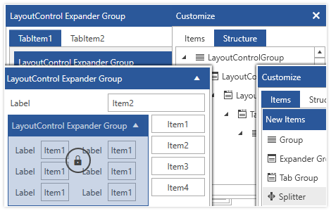
-
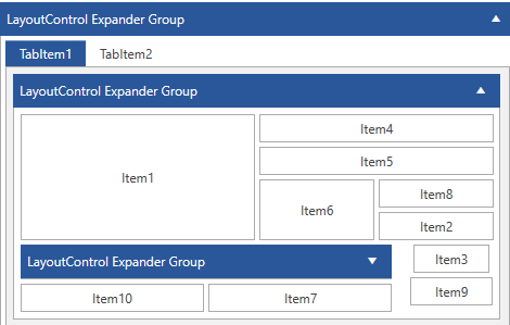
Complex layouts
With RadLayoutControl you can create complex composition that can be easily rearranged and resized according to the available size of the control.
-
Runtime layout customization
End users can customize the layout even while the application is running, including rearranging items and hiding and resizing them.
-
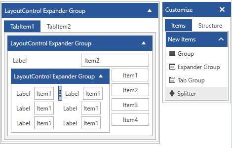
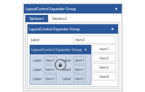
Items Nesting
The control also supports nesting items inside one another which gives you great flexibility and control. It allows for the creation of complex layouts in an easy and intuitive drag and drop manner.
-
Layout display modes
The control allows you to define different display modes for the layout items—standard, expander or tabbed.
-
Save/Load Layout
This feature allows you to save the current state of the layout and restore it afterwards, so different users can store and load their own settings when needed.
-
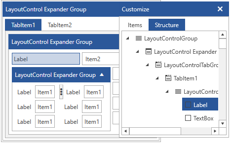
Toolbox
The toolbox allows you to easily add items to the layout control via drag/drop. You can also use it to keep track of deleted items or the hierarchical structure of the layout.
-
Design-time Support
The LayoutControl supports the arrangement of layout items and configuration of the control straight at design time. This gives you an easy way to arrange your controls in a very flexible layout, thus saving you time as the control takes care of the overall layout.
