
UI for WPF
WPF CardView
- The Telerik WPF CardView is a versatile tool that allows you to display data in a card-like layout where you can sort, group and edit each card.
- Part of the Telerik UI for WPF library along with 165+ professionally-designed UI controls.
- Includes support, documentation, demos, virtual classrooms, Visual Studio Extensions and more!

-
Display Data in Card Layout
The WPF CardView is a robust, feature-packed data visualization control that enables you to organize lists of data in a card-like layout with various orientations. The control supports grouping, sorting, filtering, and editing options, and its UI virtualization ensures superior performance.
Documentation on Getting Started with Telerik UI for WPF CardView Control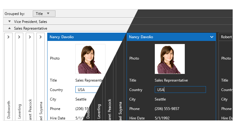
-
UI Virtualization & Performance
The built-in UI Virtualization ensures that only the containers visible in the viewport are generated, hence reducing memory footprint and boosting performance to new heights.
Documentation on Telerik UI for WPF Card View UI Virtualization -
Support for Various Operations
The WPF CardView control enables you to perform multiple operations on the cards. The built-in selection support allows you to easily select and edit the data fields of a given card, sort cards via a drop-down menu, utilize the filtering support, or enable your end-users to interactively group the cards via a simple drag and drop action.
Documentation on Editing, Selection, Grouping, Sorting and Filtering for WPF CardView control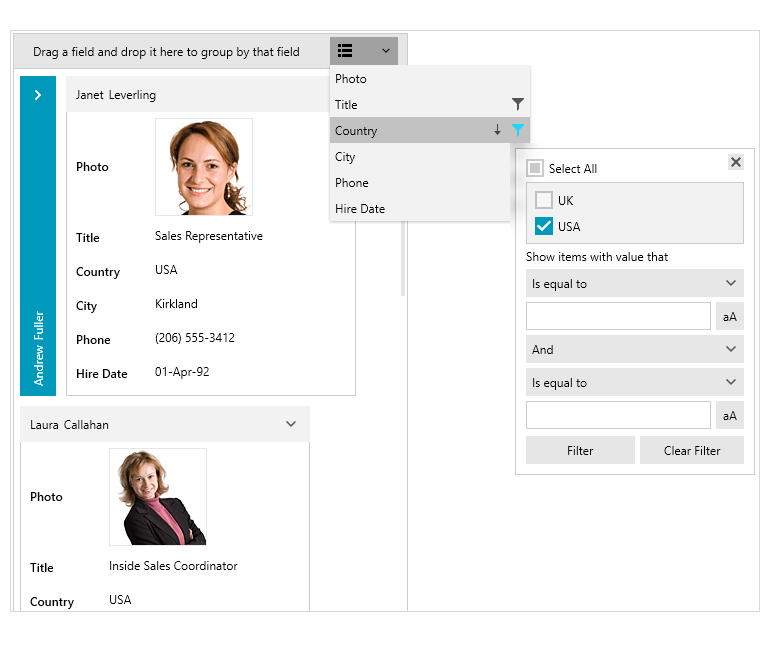
-
Support for Expand and Collapse Operations
The WPF CardView control provides you with the ability to collapse and expand cards and groups.
Documentation on Expand and Collapse Support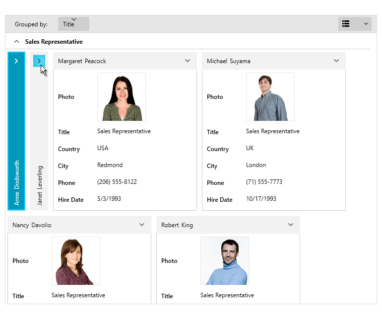
-
Different Card Layouts
The WPF CardView control gives you options of different card layouts – you can choose between a row or column-based ordering.
Documentation on the Different CardView Layouts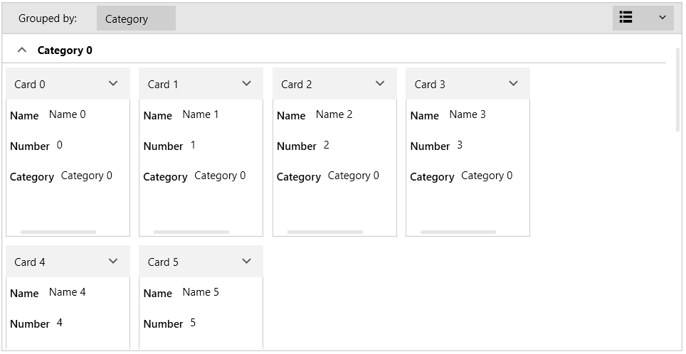
-
Customizable Elements
The control's API gives you flexible customization of the CardView elements such as cards, groups and filtering.
Documentation on Customizations of the CardView Elements -
Localization Support
The built-in localization mechanism in the platform allows you to localize CardView control. Localization support includes the following languages: English, German, Spanish, French, Italian, Dutch, and Turkish.
Documentation on Localization Support
