UI for WPF
WPF DateRangePicker
- DateRangePicker control allow you to select a range of dates with ease within your WPF app.
- Part of the Telerik UI for WPF library along with 165+ professionally-designed UI controls.
- Includes support, documentation, demos, virtual classrooms, Visual Studio Extensions and more!
-
Overview
The Telerik UI for WPF DateRangePicker is a scheduling control that allows users to easily select a range of dates in your application. This is useful for scenarios such as booking hotels, showing graphs with sales data in specific ranges, etc. The DateRangePicker is packed with built-in features like culture settings, read-only support, localization, allowed selection range, blackout dates, predefined and custom ranges, text input formatting, API for customization and more!
-
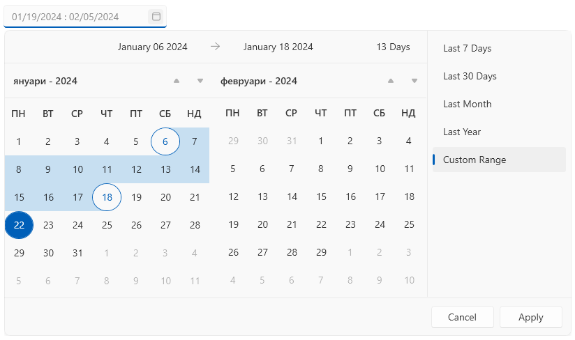
Culture Settings
The DateRangePicker control includes an integrated localization feature, enabling you to change the culture and language settings. Additionally, you can set the first day of the week and the first week of the year.
-
Localization
The integrated localization mechanism allows translating the WPF DateRangePicker control based on the applied culture. You can choose between the following languages:
- English
- German
- Spanish
- French
- Italian
- Dutch
- Turkish
-
Restricted Selection Range
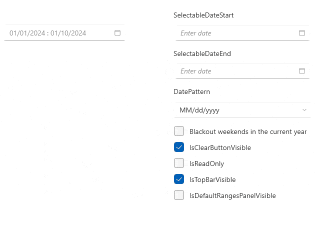
The API allows you to limit the dates available for selection and disable all other dates in the calendars.
See the WPF DateRangePicker documentation: Programmatic Selection
-
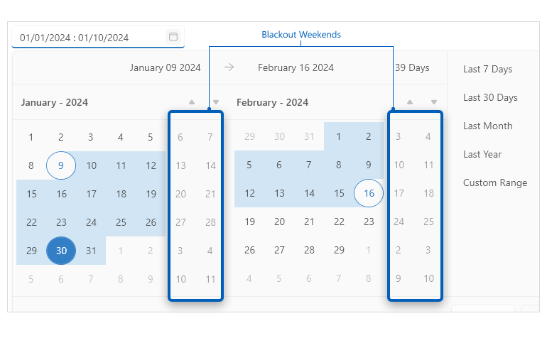
Blackout Dates
This functionality allows you to define a set of dates that will be disabled so that end users cannot select them.
-
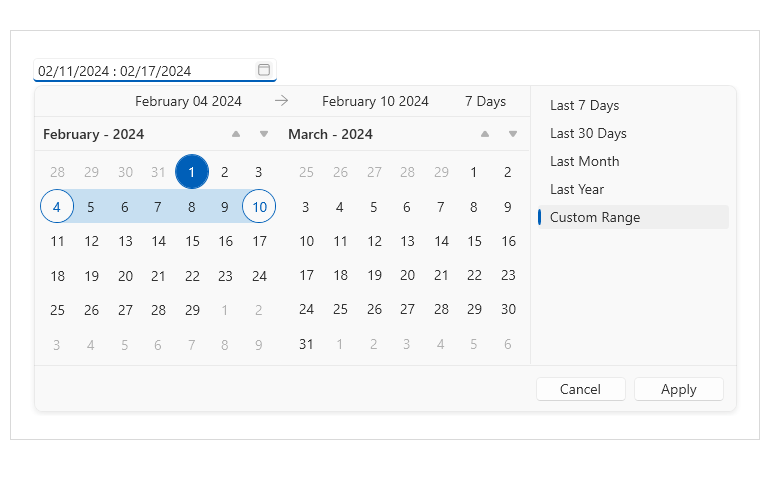
Predefined and Custom Ranges
The custom ranges consist of predetermined date intervals displayed next to the calendars of the DateRangePicker control. These intervals can be used to easily select a specific time span.
See the WPF DateRangePicker documentation: Custom Date Ranges

-
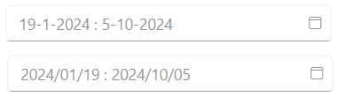
Text Input Formatting
The DateRangePicker control provides a variety of settings that can be used to customize the date text input. You can use a format string, change the placeholder symbol, separator between the dates, or set a date pattern.
See the WPF DateRangePicker documentation: Text Input Formatting
-
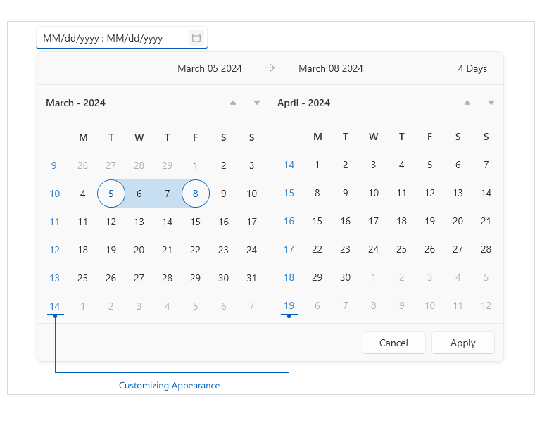
Customizing Appearance
The WPF DateRangePicker control offers various properties that enable customization of its appearance. Some of the settings that you can adjust include showing week names and numbers in the calendar, customizing the clear button and hiding the top bar, header or the custom ranges panel.
See the WPF DateRangePicker documentation: Customizing Appearance