UI for WPF
WPF SlideView
- Telerik UI for WPF SlideView is a navigation component for transitioning between different views.
- Part of the Telerik UI for WPF library along with 165+ professionally-designed UI controls.
- Includes support, documentation, demos, virtual classrooms, Visual Studio Extensions and more!
-
SlideView Visualization Capabilities
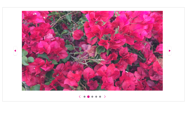
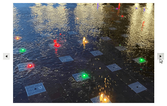
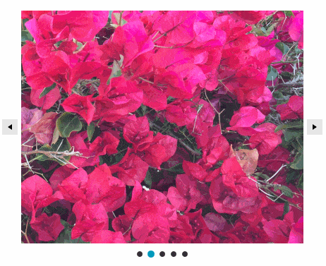
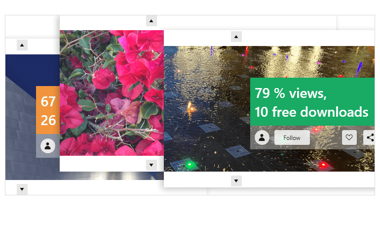
The Telerik UI for WPF SlideView control is a versatile navigation component that facilitates seamless transitioning between different views, offering an engaging and interactive navigation experience. It allows you to create visually appealing image galleries and efficiently display content within your application. The control features navigation, animation, horizontal and vertical orientation and customization of the navigation buttons.
-
Navigation
In addition to the conventional navigation buttons, the WPF SlideView control incorporates glyphs called pips, which serve as visual indicators for the current page within a collection. These pips enable users to easily switch between pages by simply clicking on a different pip, enhancing the navigation experience and providing convenient page selection functionality.
-
Orientation
The WPF SlideView control provides flexibility in data navigation customization. It offers more than just the conventional horizontal navigation, allowing you to also utilize the vertical option based on your needs.
-
Animations
The PipsPager control comes with built-in support for animations during data navigation. You have the option to disable the default animation if desired or customize it according to your preferences. You can fine-tune various aspects of the animation, such as duration, speed, easing mode and more, allowing you to create a navigation experience that aligns perfectly with your application's style and requirements.
-
Customizing Navigation Buttons
With the WPF SlideView control, you have the freedom to customize the navigation buttons according to your preferences. This includes the ability to adjust their visibility, position and style to have them seamlessly blend with your application's design. Furthermore, you can define an auto-hide period for the buttons, allowing them to automatically disappear after a specified duration, providing a cleaner and more immersive user interface. The control offers the option to enable or disable infinite scrolling, giving you the flexibility to tailor the navigation experience based on your specific needs.