UI for WPF
WPF Badge Control
- The Telerik UI for WPF Badge enables you to show users additional information such as number of unread emails, user status indicators, unread messages and more. The Badge can easily be customized to accommodate any business scenario.
- Part of the Telerik UI for WPF library along with 165+ professionally-designed UI controls.
- Includes support, documentation, demos, virtual classrooms, Visual Studio Extensions and more!
-
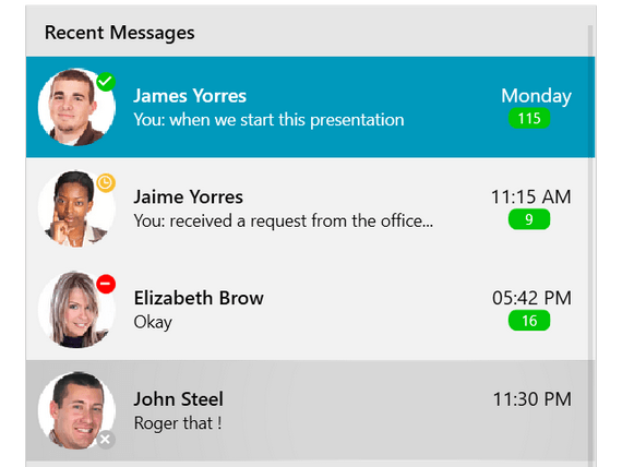
Displaying Notifications Into Your WPF Applications
The Telerik UI for WPF Badge control provides the now-essential feature of displaying unread messages or notifications to your WPF applications. It brings a modern user experience that users expect in desktop applications. You can implement the Badge control to display the number of unread emails or messages, user status indicators, different kinds of notifications and many more. With the WPF Badge’s easy customization capabilities, the control can accommodate any business scenario.
Check out the Telerik UI for WPF Controls Demo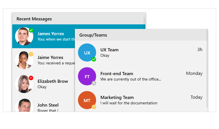
-
Badge Position and Alignment
The WPF Badge allows for full configuration of its position and alignment. You can align the badge vertically or horizontally, position it below or above the element it’s attached to, and at its beginning, middle or end.
Documentation on the Telerik UI for WPF Badge Control
-
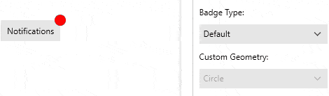
Badge Types
The control ships with several predefined badge types that are ready to use as is or can be customized according to business needs. The following values are predefined:
- Default
- DotOnly
- Available
- DoNotDisturb
- Rejected
- Remove
- Offline
- Away
- OutOfOffice
- Add
- ContentOnly
The Badge’s form can be customized as well. You just set the type Geometry property to change the form. You can apply one of the following geometries:
- Circle
- Ellipse
- Rectangle
- RoundedRectangle
- Square
- Triangle
- RightTriangle
- Pentagon
- Hexagon
- Heptagon
- Octagon
- Star5
- Cloud
- Oval
-
Animation Support
The Telerik UI for WPF Badge allows you to display the badge indicator with an animation. The type of animation, its duration and easing can be specified.
For more information visit the Telerik UI for WPF Badge Control Documentation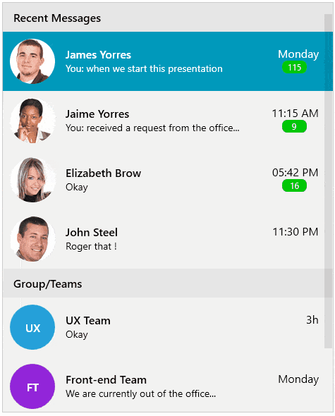
-
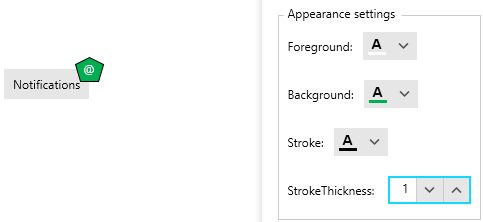
Flexible Customization and Styling
The Badge control comes with a default and custom template that you can customize to your liking. You can style any badge element, including its text, color, margin, font size, background color, corner radius and more.
Documentation on the Telerik UI for WPF Badge control