UI for WPF
WPF ToolTip
- The WPF Tooltip component is a popup with information related to a UI element, displayed when the element is clicked or hovered over.
- Part of the Telerik UI for WPF library along with 165+ professionally-designed UI controls.
- Includes support, documentation, demos, virtual classrooms, Visual Studio Extensions and more!

-
Custom Tooltips
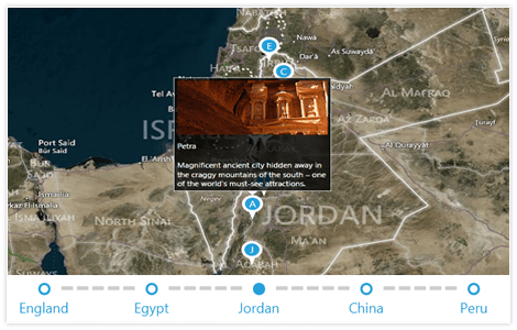
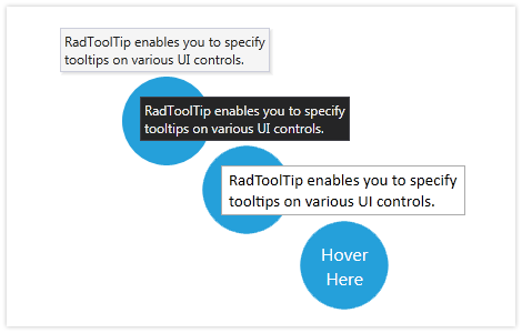
With RadToolTip, you can easily set up and show customizable tooltips that appear once the end user hovers over a particular control. Include a brief description, any other text or even an image. Easily control the placement, position and other properties of the content in the tooltip.

-
Easy Customization
Use any of the 15 predefined, professional-looking themes that come as part of Telerik® UI for WPF to style the appearance of RadToolTip.

All WPF Components
Data Management
Data Visualization
Scheduling
Layout
Navigation
- Speech-to-Text Button New
- SlideView
- PipsPager
- OfficeNavigationBar
- HyperlinkButton
- Callout
- Notify Icon
- TabbedWindow
- NavigationView
- RadialMenu
- ContextMenu
- TreeView
- ToolBar
- TabControl
- RibbonView
- PanelBar
- OutlookBar
- Menu
- Buttons
- Breadcrumb
Media
Editors
File Upload & Management
- File Dialogs
- SpreadStreamProcessing
- CloudUpload
- PdfProcessing
- SpreadProcessing
- WordsProcessing
- ZIP Library
Interactivity & UX
- HighlightTextBlock
- CircularProgressBar
- Virtual Keyboard
- StepProgressBar
- Badge Control
- Splash Screen
- Touch Manager
- Conversational UI
- DesktopAlert
- ToolTip
- ProgressBar
- PersistenceFramework
- BusyIndicator
- DragAndDrop
Navigation
Tools
Pdf Viewer
