KendoReact
Free React Tooltip
- Easily add a popup with information that appears on a hover or click.
- Part of the KendoReact library along with 120+ free and paid enterprise-grade UI components.
- This component is free to use, including in production—no sign-up or license required!
-
Build Great UX with a Customizable Tooltip
The KendoReact Tooltip provides a popup with information that is related to a particular UI element. The React Tooltip can be displayed when hovering over or clicking on an element.
-
Anchor Elements
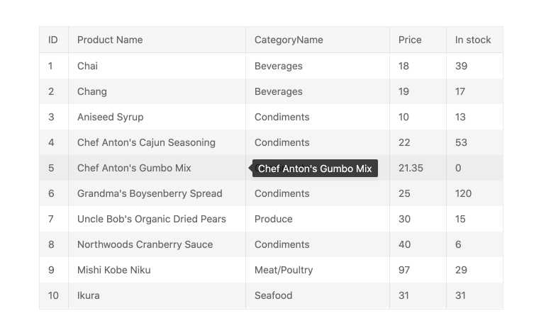
To ensure that any HTML element can show additional information, the KendoReact Tooltip allows the component to be displayed and anchored to any HTML element on a page.

-
Positioning
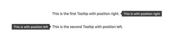
By default, the KendoReact Tooltip determines its position automatically by understanding the available space around the component when it displays on a page. To take control over where and how the React Tooltip displays, one can simply use the position property.

-
Multiple Tooltips Configuration
The KendoReact Tooltip is not limited to being displayed in one area of the same page. In fact, the KendoReact Tooltip can be used multiple times throughout a single React component, ensuring that any element that needs additional information can utilize a Tooltip.
-
Custom Rendering
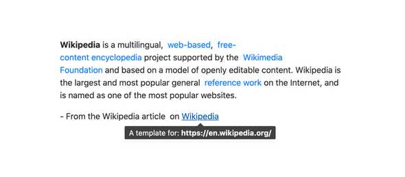
Out of the box, the KendoReact Tooltip has built-in styling that fits with the current theme that has been applied to the KendoReact UI components. For further customization with the look and feel, the KendoReact Tooltip has the ability for templates to be used to customize the content, look and feel of the Tooltip.
-
Support for SVG Elements
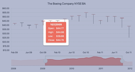
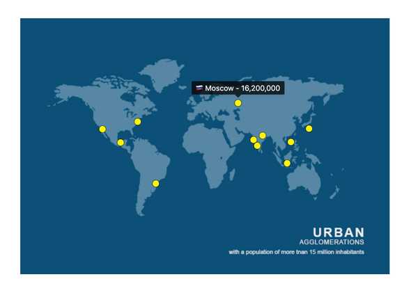
You can use the React Tooltip to create tooltips for SVG elements. This comes in handy when you have SVG graphics (for example, charts or maps) rendered on the page.

-
Controlled and Uncontrolled Modes
The KendoReact Tooltip supports both controlled mode, where the React Tooltip maintains its own state, and uncontrolled mode, where the state is maintained outside of the KendoReact Tooltip.
See the React Tooltip Controlled and Uncontrolled Modes demo
-
Integration with KendoReact Components & Third-Party Components
Since it is a very flexible component, the KendoReact Tooltip can easily be integrated into other KendoReact UI components, including components such as the KendoReact Data Grid or KendoReact Charts - as well as any other components or HTML elements in your React app.