KendoReact
Free React Rating
- Enable your users to easily leave a rating and modify the values they've chosen.
- Part of the KendoReact library along with 120+ free and paid enterprise-grade UI components.
- This component is free to use, including in production—no sign-up or license required!
-
Give Users an Enjoyable Way to Rate Content
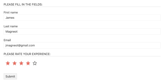
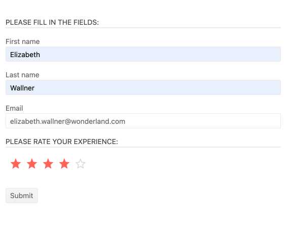
The React Rating UI component allows users to leave a rating in a digestible, visual way. It enables React applications to display rating values that users can choose and update through the component's interface. With its built-in support for partial steps, the KendoReact Rating can accommodate round, half or partial rating values, such as a 4.9-star rating. The React Rating component works well by itself or integrated into other React UI components, such as the KendoReact Data Grid.

-
Configuration Options
Thanks to a large set of configuration options, the KendoReact Rating component can meet any design requirement when it comes to rating capabilities within an application. You can define aspects like precision, which allows for partial values to be displayed, labels, which appear alongside icons representing the current rating, and interactivity, which controls if the React Rating component is enabled or disabled.

-
Forms Support
The KendoReact Rating component can be integrated with any HTML form, added to the KendoReact Form component and works with any third-party library that targets building forms with React.
-
Customization
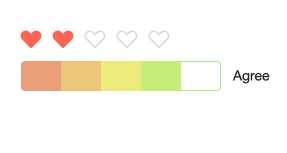
Each item of the KendoReact Rating component can be customized and styled to fit your app design. This lets React developers customize aspects like the icon used to display the current and maximum rating value. You can completely override the rendering of each item to enable scenarios such as a color gradient showing a low rating in red and a higher rating in green.
-
Controlled Mode
The KendoReact Rating component supports both uncontrolled (the default) and controlled modes. You can add the React Rating component into any React application and follow the appropriate mode for said application without having to do extensive customization.
-
Keyboard Navigation
With the built-in keyboard navigation, users can interact with the KendoReact Rating component using just their keyboard.
-
Accessibility
One of the core aspects of KendoReact is compliance with accessibility standards. The KendoReact team understands how important accessibility is for the web and this drives the team to make accessibility integral to every component. The KendoReact Rating supports Section 508, Keyboard Navigation, and WCAG 2.0 compliance with a AAA rating.