
KendoReact
React RangeSlider
- A handy and accessible visual interface for selecting numeric ranges that can replace numeric inputs.
- Part of the KendoReact library along with 120+ free and paid enterprise-grade UI components.
- Includes legendary technical support, design resources, comprehensive documentation, demos, and more!
-
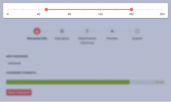
Provide a Visual Control for Selecting Numeric Ranges
The React RangeSlider enables end-users to increase, decrease and select a predefined range of values by dragging left and right handles along a track. The React UI component is a perfect companion to any user experience that requires a user to select a range of values.

-
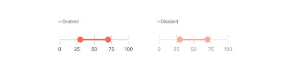
Disabling RangeSlider
By default, the KendoReact RangeSlider can be interacted with when placed on a page. For scenarios that require users to be unable to interact with a component until certain requirements are met, the React RangeSlider can be disabled by setting a single configuration option.
-
Labels
To help indicate what each tick on a KendoReact RangeSlider represents, React developers have full access to setting the label of each tick to help users select values.

-
Controlled and Uncontrolled Modes
React components often work in either controlled mode, where the component itself maintains its state, or uncontrolled mode, where the developer is in charge of handling state. The KendoReact RangeSlider supports both controlled and uncontrolled modes.
See the React RangeSlider Controlled and Uncontrolled Modes demo
-
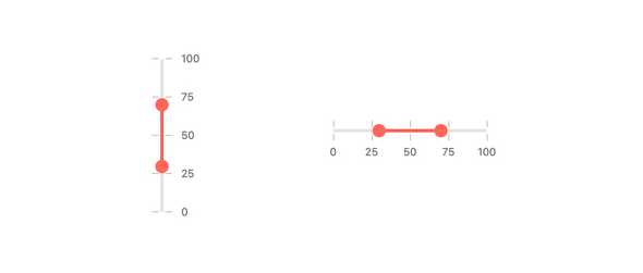
Orientation
The React RangeSlider component has a single configuration option to help set the orientation to either vertical or horizontal orientations.
-
Keyboard Navigation
With its built-in keyboard navigation, the KendoReact RangeSlider can easily be interacted with using just a keyboard, allowing users to select a range of values using nothing but the keyboard as an input.
-
Accessibility
Accessibility is a top priority with the KendoReact UI library and the RangeSlider is certainly a part of this effort! With this in mind, the React RangeSlider is compliant with WAI-ARIA and Section 508 standards, as well as AA rated with WCAG 2.0.

