KendoReact
Free React Pager
- Improve the performance and user experience by splitting long content into pages with the React Pager component.
- Part of the KendoReact library along with 120+ free and paid enterprise-grade UI components.
- This component is free to use, including in production—no sign-up or license required!
-
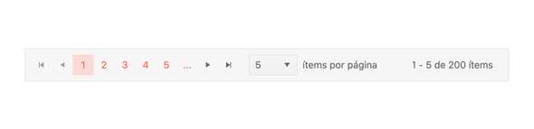
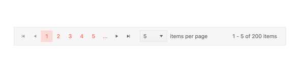
Enable Users to Navigate Through Data Subsets
The React Pager provides an intuitive user experience for navigating through pages of information, including buttons for going backwards and forwards in the available pages, changing the number of data items per page and displaying information around the overall number of data items available. All this within a single component.
-
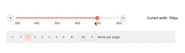
Responsive Design
The KendoReact Pager component facilitates a responsive web design by adjusting its layout according to the specified width or the available screensize.
-
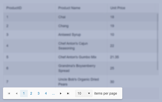
Appearance
The KendoReact Pager enables you to choose between several predefined size options to control its size. To change the default size of the Pager, simply set its size property and the padding of its elements will adjust accordingly.
-
Flexible Configuration Options
The KendoReact Pager UI component offers the possibility to show all items in a single page. This functionality can be enabled either initially or through the PageSize DropDownList. The PageSize and PageSizeValue options of the Pager accept string “All” to indicate that all items should be shown.
-
Accessibility
The Kendo React Pager component is designed to prioritize accessibility, ensuring that all users have full control over its functionality right out of the box. The component adheres to the Web Content Accessibility Guidelines (WCAG) 2.1 AA standards and Section 508 requirements. It also follows the Web Accessibility Initiative - Accessible Rich Internet Applications (WAI-ARIA) best practices for implementing the keyboard navigation , and provides options for managing its focus. Additionally, it is tested against the most popular screen readers to ensure compatibility.

-
Globalization
As the KendoReact Filter component has many built-in messages, it can be important to ensure that these messages are localized properly. This is why every message contained within the UI component can be overridden to fit in to your user's desired language.