KendoReact
React Heatmap Chart
- Offer users a customizable Heatmap chart that visualizes the magnitude of a value over two dimensions.
- Part of the KendoReact library along with 120+ free and paid enterprise-grade UI components.
- Includes legendary technical support, design resources, comprehensive documentation, demos, and more!
-
Build Powerful Data Visualizations with the React Heatmap
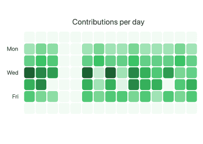
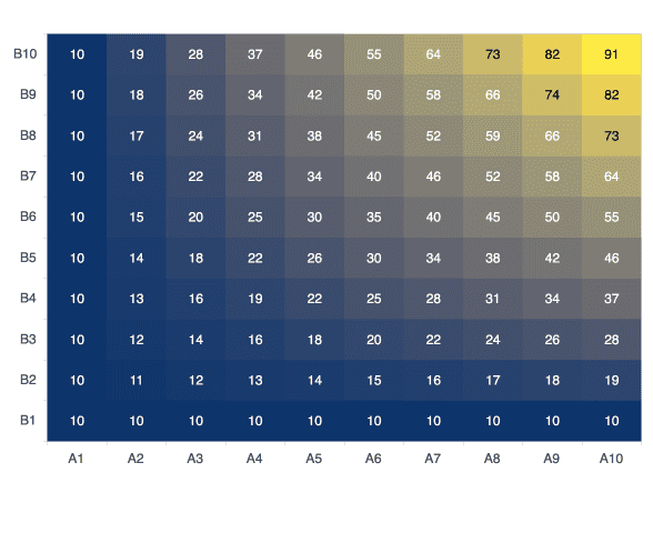
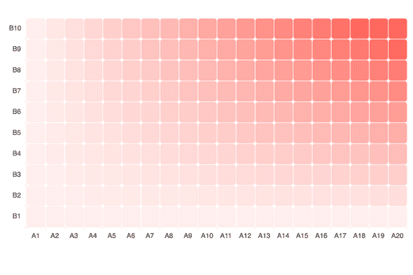
The React Heatmap (also known as Cluster Heatmap), part of the KendoReact Charts library, visualizes data in a two-dimensional matrix where the relative value of data points is represented by different colors. Out-of-the-box, you get built-in color scales, a variety of marker shapes, panning and zooming, tooltips, crosshairs and more. Like any other data-consuming KendoReact component, the React Heatmap can be bound to any data source.
-
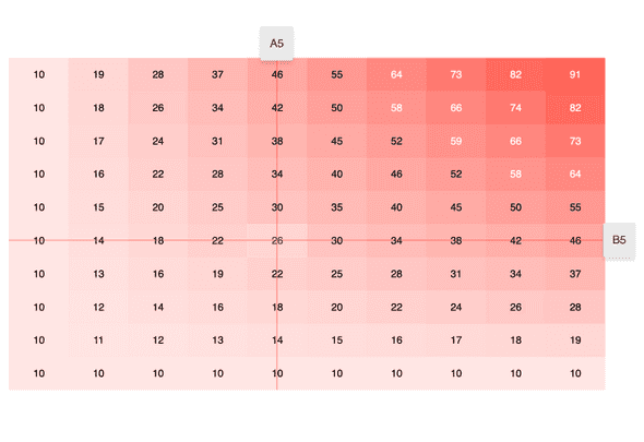
Crosshairs
For busy or large heatmaps, it can be difficult to see a specific X and Y value for individual data points. Thanks to the built-in Crosshairs feature of the React Heatmap chart component, lines going across the X and Y axis follow the mouse pointer and display the current X and Y values along the way. Enabling this functionality is as simple as setting a single property.
-
Data Binding
You can bind the KendoReact Heatmap series to arrays and objects. A common scenario is to bind it to datasets representing an X and Y axis and values. In order to bind data to the Heatmap from any source, you just have to keep track of three properties related to the values of your data points, making the component extremely flexible.
-
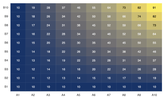
Color Scales
The built-in color scale of the Heatmap highlights the largest value using the main series color and indicates lower values with sequential lighter shades. Of course, you can define a custom color scheme, including working with libraries like d3-scale-chromatic.
-
Marker Shapes
Depending on your dataset and design requirements, you may prefer differently shaped heatmap markers (data points). With the KendoReact Heatmap, you can choose between four marker shapes: rectangle, triangle, circle and rounded rectangle with configurable border radius. Typically, the distance between the markers is fixed and the size of each marker is determined by the available space. However, you can also use a fixed marker size and let the distance vary instead.
-
Panning & Zooming
With large datasets, it may be preferable to display only part of the data within one cluster heatmap. By enabling panning and zooming, this becomes a viable UX option. Panning allows users to scroll horizontally over an axis, moving left and right and navigating through large sets of data with ease. Zooming can move in and out of an area of a chart with the scroll wheel of a mouse or through selecting an area on the KendoReact Heatmap.
-
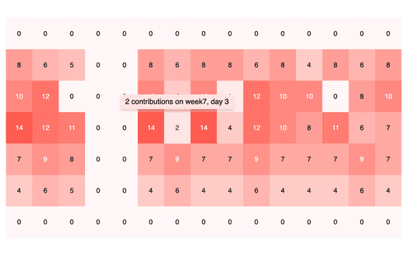
Tooltips
With its built-in support for tooltips, the React Heatmap can be configured to display information when the user hovers over individual chart points. By default, these tooltips can be bound to a field from the underlying data model but they can also be customized to contain a completely unique layout through a custom renderer for the tooltip element.