KendoReact
Free React Grid Layout
- Ensure hassle-free organization of the different elements in your React app in a grid structure with rows and columns.
- Part of the KendoReact library along with 120+ free and paid enterprise-grade UI components.
- This component is free to use, including in production—no sign-up or license required!

-
Organize the Component Content in a Grid Structure
The React GridLayout component allows you to easily arrange its contents into rows and columns in a grid structure. It offers a grid-like system for organizing the content in your app based on the CSS grid layout. You can configure items per row or column, as well as span content across them. The KendoReact GridLayout can help you apply the same basic rules (page structure) across multiple pages throughout your app, ensuring UI consistency.

-
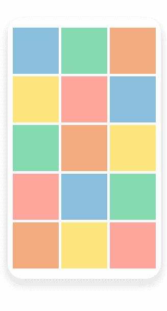
Appearance
Every grid layout is made of the basic building blocksârows, columns, gaps and alignment of inner elements. With the KendoReact GridLayout, you get full control over these properties. The goal of the component is to make configuring options like row and column dimensions, gaps between both rows and columns, as well as the horizontal and vertical alignment as easy as possible.
-
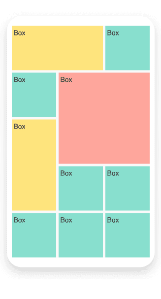
Items
If you're looking to create a more dynamic page layout that breaks from the standard grid structure with identical modules, you can use the KendoReact GridLayout items feature to join several modules together and break the visual flow. To do that, use the items properties to specify how many and which columns and/or rows you want to be included in each item.