
KendoReact
React DateRangePicker
- This customizable React DateRangePicker enables your users to select a start and end date in a single component.
- Part of the KendoReact library along with 120+ free and paid enterprise-grade UI components.
- Includes legendary technical support, design resources, comprehensive documentation, demos, and more!
-
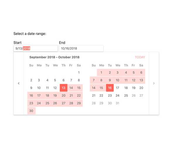
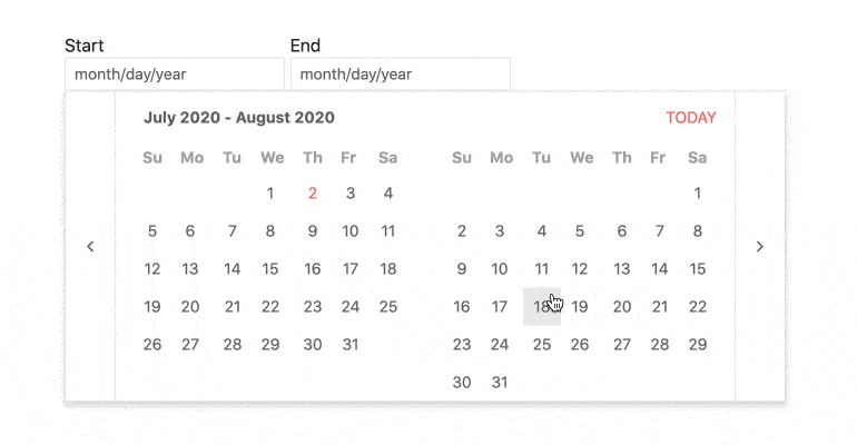
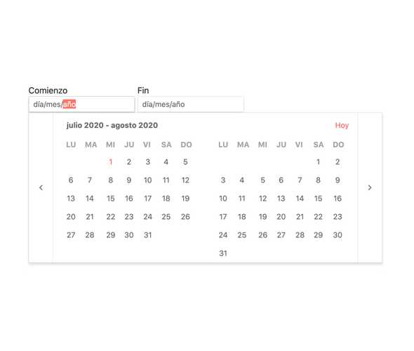
Enable Users to Select a Date Range Using Multiple Calendars
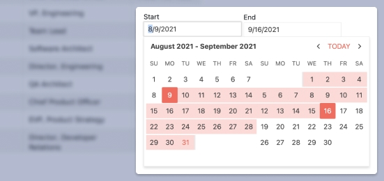
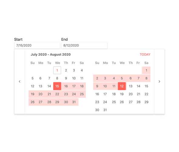
The React DateRangePicker component, part of KendoReact, offers a highly customizable interface for end users to select a range of dates spanning over multiple calendars. The component by default has an end and a start date, and dates can be selected across any range and is supported by showcasing two calendars side-by-side to easily select a range of dates that spans over several months.
-
Disabled DateRangePicker
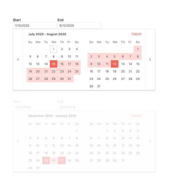
Certain scenarios may call for the KendoReact DateRangePicker to be disabled in order to prevent users from selecting a range of dates. With a single property that can be toggled on and off on the fly, the DateRangePicker can prevent any interaction and showcase a clear visual indication that the component is disabled.
-
Default Value
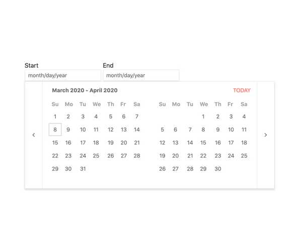
By default, the value of the KendoReact DateRangePicker is empty and the popup containing the calendars is hidden. By just using a few configuration options, the selected range can be predefined by binding to the value property of the component and the popup for the calendars can show on initial render of the page.

-
Focused Dates
The calendars featured in the React DateRangePicker always has a focused date which by default is todayâs date. This focused day as a slightly different visual style to make it stick out from the rest of the available days. What day is focused is of course completely customizable and can be changed by passing in a new day to a configuration option.
-
Date Limits
The KendoReact DateRangePicker can handle any date in the future or in the past, but this may be too broad of a range for the scope of your application. This is why the DateRangePicker can be configured to only allow dates within a particular range, limiting which days can be navigated to on the calendars and which can be typed into the input of the React component.
-
Formats
Date formats are extremely varied and the KendoReact DateRangePicker is ready to handle any format thanks to support for valid standard date and time format strings.

-
Adaptive Rendering
The KendoReact DateRangePicker supports an adaptive mode that provides a mobile-friendly rendering of its calendar popup. When enabled, the component will automatically adapt to the current screen size and will change its rendering accordingly.
-
Reverse Selection
When selecting a range of dates across a calendar a user may select the earlier date first and the later date second. However, there may be several cases where a user would need to select the end date first and then select the start date. For this scenario, the KendoReact DateRangePicker features built-in logic to autocorrect the selection of its calendars to ensure that the start value is always before the end value.
-
Custom Rendering
The KendoReact DateRangePicker has several configuration options related to making the DateRangePicker fit any design, but there may come a time where a deeper level of customization is needed. This is why the React DateRangePicker offers custom renderers for the start and end date inputs, the calendars displayed, as well as the popup containing the calendars, enabling developers to fully customize the KendoReact DateRangePicker to fit any design.
-
Globalization
The KendoReact DateInput component supports globalization out of the box, which means that the format of the date placeholder and date can change depending on the locale of the user without needing to manually reconfigure the React component.
-
Controlled and Uncontrolled Modes
React components used in forms can come as uncontrolled components, which let the form data be controlled directly by the DOM, or as controlled components where the form data is handled by a React component. By default, the KendoReact DateRangePicker is in an uncontrolled mode, but can easily transition to a controlled mode by handling a few properties of the component.
See React DateRangePicker Controlled and Uncontrolled Modes demo
-
Keyboard Navigation
The KendoReact DateRangePicker features ways of selecting a range dates using just keyboard navigation. This includes typing in the start and end dates as well as navigating through the built-in calendars to select a range of dates using just the keyboard.
-
Accessibility
Creating accessible React UI components is a core concept of KendoReact, and the DateRangePicker is no exception! The KendoReact DateRangePicker is built to be compliant with Section 508 and WAI-ARIA standards, and is AAA rated with WCAG 2.0.

