
KendoReact
Free React DateInput
- Give your users the ability to input dates in a textbox using their keyboard. With support for date formats, placeholders and forms.
- Part of the KendoReact library along with 120+ free and paid enterprise-grade UI components.
- This component is free to use, including in production—no sign-up or license required!
-
Add Date and Time Fields to React Forms with Minimal Effort
The React DateInput is a perfect input component for handling quick and efficient date values. Thanks to the built-in formatting and strict date handling, the component only accepts valid date options and will not accept any letters or symbols.

-
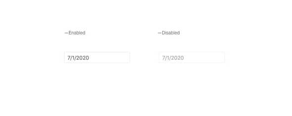
Disabled DateInput
By default, the KendoReact DateInput is enabled, but certain requirements may call for the React DateInput component to be disabled until a certain condition is met. With a single property, the KendoReact DateInput can change its appearance to indicate that the component is disabled and prevent any interaction.
-
Spin Buttons
The Spin Buttons of the KendoReact DateInput, enabled by a single property, quickly increases or decreases the currently selected portion of the date. This means days, months and years can all be interacted with through the spin buttons as users tab or click throughout the current date value.

-
Incremental Steps
With the Incremental Steps feature, the KendoReact DateInput spin buttons can increase or decrease values based on pre-defined increments and can be defined granularly on every part of the date. This means your days could be changed by one, while the month is incremented in steps of three of four, and so on.

-
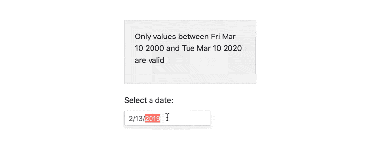
Date Limits
The KendoReact DateInput can accept any valid date, no matter how far in the past or in to the future the date may be. With the Date Limits feature, the React DateInput can define a minimum and maximum value and prevent the user from typing in a day outside of this range.
-
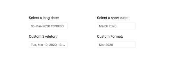
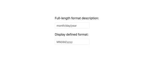
Formats
Date formats are extremely varied and luckily there are standard date and time format strings that can be followed. With this in mind, the KendoReact DateInput supports any valid string format, all controlled by a single property.
-
Placeholders
Placeholders are useful to indicate to end users what kind of format that the React DateInput expects their date to be. This is why the KendoReact DateInput component comes with a few predefined formats for the placeholder as well as the ability for developers to completely customize every part of the placeholder that the users see.
-
Floating Label
The React DateInput supports adding floating labels as part of its input. This feature displays an initial message within the component, which then floats outside the component when the user enters the input. The floating label is then replaced by the mask of the component, ensuring that users are aware of the content format they should adhere to.
-
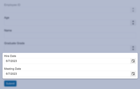
Forms Support
Thanks to built-in configuration options like min, max, required, as well as overall styling for invalid states and validation messages, the KendoReact DateInput can easily integrate into any existing form, whether this is the KendoReact Form component, or any other React form library.

-
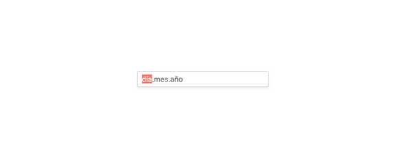
Globalization
The KendoReact DateInput component supports globalization out of the box, which means that the format of the date placeholder and date can change depending on the locale of the user without needing to manually reconfigure the React component.
-
Keyboard Navigation
Keyboard Navigation is a critical part of modern web applications and the KendoReact DateInput component contains features to easily help input a date without needing a mouse.
-
Accessibility
Continuing a tradition of putting accessibility at the forefront of building React UI components, the KendoReact DateInput is AAA rated for WCAG 2.0, and compliant with both WAI-ARIA and Section 508 standards.

