
KendoReact
React ColorPicker
- Offer interactive UX with a predefined palette or a gradient color selector.
- Part of the KendoReact library along with 120+ free and paid enterprise-grade UI components.
- Includes legendary technical support, design resources, comprehensive documentation, demos, and more!
-
Ready-To-Use Color Picker Component
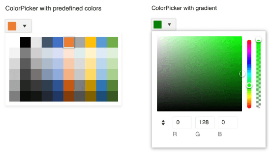
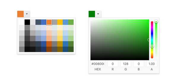
The React ColorPicker provides users with an intuitive way of selecting and submitting color values. With support for both a predefined color palette, as well as a gradient color selector, the KendoReact ColorPicker can fit any requirements for selecting colors in your React applications.
-
Disabled ColorPicker
By default, the KendoReact ColorPicker is enabled and can be interacted with immediately. However, some scenarios may need the React ColorPicker to be in a disabled state and prevent user interaction until certain requirements are met.

-
Default Value
When initially added to a React application, the KendoReact ColorPicker renders without an initial value. For scenarios that require a value to be bound to the ColorPicker to display on page render, this can be done by simply setting the default value.
-
View Types
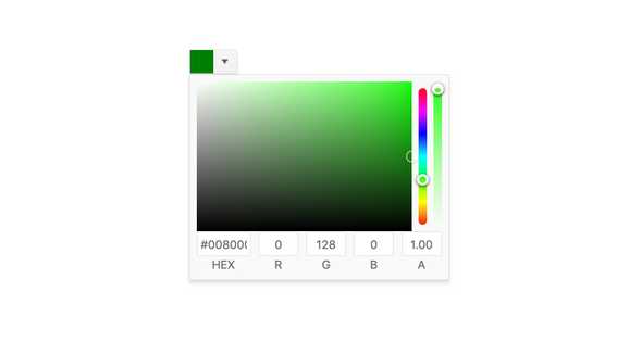
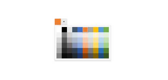
The KendoReact ColorPicker allows users to pick colors from either a color gradient, which provides an interactive way to select a color by dragging a pointer around a gradient, or a color palette which contains predefined colors in a palette.
-
Controlled and Uncontrolled Modes
To ensure that the KendoReact ColorPicker component can fit in any React application, the ColorPicker supports both controlled and uncontrolled modes. This lets the React ColorPicker either maintain its own state, or have its state controlled by the developer.
See the React ColorPicker Controlled and Uncontrolled Modes demo
-
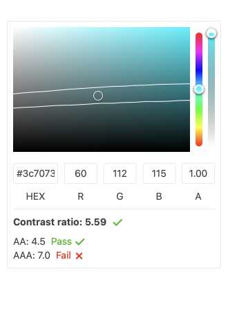
Contrast Color Tool
When enabled, the React ColorPicker contrast color feature suggests a secondary color that contrasts the main color users have selected. Primarily serving accessibility enablement the KendoReact ColorPicker will display the current contrast ratio and indicate whether the contrast color is compliant with an AA or AAA contrast ratio.
-
Custom Rendering
For scenarios that require more personalization, the KendoReact ColorPicker has several options for customizing its appearance. This includes the palette and gradient popups, as well as adding custom icons to the componentâs input element.

-
Keyboard Navigation
Every aspect of the KendoReact ColorPicker can be navigated through using keyboard navigation, ensuring that end users can focus the component and quickly select colors, without having to use a mouse.
