KendoReact
React ColorGradient
- Easily give users a way to select any color from a gradient or by manually entering HEX or RGB values.
- Part of the KendoReact library along with 120+ free and paid enterprise-grade UI components.
- Includes legendary technical support, design resources, comprehensive documentation, demos, and more!
-
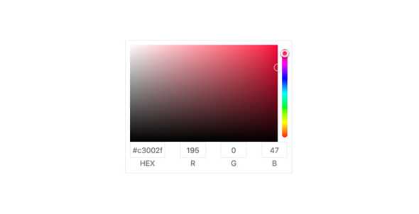
Enable Users to Select Colors from a Gradient
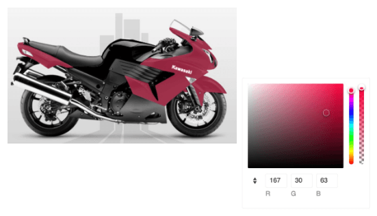
The React ColorGradient provides a beautiful and easy to use user interface for choosing a gradient color. The user can see the preview of the gradient and adjust it to the perfect color using the sliders and the value inputs.
-
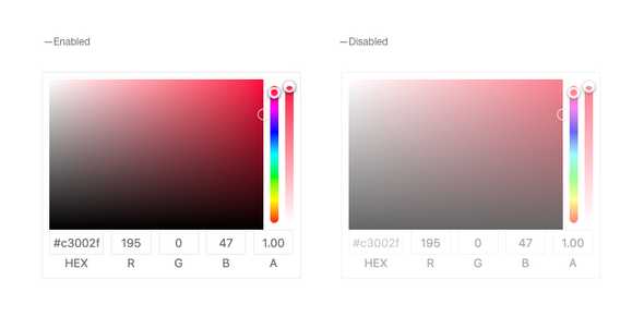
Disabled ColorGradient
We can dynamically make this KendoReact component disabled or enabled to reflect the application state. In some cases, the user may need to complete. specific requirements before selecting a gradient color, and we can make it disabled until the requirements are met.
-
Controlled and Uncontrolled Modes
By default, the React ColorGradient is in uncontrolled mode and it updates its value internally out of the box. Developers can also set it in controlled mode and sync its value with the application state.
See the React ColorGradient Controlled and Uncontrolled Modes demo
-
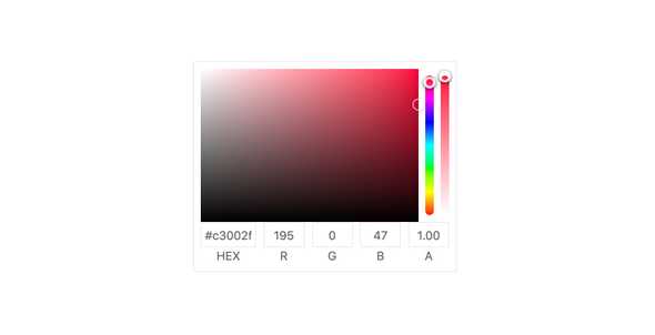
Format prop
The format prop, available in the ColorPicker component, enables you to specify the default input format for the gradient input editor. You can choose between "rgb," "hex," or "rgba" to match your preferred color format.
-
Opacity Inputs
In some cases, the opacity of the gradient is not required, and we can remove the opacity input to make the component more compact. This can be done by setting just a single option that can also be set dynamically.