KendoReact
React ChunkProgressBar
- Visualize a task in progress through a predefined number of steps with the React Chunk ProgressBar component.
- Part of the KendoReact library along with 120+ free and paid enterprise-grade UI components.
- Includes legendary technical support, design resources, comprehensive documentation, demos, and more!
-
Track Progress Through a Predefined Number of Chunks
The KendoReact ChunkProgressBar component displays progress within your React applications broken down in to chunks, or parts, representing an equal breakdown of the total progress.

-
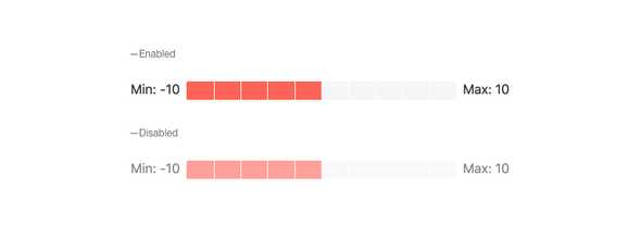
Value and Ranges
By default, the KendoReact ChunkProgressBar represents values from 0 to 100. For scenarios where this may not work, the min and max properties can be used to set a defined range of new values.

-
Disabling ChunkProgressBar
When added to a page, the KendoReact ChunkProgressBar is fully interactable out of the box. For scenarios that may require users to be unable to interact with the component until certain criteria are met, the React ChunkProgressBar can toggle between enabled and disabled with a single configuration option.
-
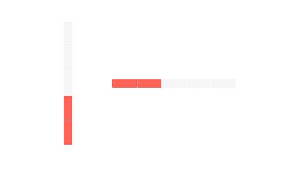
Orientation
The KendoReact ChunkProgressBar component can be rendered in both horizontal and vertical orientations.
-
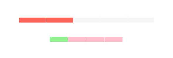
Direction
By default, the KendoReact ChunkProgressBar shows progress by filling itself from left to right. If one needs to fill the component from right to left instead, the reverse property can be used.

-
Appearance
The React ChunkProgressBar has default styling associated with the applied KendoReact theme. When styling needs to be updated, the KendoReact ChunkProgressBar can be configured to change its default height or width, as well as customize the appearance of empty or filled chunks to help the component conform to any design requirements.
-
Globalization
Thanks to the ability to be rendered in Right-to-Left modes, the KendoReact ChunkProgressBar supports many globalization scenarios.