KendoReact
Free React Chip
- Create compelling UX in your React app with this flexible component for displaying information in stylized containers called chips or pills.
- Part of the KendoReact library along with 120+ free and paid enterprise-grade UI components.
- This component is free to use, including in production—no sign-up or license required!

-
Customizable Chip (Pill) Component
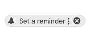
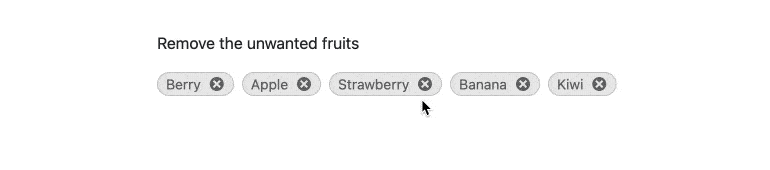
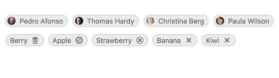
The React Chip and React ChipList components let you add stylized containers, often referred to as "pills", to your React application. The React Chip component is responsible for a single "pill" and can contain text, an image or avatar (optional) and a built-in icon, such as an "X," to indicate that an action can be taken. The Chip can be used on its own or as part of other components to showcase unique values that have been selected by the user.
-
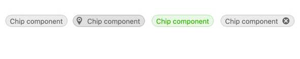
Removable Chip
Through the removable property, React developers can configure whether the KendoReact Chip component should provide a built-in âXâ icon to allow users to remove the Chip. When this property is set to false, the React Chip component will render without this icon.
-
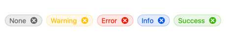
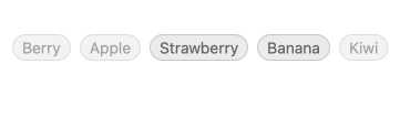
Chip Types
To provide as much flexibility as possible, the KendoReact Chip component has several readily available types, each with its own unique style. Available types include none, info, error, success and warning and can be iterated through by setting the type property.
-
Disabled Chip
By default, the React Chip component is enabled. However, there may be scenarios that require the KendoReact Chip component to be disabled until a certain condition is met. With the disabled property, developers can quickly enable or disable the component through a single configuration option.
-
Customization
The KendoReact Chip component provides several avenues for customizations. These include providing icons or avatars within the Chip content, creating a custom icon for removing a chip and setting custom CSS classes that can alter the look –and feel of the React Chip component to meet all design requirements.
-
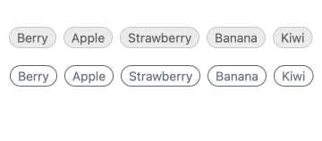
Appearance
The KendoReact Chip component has two built-in appearance options. The filled option sets a background color of the React Chip and fills in the entire content area. The outlined option displays only the outline of the Chip component.
-
Custom Content
You can define different types of custom content for the chip: your imagination is the a limit for how your React Chip component can look. For example, you can add custom icons, links or virtually any other content.