
KendoReact
Free React Calendar
- Fully customizable and accessible React Calendar component that can meet any UX need, including globalization.
- Part of the KendoReact library along with 120+ free and paid enterprise-grade UI components.
- This component is free to use, including in production—no sign-up or license required!
-
Enable Users to Easily Select Single Days or Date Ranges
The React Calendar component, part of KendoReact, is a form component representing a Gregorian calendar, allowing users to intuitively select a single date, or date ranges, with a few clicks. Beyond displaying dates in similar fashion to the calendar in your kitchen, each cell within the calendar can be completely customized and the KendoReact calendar is fully compatible with modern accessibility guidelines.
-
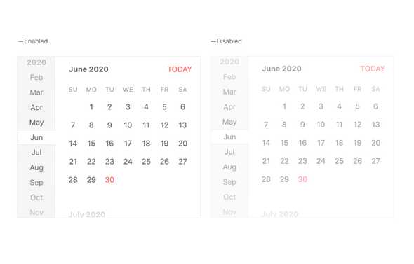
Disabled Calendar
By default, the React Calendar is enabled and can be fully interacted with, but there may be scenarios where the users should be unable to select a date until some condition has been met. This is where the disabled property of the KendoReact Calendar comes in to play, showcasing a different look-and-feel of the calendar interface as well as preventing any interactions.
-
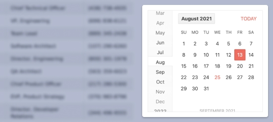
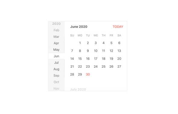
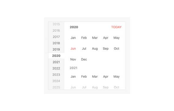
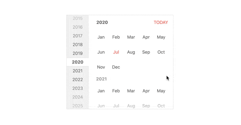
Fast Navigation Bar
The Fast Navigation Bar of the KendoReact Calendar provides a shortcut to quickly navigate through years and months without having to leave the context of the main calendar interface of selecting a particular day of the month. This interface is enabled by default, but can be hidden with a single configuration option.
-
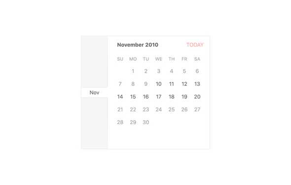
Active View
The Active View feature of the KendoReact Calendar defines at what depth of date selection the calendar starts in. This ranges from showing the days of the month, which is the default, or showing the months of the year, years in a decade, or even as high up as decades in a century.
-
Date Limits
The KendoReact Calendar component allows users to traverse any date of the past or future. This may be too broad of a range for certain scenarios and this is where the Date Limits feature comes in. By defining the min and max properties, developers can limit the range of dates that will be displayed within the React Calendar component.
-
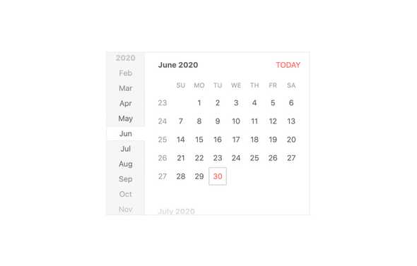
View Selection Depth
The View Selection Depth feature of the KendoReact Calendar limits the depth of the calendar, limiting how far out the calendar can zoom, or how granular it can be with its selections. This can limit the React Calendar component to just select the year, without the ability to show decades or centuries, and simply select the month, instead of the default of selecting the day of the month.
-
Week Number Column
The number of the week can be an easy way to discuss upcoming vacations or events. With a single property, the KendoReact Calendar component can show or hide a column responsible for displaying the appropriate week number next to each week displayed in the calendar.
-
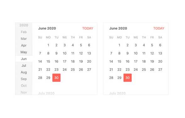
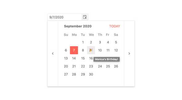
Custom Rendering
While the default user interface of the KendoReact Calendar component can take advantage of various themes to fit into design systems, there may be times when some additional customization needs to be done outside of setting up colors and padding. For example, an emoji could be added to a particular day to indicate a special holiday or a birthday. Every part of the React Calendar, from the individual day cell, week cells, navigational items, or the title of the Calendar can all be overridden with a custom renderer.
-
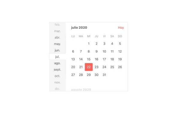
Globalization
Globalization allows for the React Calendar to adhere to the locale of the user. This includes changing the language of the placeholders and messages that appear in the Calendar, as well as updating the names of the month. This can be updated and changed on the fly, allowing for developers to provide the same React UI components in different languages with a single click.
-
Keyboard Navigation
Navigating through a page with a mouse is not the only way end users interact with websites â some form of keyboard interaction is inevitable. This is why the KendoReact Calendar component has built-in keyboard navigation to assist with traversing the component and selecting a date without having to touch the mouse.

-
Accessibility
Accessibility is an important part of the KendoReact library and the Calendar is no exception. Out of the box, the React Calendar is compliant with Section 508 standards, follows WAI-ARIA standards, and is AAA rated according to WCAG 2.0.

