Usage Guidelines
The Telerik and Kendo UI ColorPalette requires you to follow some basic principles when using the component.
Number of Tiles
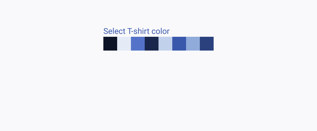
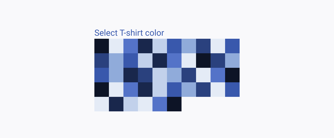
When implementing color selection tools in your user interface, it's important to balance between offering a useful array of options and not overwhelming users. The ColorPalette component provides a valuable solution by offering a predefined set of harmonious colors to assist the users with design and customization tasks. However, it's equally important to ensure that users aren't inundated with an excessive number of color options, as this can lead to decision fatigue and design inconsistencies. In cases where a wider range of colors is required, use the ColorPicker or ColorGradient component instead.


Tile Size
When implementing the ColorPalette component, it's crucial to consider the size of the color tiles for an optimal user experience.


