Usage Guidelines
Industry-wise, elevation implementation follows some basic principles and established standards.
Emphasis
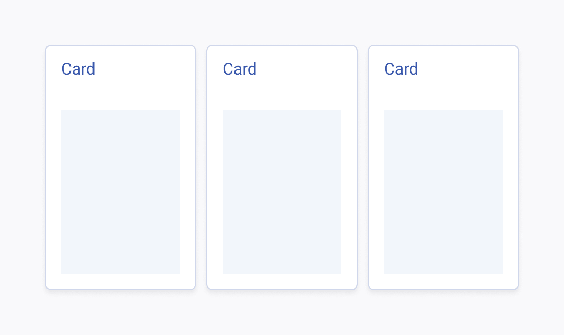
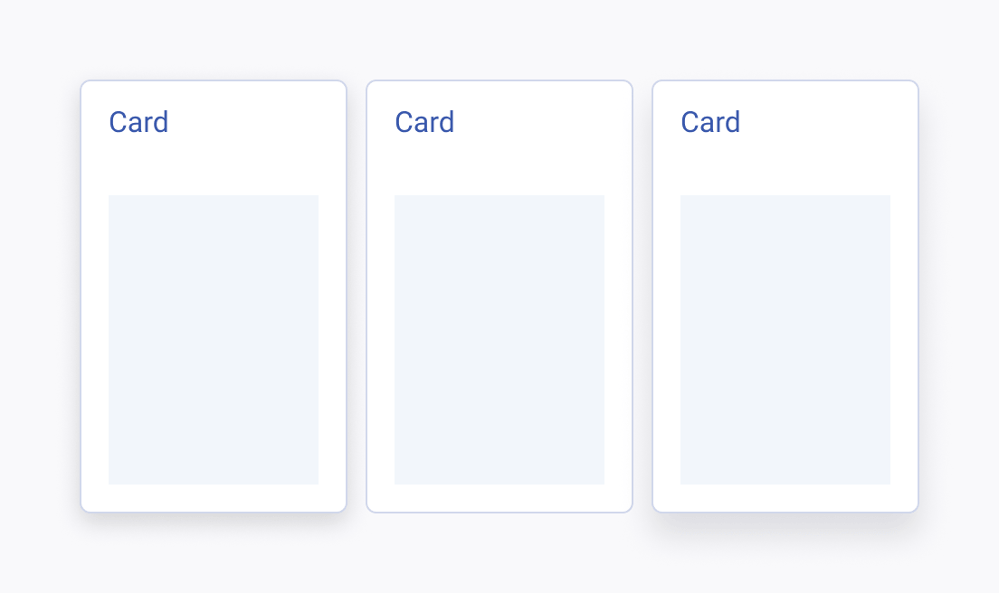
The use of elevation on primary, interactive, or floating elements is crucial as it visually differentiates these components from the rest of the user interface and signals their importance and functionality. Not only does this intuitively guide users through their interactions, but it also reinforces the visual hierarchy, making the interface more user-friendly and efficient.


Consistency
It is crucial to maintain identical elevation levels for identical elements to ensure a coherent visual structure across the user interface. This consistency helps users quickly comprehend the hierarchy and functionality of elements, improving the overall user experience by reducing cognitive load and confusion.


Size-Proportional Shadows
Applying strong elevation levels to larger components like cards and dialogs helps to emphasize their significance and draw user attention, creating a clear visual hierarchy. Conversely, using lighter elevation on smaller elements like buttons and chips maintains a clean and uncluttered interface, enhancing overall usability and aesthetic balance.


