Chip

Chips present information about people, places, or subjects in a compact form and can trigger actions.

Usage Guidelines

The Telerik and Kendo UI Chip requires you to follow some basic principles when using the component.

Label Width

Although the Chip component can contain larger chunks of text, try to keep its content clear, compact, concise, and as short as possible. The goal of the Chip is to be compact, so be mindful of its placement when adding textual content.

A Telerik and Kendo UI Chip component consisting of two short words.
Keep the label of the Chip as short as possible.
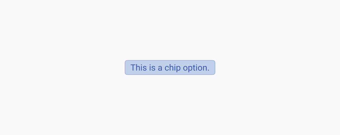
A Telerik and Kendo UI Chip component consisting of a five-word sentence with a period in the end.
Avoid assigning longer and long-winded labels.

Fill Modes

The Telerik and Kendo UI Chip supports the solid and outline fill modes. The two imply different emphases of the meaning and aim to blend seamlessly with other components in the context of the user interface.
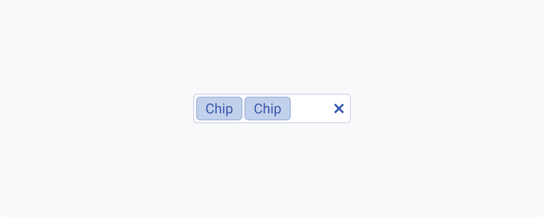
Two Telerik and Kendo UI Chips within a single component, both using the same solid fill mode.
Use different fill modes for the Chip depending on the context.
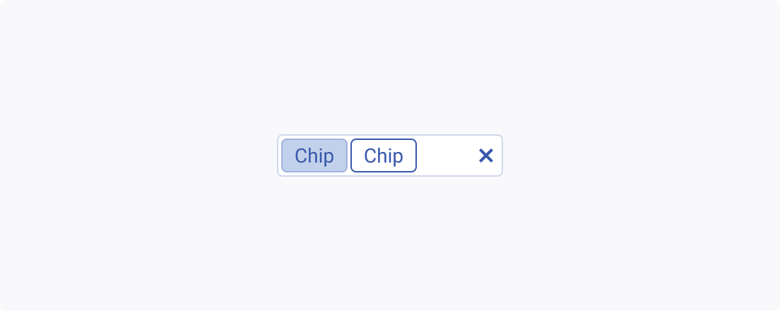
Two Telerik and Kendo UI Chips within a single component, each using a different fill mode.
Avoid mixing Chip components with different fill modes within the same group or component.

Size

Depending on the purpose of the component, the Chip enables you to apply the small, large, or the default medium sizing option to smoothly fit into the UI.
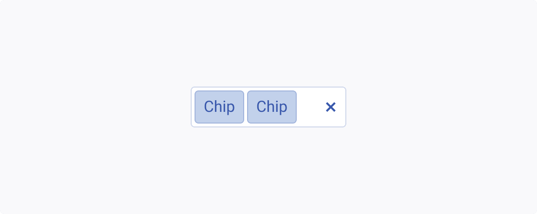
Two Telerik and Kendo UI Chips located in a single component and of the same size.
Use the size of the chips in accordance with the size of the components they are connected to or are part of.
Two Telerik and Kendo UI Chips located in a single component but using different sizes.
Avoid combining Chips of different sizes within a single component.
Feedback