Usage Guidelines
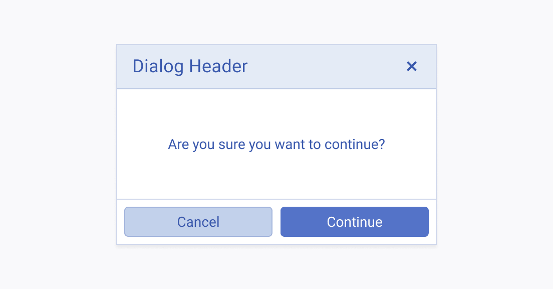
The Telerik and Kendo UI Button requires you to follow some basic principles when using the component.
Fill Modes
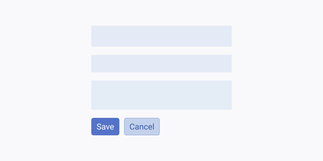
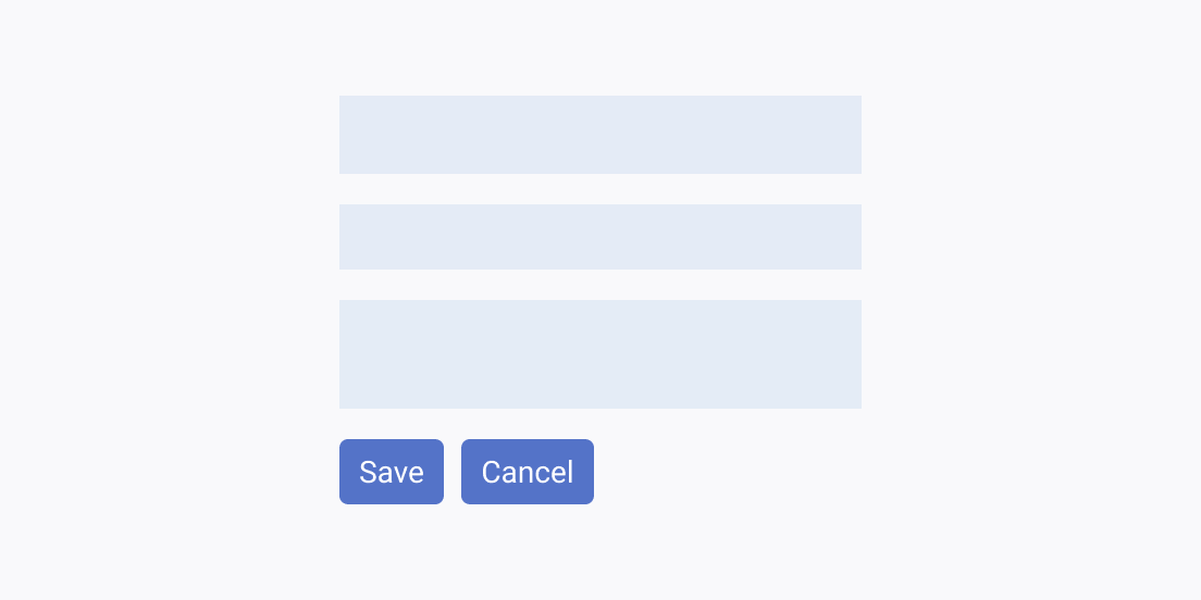
The Button supports the solid, outline, and flat fill modes, which put different emphasis on the indicated actions.
Label Text
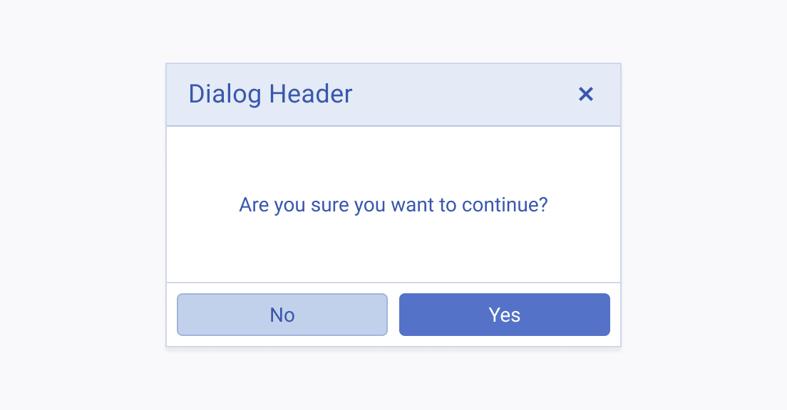
The label of the Button must be clear, straightforward, and leaving no room for misinterpretations.

Label Width
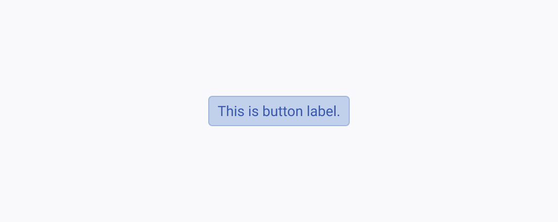
Whether the Button renders an icon, icon and text, or text only, it must convey a clear message, be compact, concise, and tight-fitting.

Size
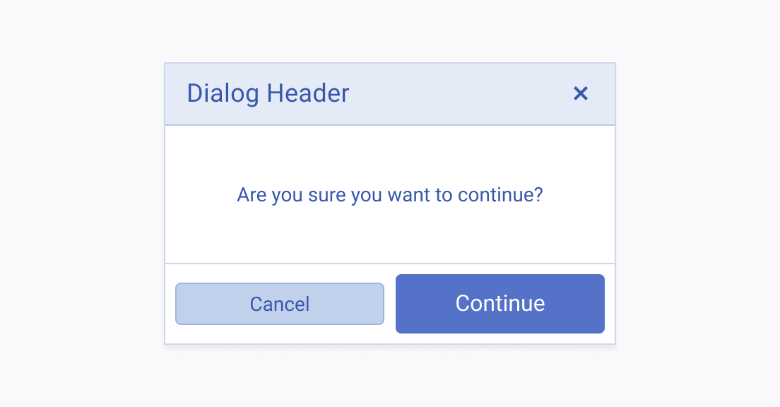
Depending on the purpose of the Telerik and Kendo UI Button, you can apply any of its supported sizing options to smoothly fit it into the UI. However, sizing needs extra attention when you combine two or more sizing variations in a single component.
