
UI for ASP.NET MVC
ASP.NET MVC SegmentedControl
- The ASP.NET MVC Segmented Control is a space-efficient component for mutually exclusive selection between related options.
- Part of the Telerik UI for ASP.NET MVC library along with 120+ professionally designed UI components.
- Includes support, documentation, demos, virtual classrooms and more!
-
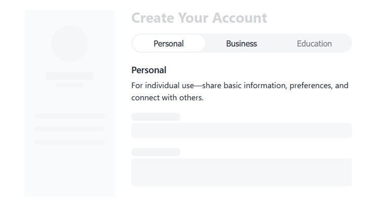
Compact Choice Selection
The Telerik UI for ASP.NET MVC SegmentedControl is a sleek, space-efficient component for fast, mutually exclusive selection between related options. Designed as a modern alternative to radio buttons and tabs, it improves usability by surfacing key choices in a single, intuitive control. With built-in support for icons, customization, accessibility, and responsive behavior, it fits seamlessly into any ASP.NET MVC application.
See the Telerik UI for ASP.NET MVC Segmented Control overview demo
-
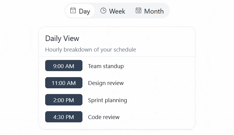
Items Width Modes
The ASP.NET MVC SegmentedControl supports configurable item widths, giving you precise control over how each segment is sized. This allows you to better accommodate different content lengths and maintain a consistent layout without additional styling.
- Compact mode: Items are sized based on their content, making this option suitable for segments with varying text length or icons.
- Stretch mode: All items expand evenly to fill the available width, ensuring a balanced appearance.
See the Telerik UI for ASP.NET MVC Segmented Control layout modes demo
e5b33c13a8374e418361186d53d81a16.gif?sfvrsn=55847244_2)
-
Icons
The Telerik UI for ASP.NET MVC SegmentedControl supports flexible content configuration, allowing each segment to include a text label, an icon, or both. You can further customize the icon appearance by using the iconClass option to apply additional CSS classes.
See the Telerik UI for ASP.NET MVC Segmented Control icons demo

-
Appearance
Control the visual appearance of the Telerik UI for ASP.NET MVC SegmentedControl, including its button size and layout behavior. Use the size option to adjust the segment buttons to small, medium, or large, depending on your UI density needs.
See the Telerik UI for ASP.NET MVC Segmented Control appearance demo
-
Events
The Telerik UI for ASP.NET MVC SegmentedControl exposes a change event that triggers when the selected segment is updated. The event provides both the selected value and the full data object for the item, making it easy to access all relevant information in your handler.
See the Telerik UI for ASP.NET MVC Segmented Control events demo
-
Keyboard Navigation
The ASP.NET MVC SegmentedControl includes keyboard navigation support, allowing users to move between options and make selections without using a mouse.
See the Telerik UI for ASP.NET MVC Segmented Control keyboard navigation demo
