

Overview of the Bootstrap Theme
The Telerik and Kendo UI Bootstrap theme is a fully-customizable SCSS-based theme for the Telerik and Kendo UI components. The theme has a similar design to the Bootstrap framework and uses the Bootstrap metrics to integrate Telerik and Kendo UI components in an application that already uses Bootstrap for layout and styles.
Starting with theme version v11.3.0, the Bootstrap theme is based on Bootstrap v5.3.
There are some important differences between the Bootstrap framework and the Telerik and Kendo UI Bootstrap theme:
- The two products do not share CSS classes and code.
- The Bootstrap framework stylesheet and the Telerik Bootstrap theme cannot be used interchangeably.
Starting with version 10.0.0 of the Telerik and Kendo UI Bootstrap theme, the theme no longer depends on the Bootstrap framework, although its values remain unchanged. You will now need to separately import the Bootstrap framework to use it.
To get the theme, you can use the available npm package, CDN link, or GitHub repository.
Getting Started
The fastest way to apply the out-of-the-box Telerik and Kendo UI Bootstrap theme is to reference the theme stylesheets that are located on a CDN. Alternatively, you can install the theme as an npm package—this approach allows you to customize the theme.
Using Bootstrap framework CSS classes on Telerik or Kendo UI components may lead to styling conflicts and is generally not necessary or recommended. Do not set the form-control Bootstrap CSS class on input components such as TextBox, ComboBox, and others.
Using the CDN Link
To use the Telerik and Kendo UI Bootstrap theme without customizing it, reference the precompiled CSS file URL for the required theme version and swatch in the head section of your application, for example:
<link
  rel="stylesheet"
  href="https://www.unpkg.com/@progress/kendo-theme-bootstrap@14.4.0/dist/bootstrap-main.css"
/>
In the above URL, @x.x.x specifies the theme version and main is the swatch name. To preview the appearance of the available built-in theme swatches, visit the online demos for the Telerik or Kendo UI product that you are using.
To obtain the CDN URL for a specific theme version and swatch:
- Visit @progress/kendo-theme-bootstrap on UNPKG.
- Select a version at the top-right.
- Open the
distfolder. - Open the required CSS file, for example, bootstrap-main.css.
- Click the View Raw button, for example, here is the CDN URL for
bootstrap-main.css.
It is possible to reference a swatch URL without a version, which will load the latest one automatically. This is strictly not recommended in production applications.
While using the precompiled CSS file is faster than compiling the theme from the source code, the approach has two drawbacks:
- The precompiled CSS file contains the CSS code for all components—even for components that you do not use in your application.
- The precompiled CSS file does not support customizations through SCSS variables because they are no longer present in the theme. To customize the theme, you must rebuild it by using the provided source code.
Installing the NPM Package
To install the Telerik and Kendo UI Bootstrap theme in your project, use the provided npm package. After installing it, you can customize the stylesheets.
npm install --save @progress/kendo-theme-bootstrapTo use the theme in your application, import it into your project styles:
// Import the entire theme
@use "@progress/kendo-theme-bootstrap/scss/all.scss" as *;
Using the Figma Kit
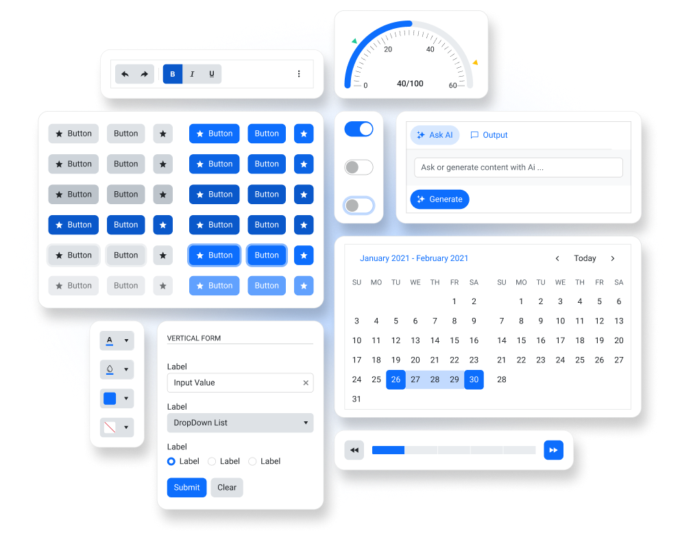
The Telerik and Kendo UI Bootstrap theme comes with a free UI kit for Figma that includes all Telerik and Kendo UI components. To learn more about the available UI kits and how to use them, see the Design Kits for Figma article.
Framework-Specific Documentation
For specific information about how to implement the Bootstrap theme in the context of the Telerik and Kendo UI libraries, refer to the official product documentation:


