Switch

Switches display a couple of exclusive choices so that users can toggle the state of an item on and off.

Usage Guidelines

The Telerik and Kendo UI Switch requires you to follow some basic principles when using the component.

Meaning

The Switch is used for displaying two exclusive choices and can act as a replacement for the RadioButton for a single choice. When in a group, the Switch can be used for options that are not mutually exclusive.
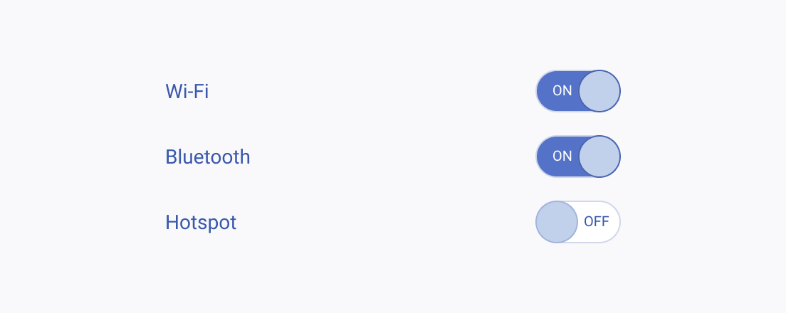
Three Telerik and Kendo UI Switches representing three non-mutually exclusive options.
Use the Switch for a list of options that are non-conflicting.
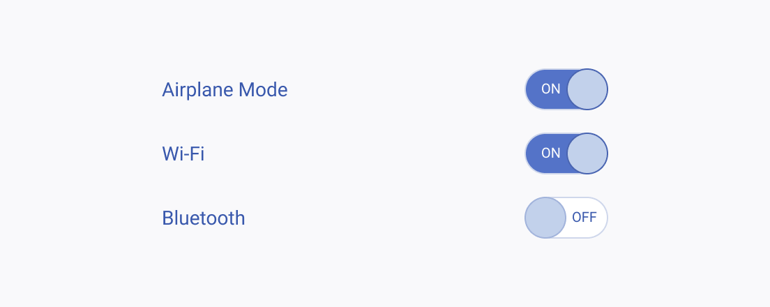
Three Telerik and Kendo UI Switches representing mutually exclusive options.
Avoid using the Switch for a list of mutually exclusive options.

Text Label

A corresponding text label, or hint, is an obligatory element when using the Switch. It must be clear to the user at all times what the Switch will do.
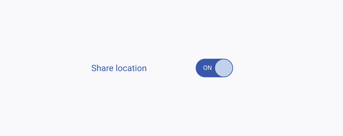
A Telerik and Kendo UI Switch with a clear and straightforward label.
Provide clear, unambiguous text to explain what the Switch will do.
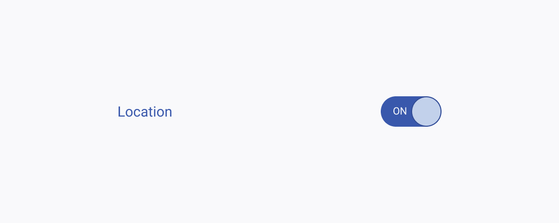
A Telerik and Kendo UI Switch showing an ambiguous label to an unclear result.
Avoid using a standalone Switch unless there is sufficient information about the result of switching it.

Text Alignment

Similar to RadioButtons and Checkboxes, if the text label corresponding to the Switch is too long, center-align the component to the first line of the text.
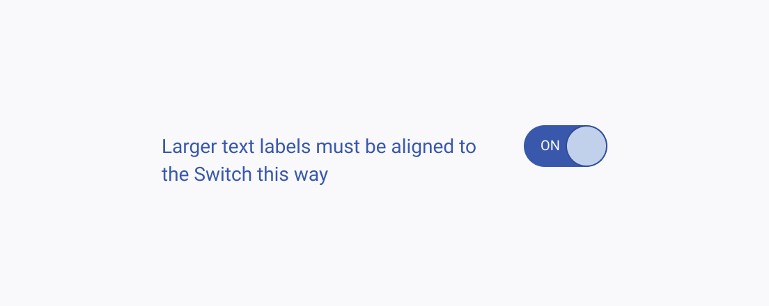
Telerik and Kendo UI Switch horizontally aligned to the first row of its longer label.
Center-align the Switch to the first line of longer text labels.
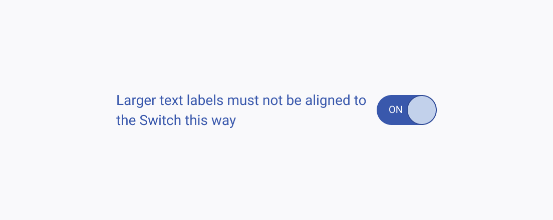
Telerik and Kendo UI Switch horizontally aligned to the height its longer label.
Avoid center-aligning the Switch to the height of the text label if it’s longer than a single line.