Usage Guidelines
The Telerik and Kendo UI SplitButton requires you to follow some basic principles when using the component.
Grouping
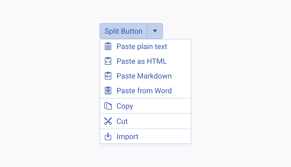
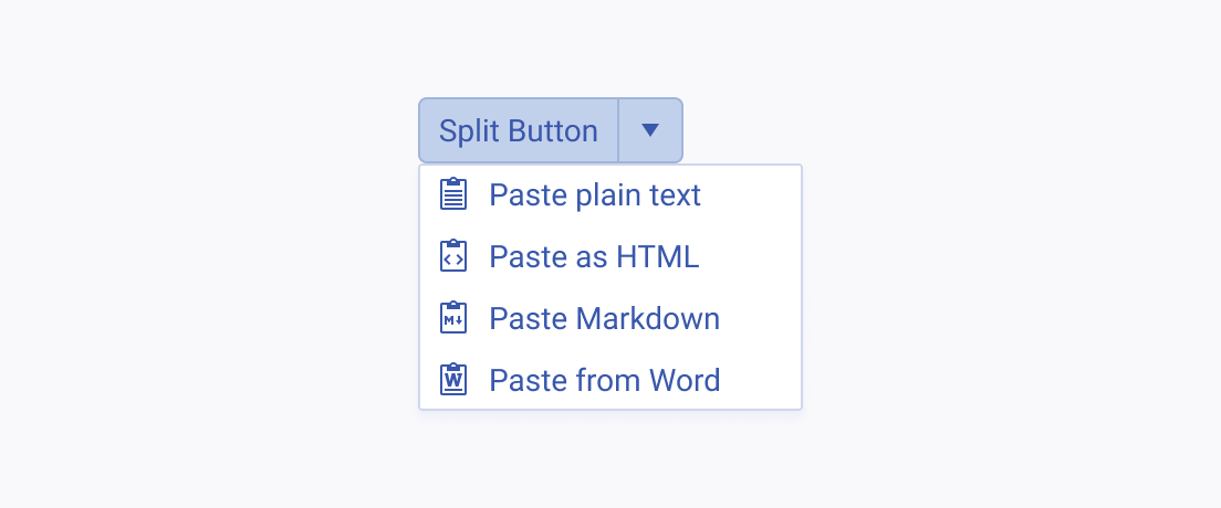
The purpose of a split button is to save space and reduce visual complexity by grouping similar commands together.
Content
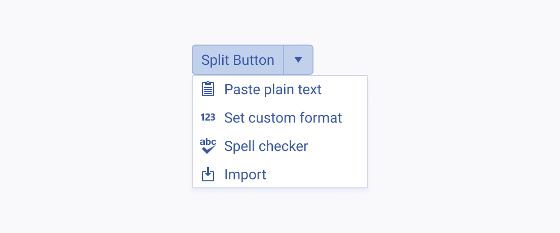
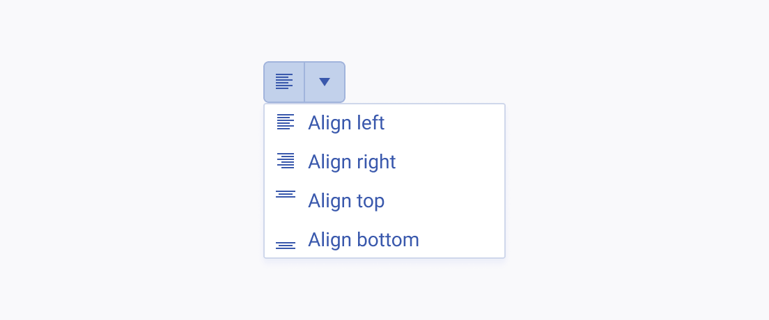
The label of the SplitButton must be as short and concise as possible. If the content cannot be displayed within the button itself, present it by using a proper icon that conveys its meaning.
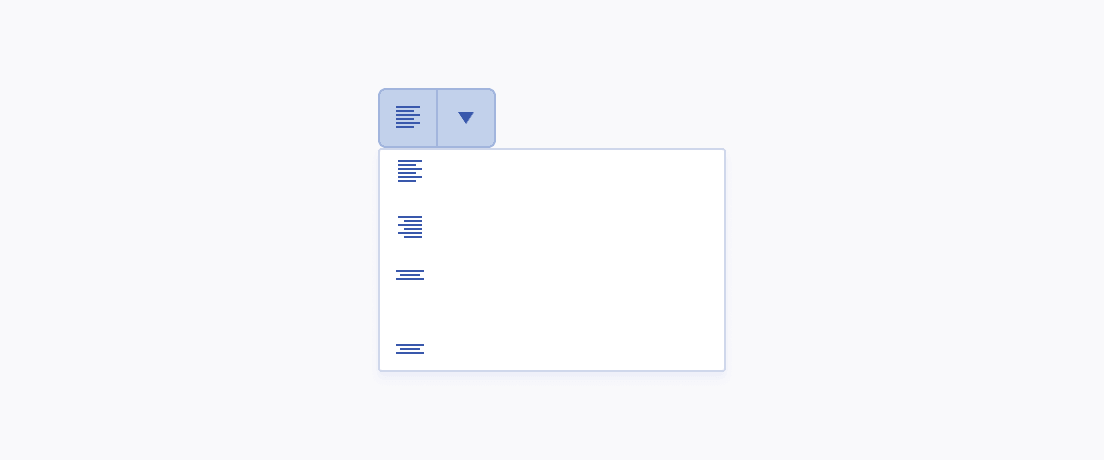
While icons can fully replace the label of the SplitButton, in the list items of the drop-down menu they must be accompanied by the corresponding text.
Hierarchy
The SplitButton comes with an established hierarchy as it contains a drop-down menu where all listed options are of equal importance.
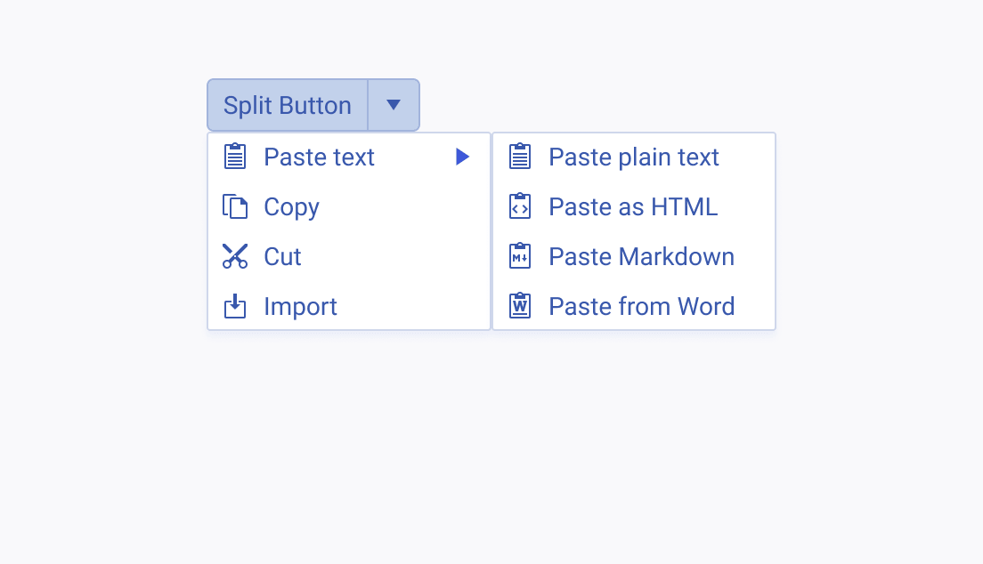
If a list item requires you to implement subitems, consider creating a new SplitButton with the list of subitems from the current SplitButton. If this approach is not feasible, use separators to enhance the distinction.
