SegmentedControl

A SegmentedControl is a horizontal UI control that lets users choose one option from a small set of mutually exclusive choices.

Usage Guidelines

In addition to the guidelines for using the Telerik and Kendo UI ButtonGroup, the SegmentedControl requires you to follow some basic principles when using the multi-button component.

Keep Icons Consistent

Icons in a SegmentedControl should remain visually consistent regardless of whether a segment is selected or not. Changing icons between states can confuse users and make it harder to recognize options. Instead, rely on state styling—such as background, color, or emphasis—to indicate selection while keeping the icon itself unchanged.
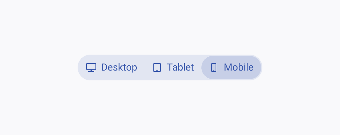
A Telerik and Kendo UI SegmentedControl using consistent icons for its segments regardless of their state.
Keep icons consistent and unchanged across active and inactive states.
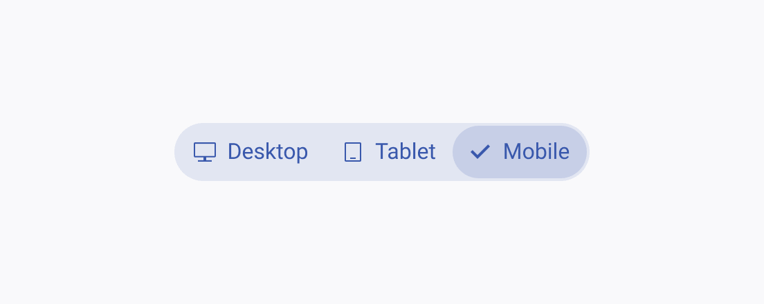
A Telerik and Kendo UI SegmentedControl using consistent icons for its segments regardless of their state.
Avoid replacing icons with checkmarks or alternate icons in the selected state.

Short and Simple

Use concise, one-word labels to keep segments readable and visually balanced.
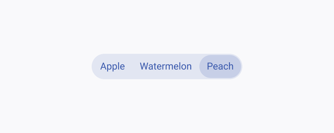
A Telerik and Kendo UI SegmentedControl using short text labels to maintain a clean and consistent visual appearance.
Keep labels short and concise to improve readability and visual balance.
A Telerik and Kendo UI SegmentedControl using short text labels to maintain a clean and consistent visual appearance.
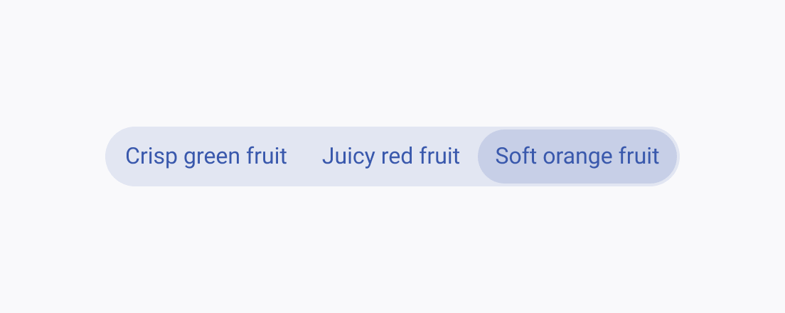
Avoid long, multi-word labels, as they reduce readability. In such cases, use the DropDownList component instead.

Consistent Size

All segments should have equal width to create a stable and predictable layout.
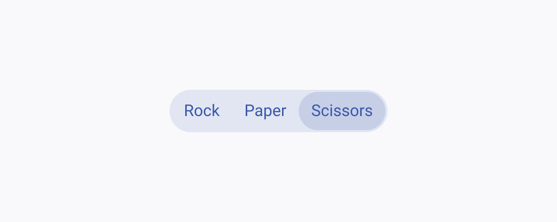
A Telerik and Kendo UI SegmentedControl with segments of consistent width to ensure a balanced and visually aligned layout.
Maintain consistent button widths across all segments.
A Telerik and Kendo UI SegmentedControl with segments of consistent width to ensure a balanced and visually aligned layout.
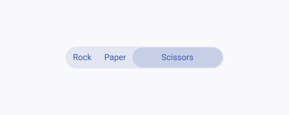
Avoid altering the width of individual segments.

Limit Segments

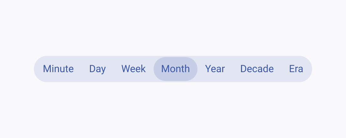
Use the SegmentedControl for switching between a small number of options, as too many segments can reduce readability and make the control harder to scan and use.
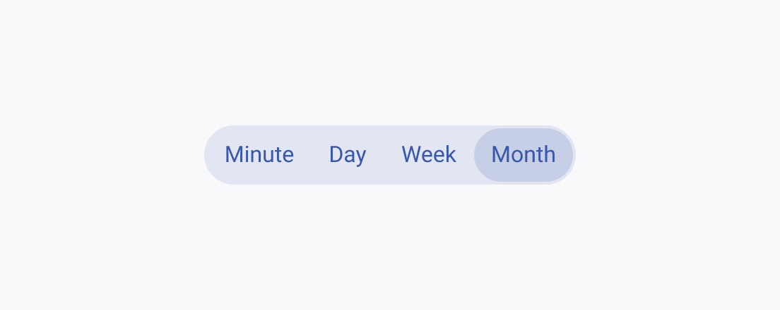
A Telerik and Kendo UI SegmentedControl with a maximum of five choices to maintain clarity and usability.
Segmented buttons are best used for selecting between 2 and 5 choices.
A Telerik and Kendo UI SegmentedControl with too many segments that can reduce readability and make the control harder to scan and use.
Avoid using too many segments, as this increases cognitive load, causes visual clutter, and reduces touch and click accuracy.

Text Truncation

Use text truncation only when space is constrained and the label meaning remains clear without the full text.
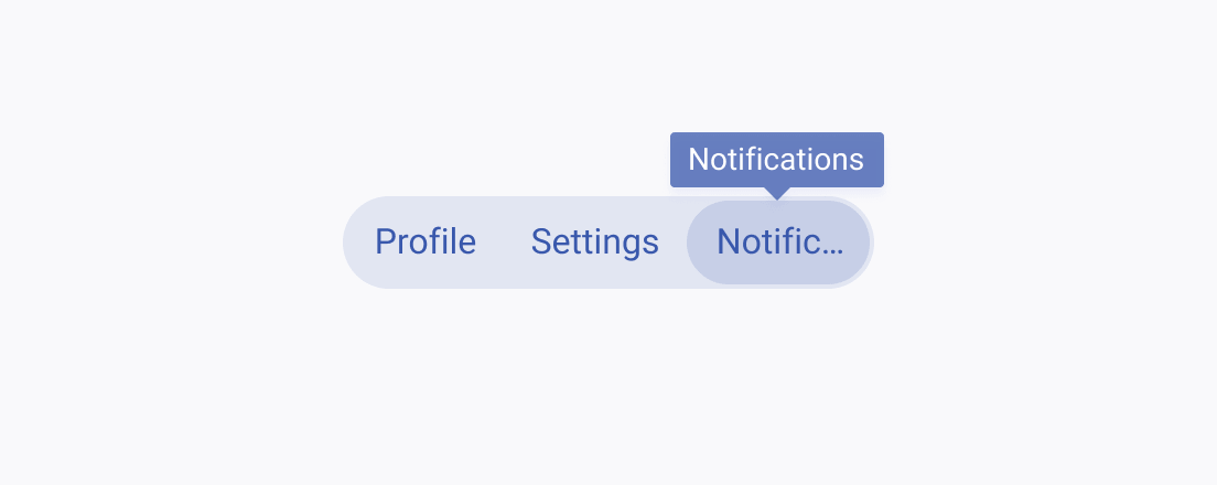
A Telerik and Kendo UI SegmentedControl where segment text may be truncated when necessary to fit the layout while preserving overall readability.
Truncate text only when absolutely necessary, and provide a tooltip or other indication on hover to show the full word.
A Telerik and Kendo UI SegmentedControl where segment text may be truncated when necessary to fit the layout while preserving overall readability.
Avoid truncating text without indicating the full word, as this can cause confusion and lead to a poor user experience.
Feedback