Usage Guidelines
In addition to the guidelines for using the Telerik and Kendo UI Button, the ButtonGroup requires you to follow some basic principles when using the multi-button component.
Fill Modes
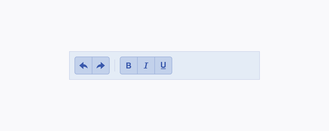
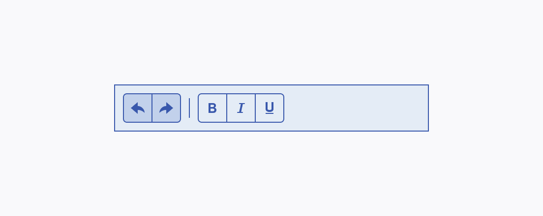
The ButtonGroup includes buttons with the solid, outline, and flat fill modes, which put different emphasis on the indicated actions.
Size
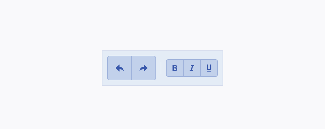
Depending on the purpose of the component, the ButtonGroup enables you to apply the small, large, or the default medium sizing option to smoothly fit into the UI. For example, small-sized ButtonGroups are suitable for compact components such as small Pagers and Toolbars, while large-sized ButtonGroups are well-suited for large Pagers and Toolbars.

Content
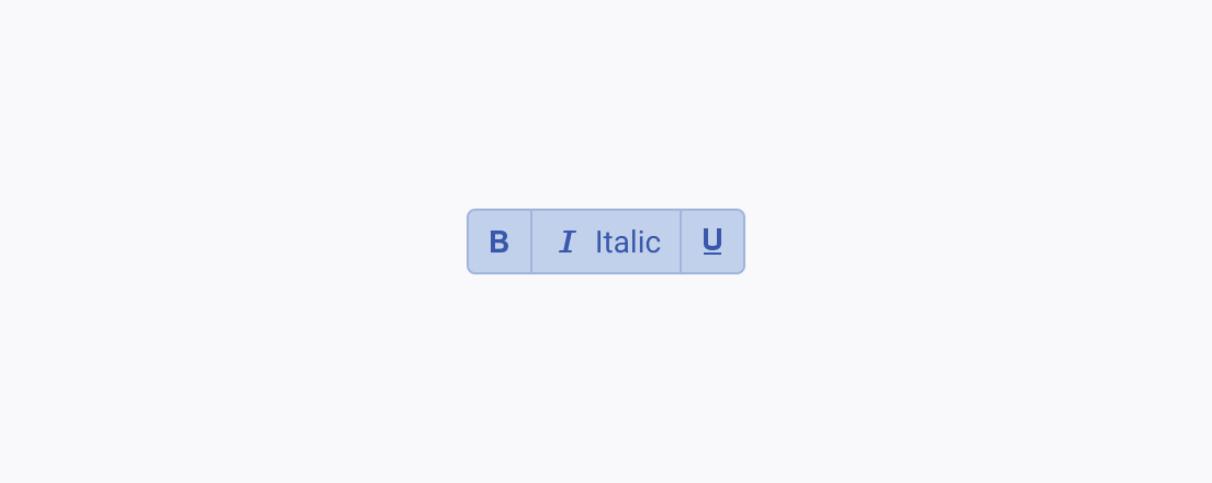
As all the buttons within the ButtonGroup are of equal importance, make sure that their appearance is the same and their content type is similar.
