Usage Guidelines
The Telerik and Kendo UI RadioGroup requires you to follow some basic principles when using the component.
Purpose
The RadioGroup component is typically used when you have a set of mutually exclusive options and users must select one of the available options.

Label
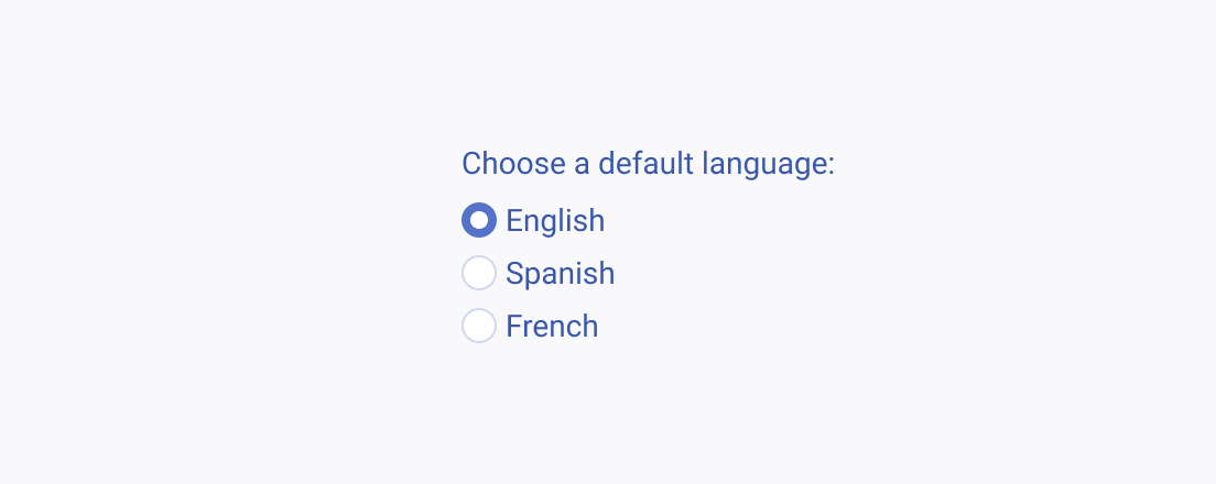
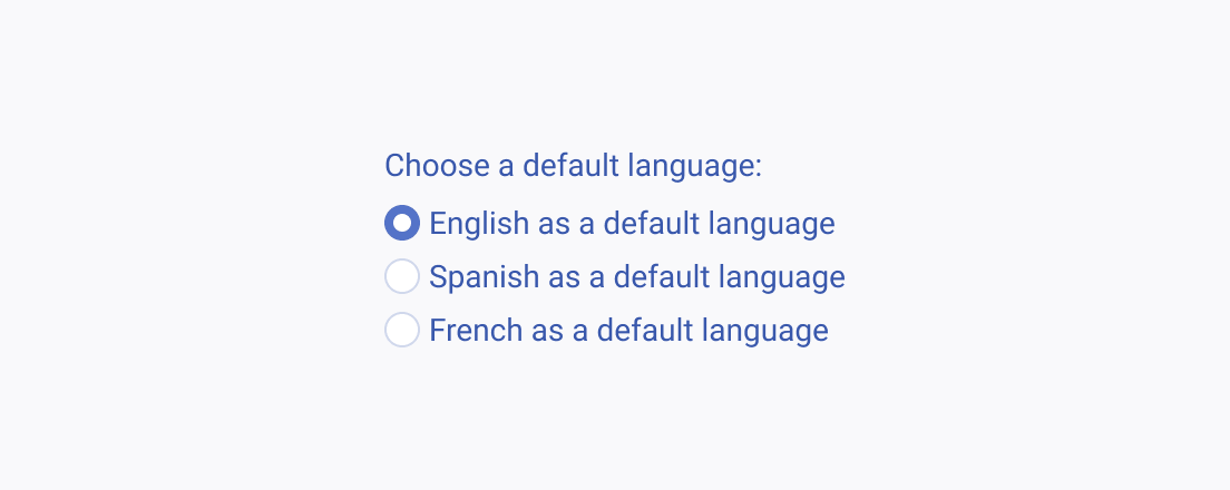
The label of the RadioGroup is of primary importance as it conveys the meaning of the options that the user can select. Therefore, the text label must be clear, straightforward, and as short as possible.
Default Selection
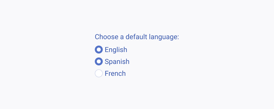
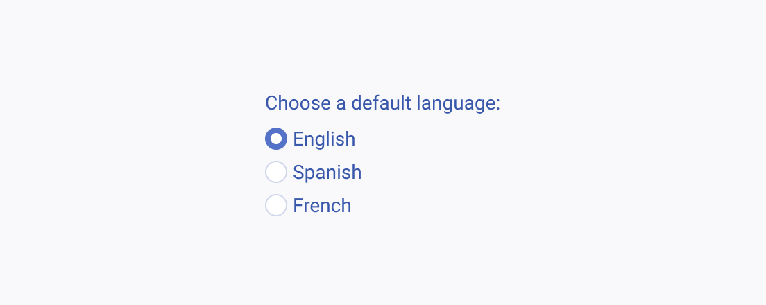
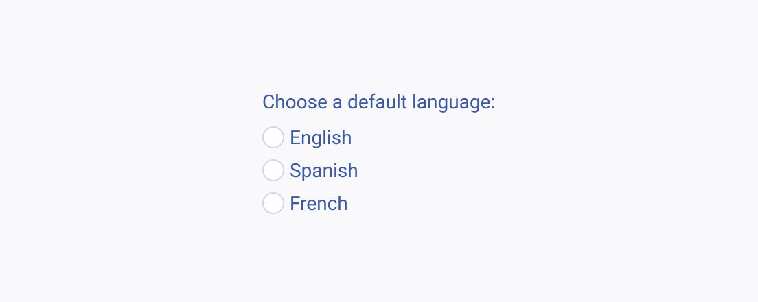
To prevent confusion among users when using a RadioGroup, don't select all alternatives by default. Instead, provide a single default or pre-selected option as a clear starting point.
Binary Selection
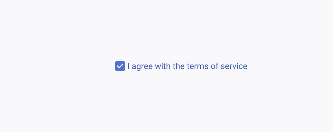
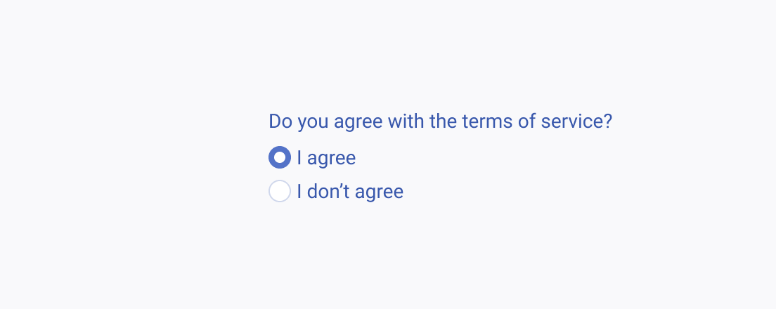
When designing a user interface with a RadioGroup, consider the best approach for binary selection scenarios. By using a single checkbox instead of two RadioButtons, you can create a more efficient and simpler interface. Using two radio buttons for binary selection within a RadioGroup can lead to unnecessary complexity and confusion for users.
