Usage Guidelines
The Telerik and Kendo UI Notification requires you to follow some basic principles when using the component.
Message
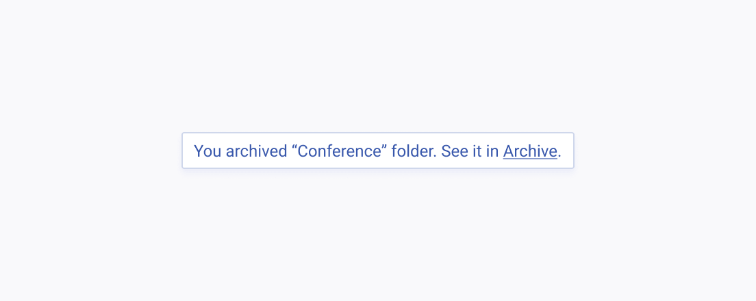
The Notification must provide a clear and unambiguous message that is meant to help the user take an action. Preferably, the text must be short, but if this is not possible, it must wrap to another line.

Colors
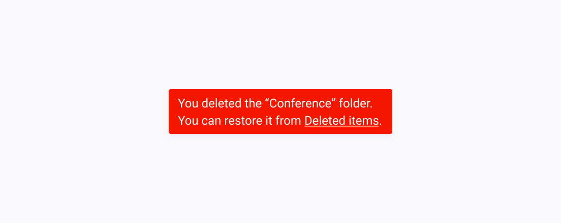
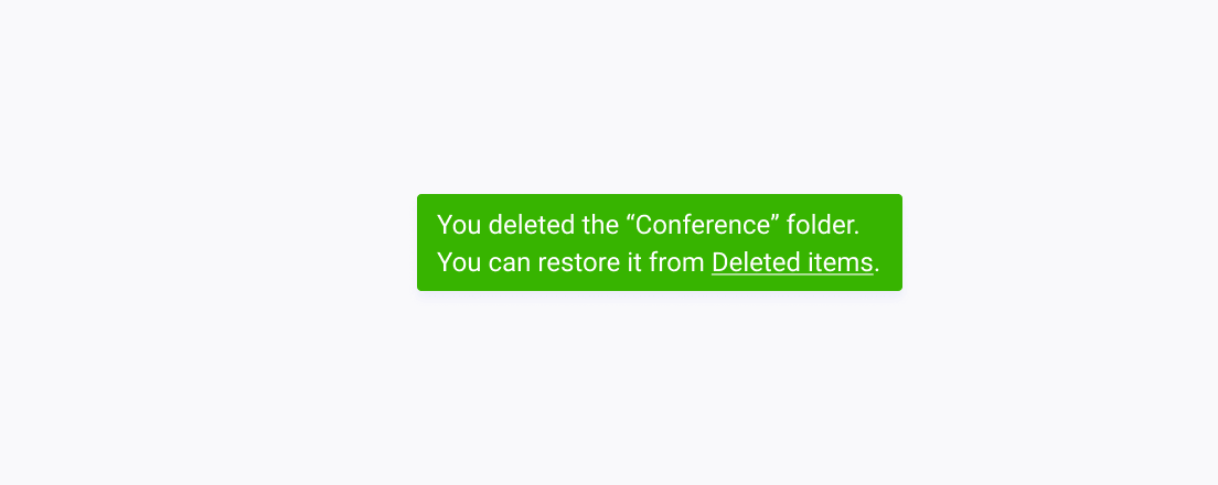
The message that the Notification conveys highly relies on the alert colors that the component uses. These colors have semantic meanings that are mutually exclusive and must never be interchanged.
Exclusivity
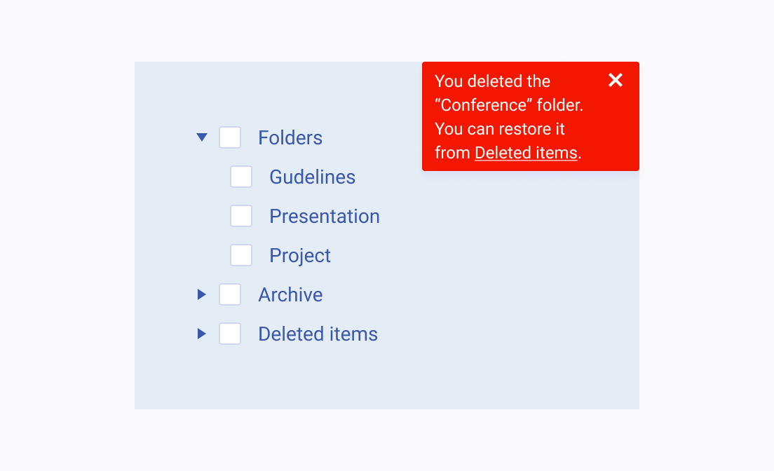
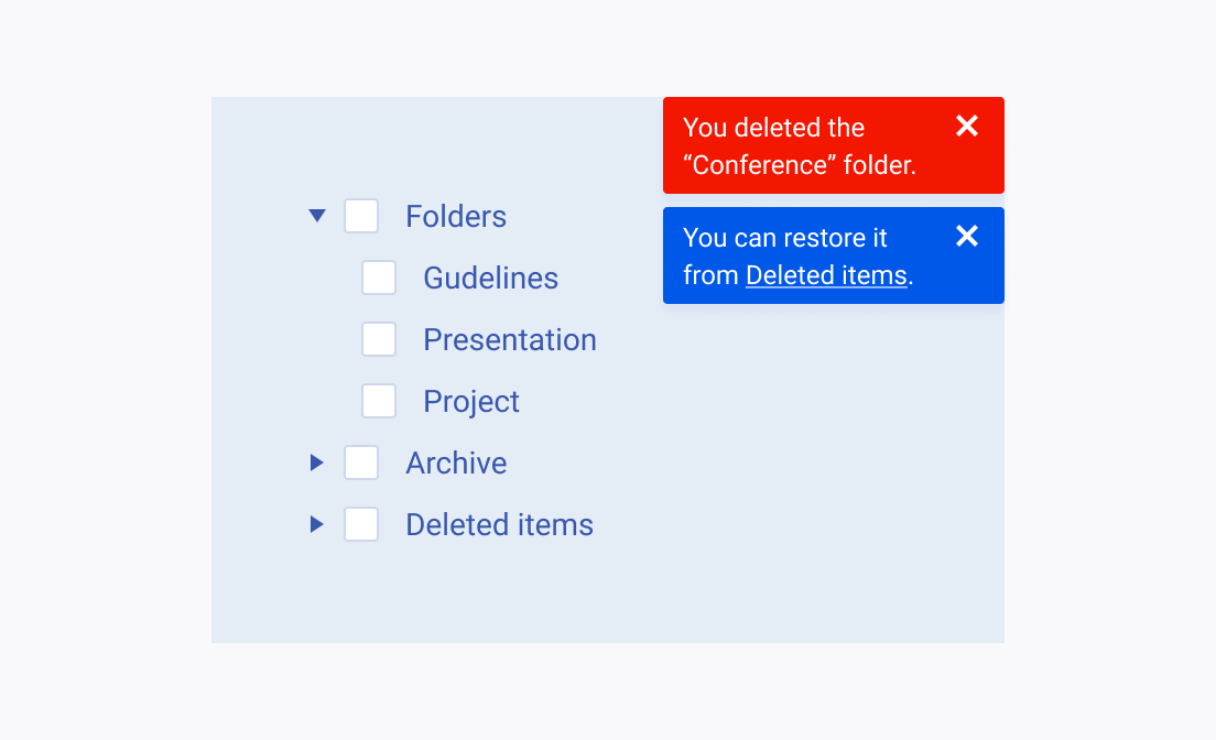
The Notification must be used sparingly on the page as it has a strong emphasis. It immediately draws the user’s attention and using it multiple times can lead to distraction, lower productivity, or even irritation.
Placement
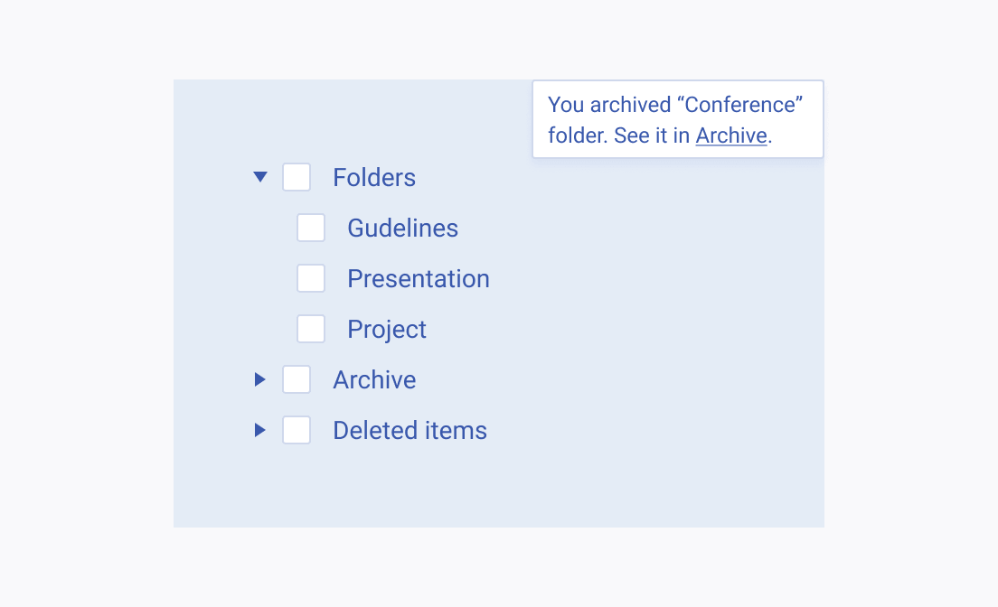
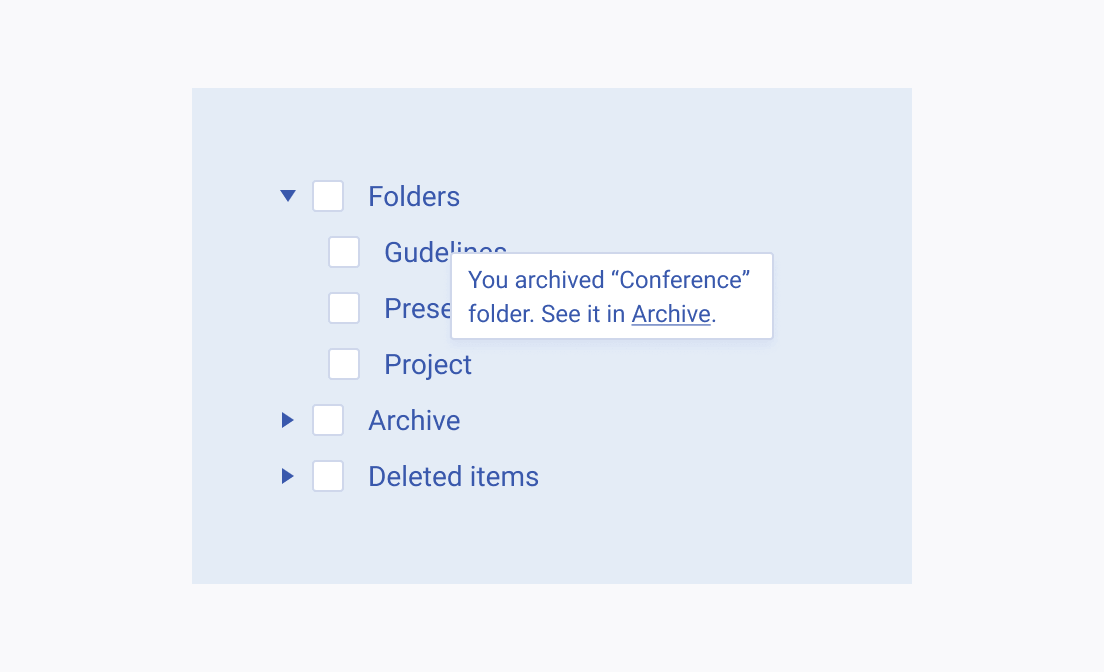
Notifications must not hide important content or affect the user’s productivity and workflow. They are usually placed at the top or the bottom of the page.
