MultiColumnComboBox

The MultiColumnComboBox component displays items in a dropdown grid layout.

Usage Guidelines

The Telerik and Kendo UI MultiColumnComboBox requires you to follow some basic principles when using the component.

Label

The label of the MultiColumnComboBox provides a clear and concise description of the component's purpose, making it easier for users to interact with the interface and understand it. Always display a label unless the MultiColumnComboBox is next to another component that has a label. The label of the MultiColumnComboBox can be set as part of the Telerik and Kendo UI Form component.

A Telerik and Kendo UI MultiColumnComboBox with a clear label
Use clear and concise labels that accurately describe the purpose or function of the MultiColumnComboBox.
A Telerik and Kendo UI MultiColumnComboBox with a missing label
Avoid using the MultiColumnComboBox without a label as this compromises the intuitiveness of the component, leading to confusion and frustration.

Purpose

When working with data that features multiple related columns and requires clear visibility and efficient selection, the MultiColumnComboBox is an excellent choice to streamline the user experience. However, it's crucial to avoid its use when dealing with simpler data sets as this may introduce unnecessary complexity.
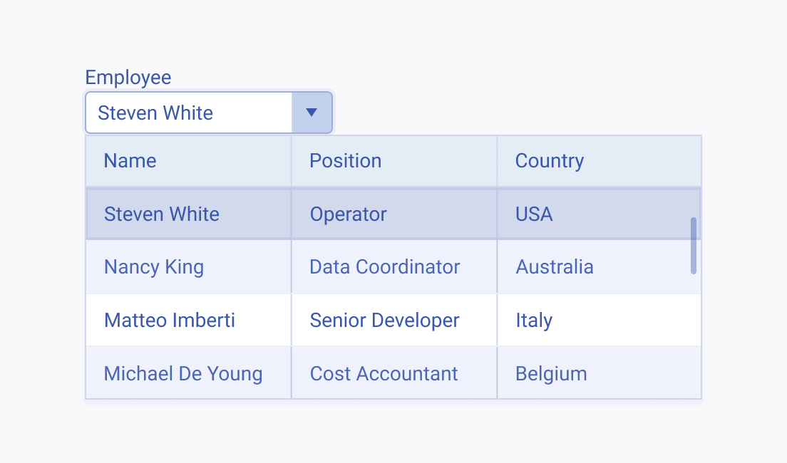
A Telerik and Kendo UI MultiColumnComboBox presenting complex data
Use the MultiColumnComboBox to present complex data with multiple related columns in a compact and user-friendly dropdown interface.
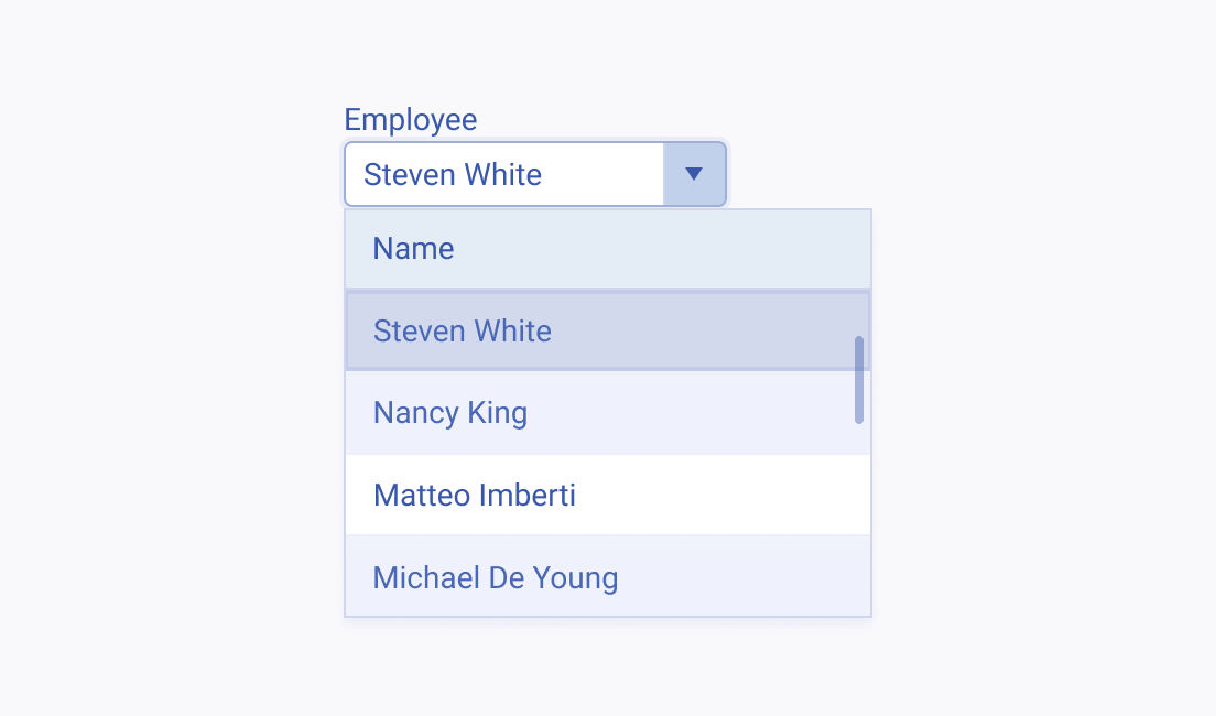
Incorrect usage of the Telerik and Kendo UI MultiColumnComboBox to represent simple data
Avoid using the MultiColumnComboBox for simple or single-column data as it may lead to unnecessary complexity and overwhelm users with information. Use the ComboBox or ListBox components instead.
Feedback