MultiColumnComboBox Overview
A MultiColumnComboBox is a user interface (UI) element combining a drop-down list or list box and an editable text field. The control displays a set of available options in a dropdown grid layout and allows the user to select from them in two ways: by typing into the text field and bringing up an option from the set or by directly selecting the desired options from the set.
Live Demo
Appearance
The MultiColumnComboBox provides built-in styling options that grant visually appealing and flexible rendering experience.
Apart from the default vision of the Telerik and Kendo UI MultiColumnComboBox, the component supports alternative styling options which enable you to configure the individual aspects of its appearance.
States
Depending on the action you want to imply through its appearance, the Telerik and Kendo UI MultiColumnComboBox can acquire the following states which you can set by using the following classes:
- A MultiColumnComboBox in its normal state appears usable and clickable. The control displays the currently selected item, which appears as text within the input field.
k-hover—Тhe hover state of a MultiColumnComboBox is applied when the user hovers over the component. This state indicates that the control is interactive and enabled. Note that the MultiColumnComboBox has an icon button that opens the drop-down list. The hover state of the icon button is independent of the hover state of the MultiColumnComboBox and indicates that the user can interact with the icon button.k-focus—The focus state is triggered when a user selects the MultiColumnComboBox with the mouse or keyboard. By displaying a highlighted border, this state indicates that the control is active and ready to receive user input.k-invalid—The invalid state is applied when the user enters or selects an unexpected value. By displaying a validation error icon and a red border, this state indicates an error in the input.k-invalid k-focus—The invalid focus state of the MultiColumnComboBox is a result of spotlighting a MultiColumnComboBox whose value or input type does not pass the validation requirements.k-disabled—The disabled state indicates that a MultiColumnComboBox is temporarily unusable because, for example, the page requires additional user input or something important is missing before the users continue to the next step. To indicate that they are unavailable, MultiColumnComboBoxes appear grayed out.
Anatomy
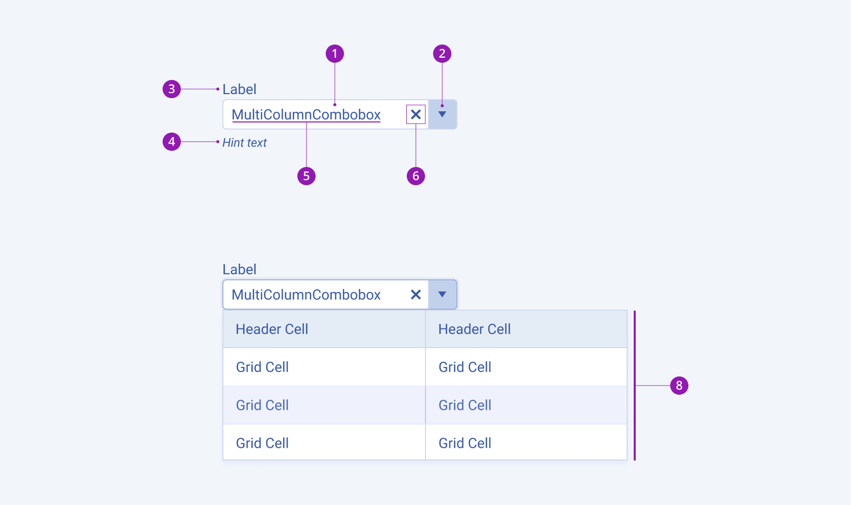
The anatomy of the MultiColumnComboBox summarizes the visual and functional elements of the component. The main elements include a text input field, an icon button, and a drop-down list that shows all available options.
The text input displays the currently selected item or a temporary placeholder text. It allows the users to type their own value or edit the currently selected item.
The MultiColumnComboBox also includes a label, hint text, and clear button that lets the user clear the current selection and revert to the placeholder text.
When using the control as a part of a Form component, the label and hint text are optional.
The next image shows the anatomy of a MultiColumnComboBox and includes the following elements:

- Input field
- Icon button
- Label (optional in Form component)
- Hint text (optional in Form component)
- Placeholder or preselected value
- Clear icon
- Popup with grid layout
Size
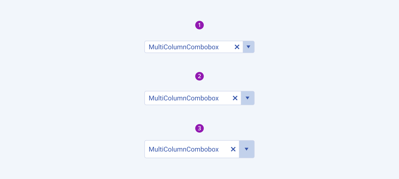
The MultiColumnComboBox provides the size configuration option that enables you to control how big or small the rendered MultiColumnComboBox will be. MultiColumnComboBoxes also provide options for size customization.
size provides the following available options:
small—Renders a small MultiColumnComboBox, which is suitable for compact components, such as Toolbars, where the available space is limited.medium(default)—Renders a medium MultiColumnComboBox.large—Renders a large MultiColumnComboBox that is suitable for adaptive designs.none—Does not set asizeand allows you to add your own, custom value.

- Small
- Medium
- Large
Fill Mode
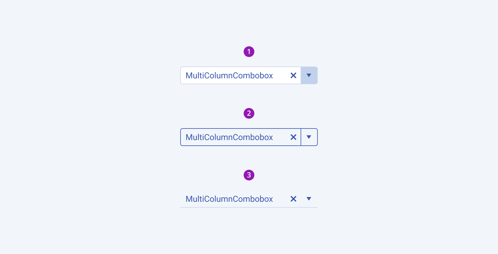
The MultiColumnComboBox provides the fillMode configuration option that enables you to control the way in which color is applied to the rendered MultiColumnComboBox. MultiColumnComboBoxes also provide options for fill-mode customization.
fillMode provides the following available options:
solid(default)—The solid MultiColumnComboBox puts a stronger emphasis on the action it indicates and draws the user's attention. This is the widely used common style.outline—The outline MultiColumnComboBox provides a minimalist look and can be a good choice when you want the MultiColumnComboBox to blend in with the background or other UI elements.flat—The flat MultiColumnComboBox has a plain and discreet look, making it a good choice when you need an unobtrusive MultiColumnComboBox that doesn't distract the users from the elements with higher importance.

- Solid
- Outline
- Flat
Border Radius
The MultiColumnComboBox provides the rounded option that enables you to control the border radius of the rendered MultiColumnComboBox. By default, MultiColumnComboBoxes are rendered with a medium border radius. If required, you can customize the border radius of the MultiColumnComboBox.
rounded provides the following available options:
small—Renders a border radius of 2 px.medium(default)—Renders a border radius of 4 px.large—Renders a border radius of 6 px.full—Renders a border radius of 9999 px.none—Does not set aroundedvalue and allows you to customize the configuration.

- Small
- Medium
- Large
- Full
Framework-Specific Documentation
For the framework-specific information about the UI components, refer to the respective product documentation:


