Usage Guidelines
The Telerik and Kendo UI Error requires you to follow some basic principles when using the component.
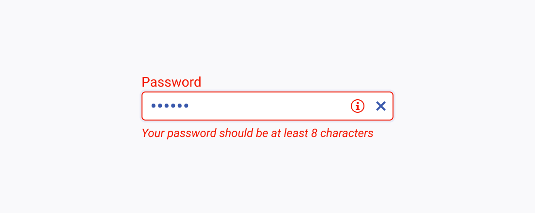
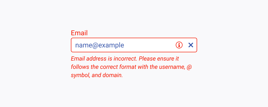
Clear Errors
Clear error messages provide specific and actionable information about the encountered problem and guide users toward resolving it. By using clear error components, users can easily understand what went wrong, why it happened, and what corrective actions they need to take.


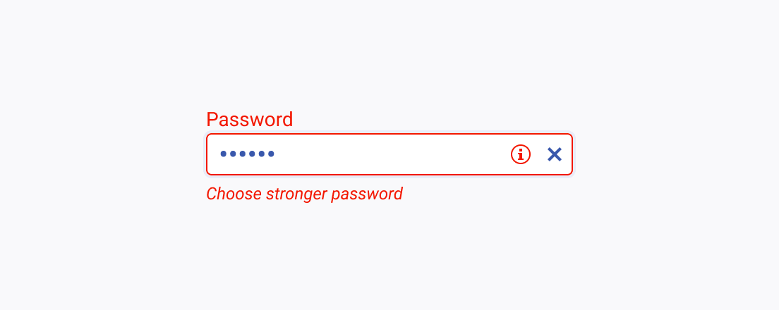
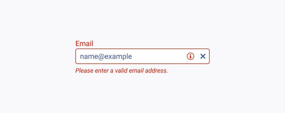
Concise Errors
Concise error messages provide the necessary information about the encountered issue in a clear and succinct manner, enabling users to quickly understand what went wrong. By keeping the error messages concise, users can easily grasp the problem and take appropriate corrective actions.


