Usage Guidelines
The Telerik and Kendo UI DropDownList requires you to follow some basic principles when using the component.
Presented Information
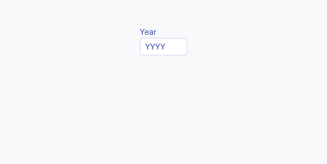
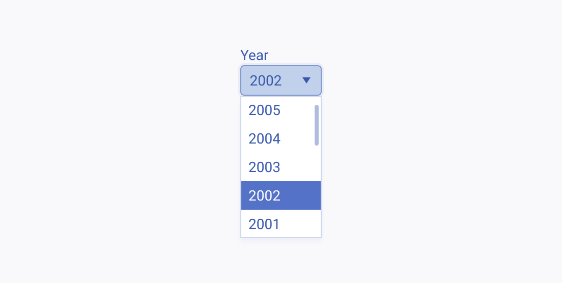
Avoid using the DropDownList for data that is too familiar to users such as the day, month, or year of their birth. It is much easier to type in such data rather than finding the specific values within a long list of options. For such familiar types of data, use an Input component instead.
Item Content
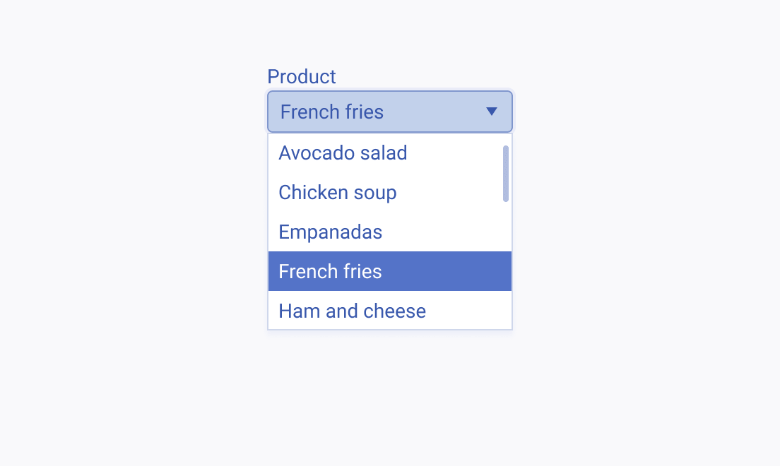
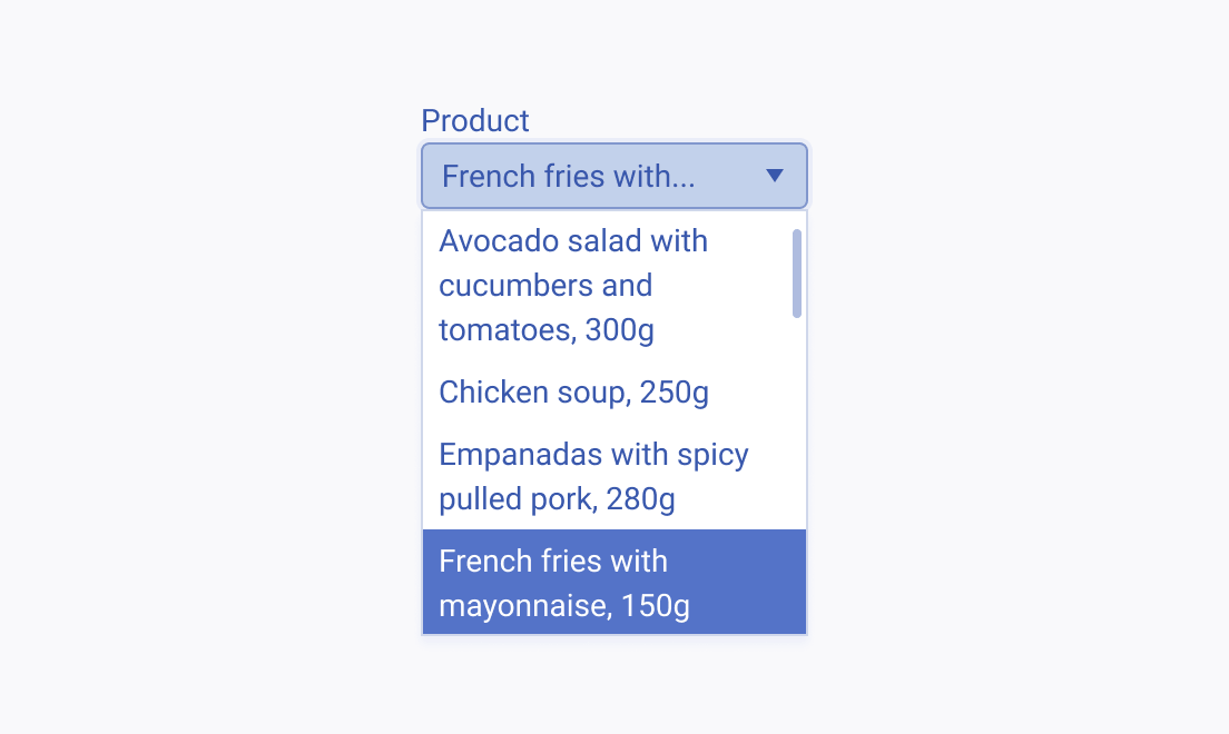
Consider the width of the DropDownList and keep the names of its options short and compact so that they fit within the component. Long item names that occupy multiple lines are hard to perceive and must be avoided.
Label
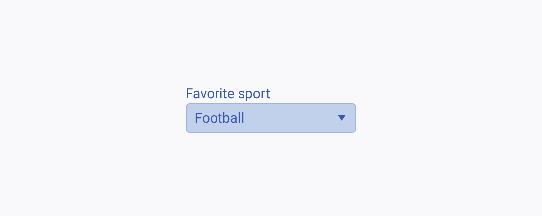
The label of the DropDownList provides a clear and concise description of its purpose, making it easier for users to interact with the interface and understand it. Always display a label unless the DropDownList is next to another component which already has a label. The label of the DropDownList can be set as part of the Telerik and Kendo UI Form component.
