DropDownButton

DropDownButtons allow the user to choose an option from a popup list with predefined menu items.

Usage Guidelines

The Telerik and Kendo UI DropDownButton requires you to follow some basic principles when using the component.

Order and Grouping

DropDownButtons provide you with a drop-down menu to choose from, and their organization is important to facilitate ease of use. Following a logical order sequence of menu items and grouping them based on functional criteria is crucial for providing a clear and intuitive user experience.
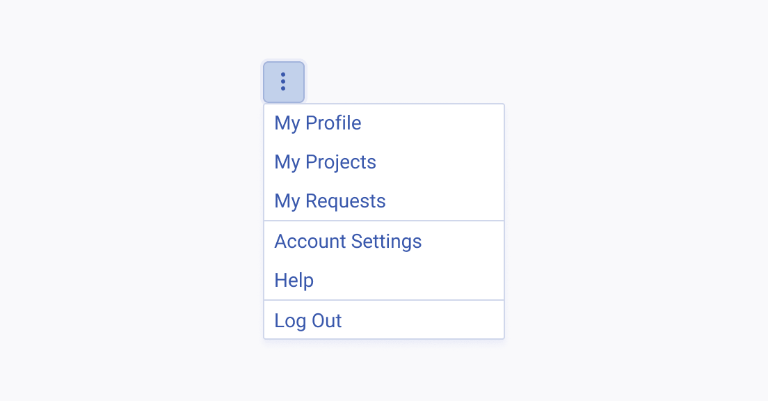
A Telerik and Kendo UI DropDownButton with items that are grouped arranged in a logical order
Organize the drop-down menu items in groups, and sort them in a logical order by placing the most selected option at the top.
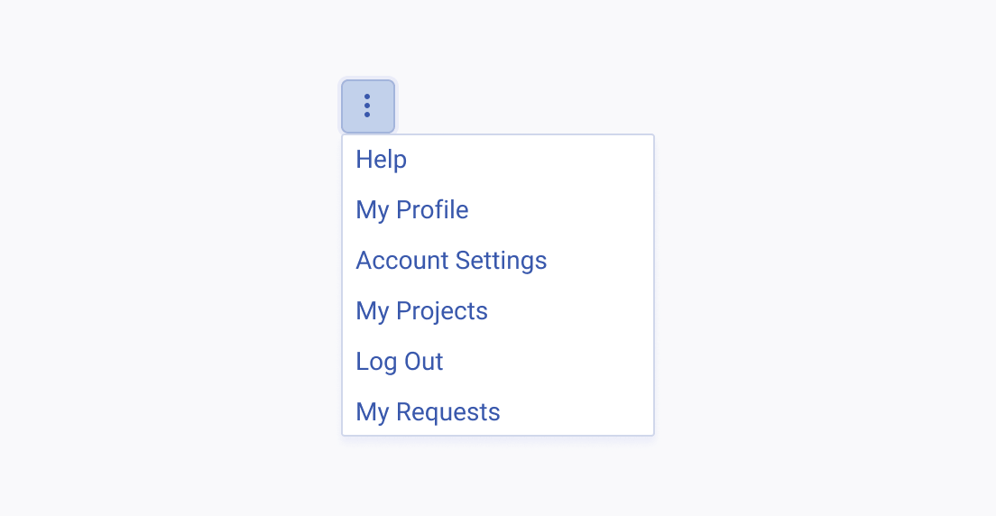
A Telerik and Kendo UI DropDownButton with randomly listed items
Avoid random sorting of the menu items as this could lead to confusion and frustration.

Label Text

The label of the DropDownButton must be accurate, informative, and leaving no room for misinterpretations.
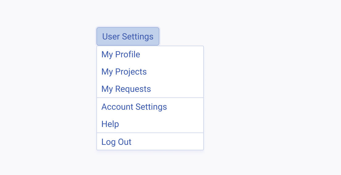
A Telerik and Kendo UI DropDownButton with a precise label
Use phrases that clearly indicate the DropDownButton action.
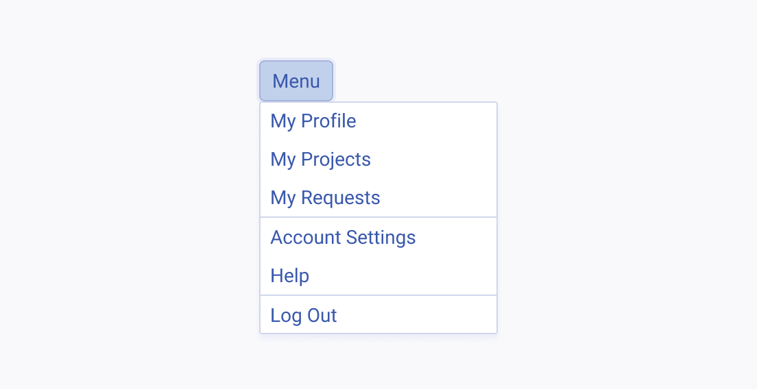
A Telerik and Kendo UI DropDownButton with a vague label
Avoid using vague and generic labels as this could lead to confusion and frustration.
Feedback