Usage Guidelines
The Telerik and Kendo UI DateInput is preferable in scenarios where the users are familiar with the date format and need to quickly and accurately type in specific dates. This approach is suitable for users who are comfortable with keyboard input and don't require the additional assistance of a calendar picker. It can be particularly useful in situations where the date format is standardized or widely known, reducing the need for extra interactions and streamlining the user experience.
The DateInput requires you to follow some basic principles when using the component.
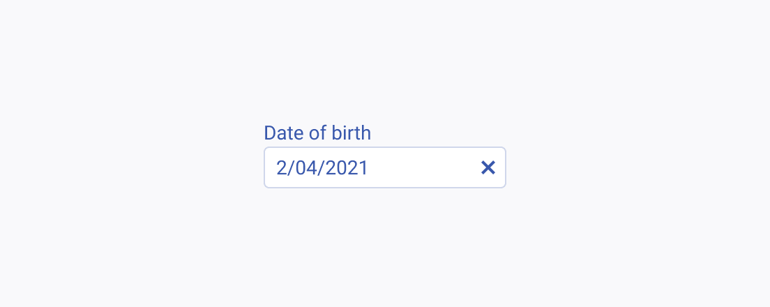
Text Label
The label of the DateInput provides a clear and concise description of its purpose, making it easier for users to interact with the interface and understand it. Always display a label unless the DateInput is next to another component that already has a label. The label of the DateInput can be set as part of the Telerik and Kendo UI Form component.
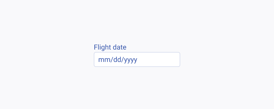
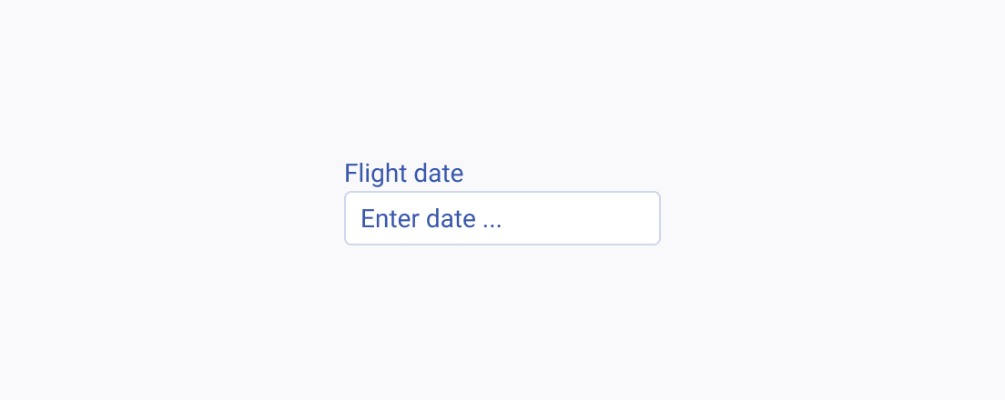
Placeholder
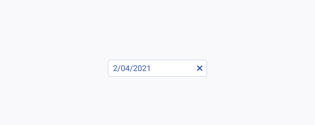
The placeholder text in the DateInput component plays a crucial role in guiding users to input dates correctly. A well-crafted placeholder can provide clear instructions or example dates, enhancing user understanding and interaction with the component.
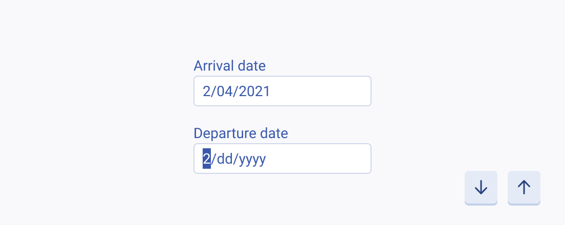
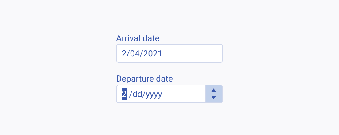
Incremental Steps
The Incremental Steps feature of the DateInput component allows users to navigate through dates by using predefined steps. Depending on the specific context and user needs, the incremental steps can be triggered either by using the keyboard arrows or spin buttons.
