Checkbox

Checkboxes indicate non-binary choices or allow users to select one or more options from a multiple-choice list.

Usage Guidelines

The Telerik and Kendo UI Checkbox requires you to follow some basic principles when using the component.

Implied Meaning

When displayed, checkboxes indicate non-binary choices or multiple selections within a list of choices.
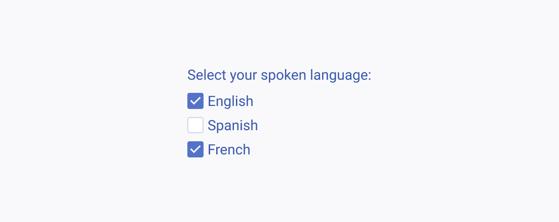
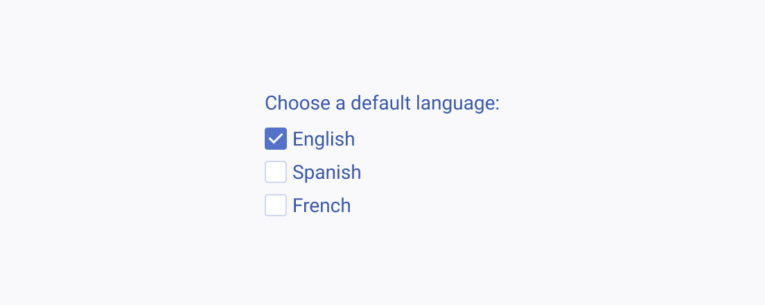
Use checkboxes to choose single or multiple options within a list of choices.
Avoid using checkboxes for mutually exclusive options.

Indeterminate State

The indeterminate state of the Checkbox component is not a standalone one and depends on the options that were previously checked by the user.
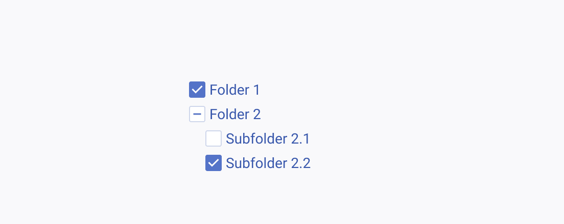
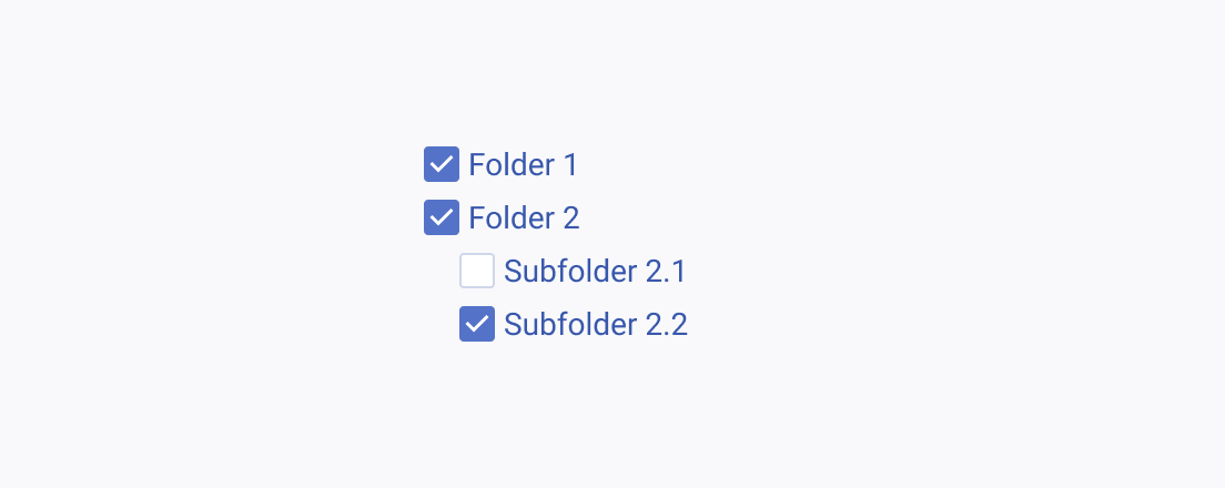
Use the indeterminate state of the Checkbox to indicate the root item in a group where not all options are selected.
Avoid using a checked Checkbox for a root item unless you want to indicate that all the options within the said group are selected.

Alignment

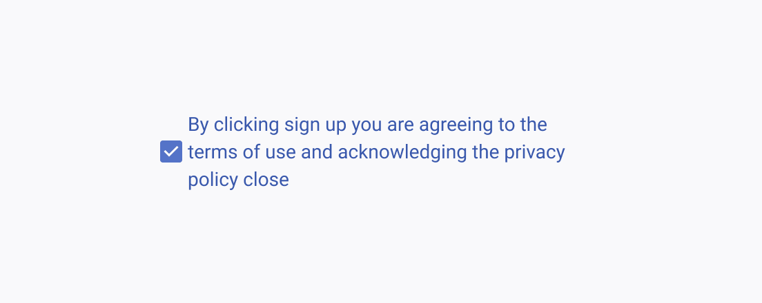
Regardless of how long the label is, the container and the label of the Checkbox are always aligned to the middle. However, always consider the height of the first row before aligning the Checkbox to its label especially when the label spans more than one row.
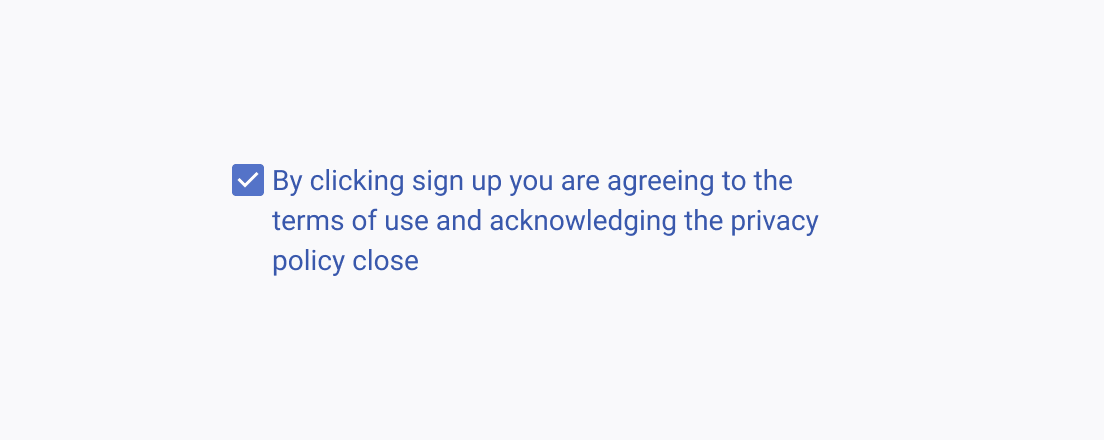
If the label is longer, align the Checkbox to the center of the first row.
Avoid aligning the Checkbox to the middle relative to the height of the label if the label is longer than a single line.