Usage Guidelines
The Telerik and Kendo UI Badge requires you to follow some basic principles when using the component.
Text Label Length
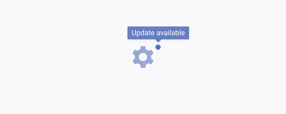
The Badge is a simple and compact component for use in a limited space in the context of more complex components. When it includes a text label, make sure it fits into the dedicated space. If it doesn’t fit, the text must truncate, and a Tooltip must appear upon hover.


Appearance
The Badge is usually smaller than the other components on the page and does not have states because users cannot interact with it.
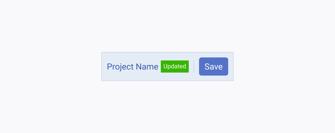
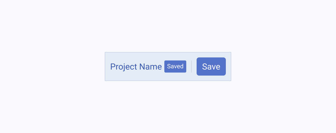
When setting the size and the theme color of the Badge, make sure that it doesn't resemble other components, like the Button, for example.


Color
As the Badge is used as an indicator, its color must be precise and relevant to the message that the badge conveys.


