UI for WPF
WPF ToolTip
- The WPF Tooltip component is a popup with information related to a UI element, displayed when the element is clicked or hovered over.
- Part of the Telerik UI for WPF library along with 160+ professionally-designed UI controls.
- Includes support, documentation, demos, virtual classrooms, Visual Studio Extensions and more!
-
Custom Tooltips
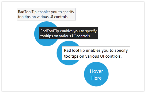
With RadToolTip, you can easily set up and show customizable tooltips that appear once the end user hovers over a particular control. Include a brief description, any other text or even an image. Easily control the placement, position and other properties of the content in the tooltip.
-
Easy Customization
Use any of the 15 predefined, professional-looking themes that come as part of Telerik® UI for WPF to style the appearance of RadToolTip.