
UI for WPF
WPF TabControl
- The Telerik WPF TabControl is a flexible navigation component, used to build tabbed interfaces. Supports powerful data binding, flexible header content, multiple tab strip placement as well as styling and appearance customization.
- Part of the Telerik UI for WPF library along with 160+ professionally-designed UI controls.
- Includes support, documentation, demos, virtual classrooms, Visual Studio Extensions and more!
-
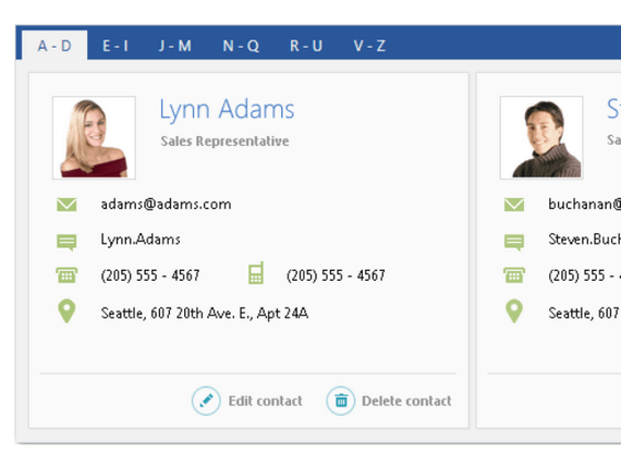
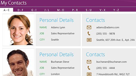
Add More Content to Your View
Easily add extra content to your view while maintaining an organized, tab-based navigation system that is easy to understand and recognize within your application.
-
Scrollable Headers and Drop-Down Display
Use scrollable headers and the drop-down display to enable even the most complicated and content-rich scenarios. -
Multiple Tab Rows and Tab Orientation Support
TabControl supports multiple tab rows and tab orientation, enabling you to use the component regardless of how many tabs you want displayed or where you want to display them. -
Easily Close Tabs
You can add a close button to one or all of the tabs in the control..gif?sfvrsn=82de794a_3)
