UI for WPF
WPF Buttons
- The Telerik Buttons control for WPF is a set of customizable buttons that allow you to build complex forms and easily manage user input. Includes DropDown Button, Split Button, Toggle Button, Hyperlink Button, Radio Button and many more.
- Part of the Telerik UI for WPF library along with 160+ professionally-designed UI controls.
- Includes support, documentation, demos, virtual classrooms, Visual Studio Extensions and more!
-
ToggleSwitchButton
SwitchButton is a modern way to provide users with the ability to pick between two options, just like the ToggleButton. A lightweight, modern, highly customizable control with support for three state mode.
-
DropDown Button
The DropDown button enables you to display any content for selection, including other controls, with a component that takes only a minimal amount of UI space.
Documentation on RadDropDownButton
-
Split Button
Build upon the DropDown button functionality and use the Split button to make the button itself an action area that can be checked or selected.
Documentation on RadSplitButton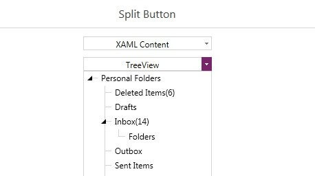
-
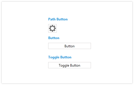
Toggle Button
The Toggle button mimics the functionality of a checkbox but goes beyond the basic check mark. Use this component to more easily visualize elements that are checked or unchecked.
Documentation on RadToggleButton -
Hyperlink Button
The Hyperlink Button control in Telerik UI for WPF is a variation of the Button control, which offers support for hyperlinks navigating the user to a specific webpage, commonly used to refer to a documentation or another article on the web.
Documentation on RadHyperlinkButton
-
PathButton
The new PathButton control is a customizable button, enabling you to build complex forms and manage user input. The PathButton has all the features of the Button control, with the addition of a path to the default template. Easily add a custom geometry to your button, or style it using one of the 15 professional-looking themes that come with UI for WPF.
Documentation on RadPathButton