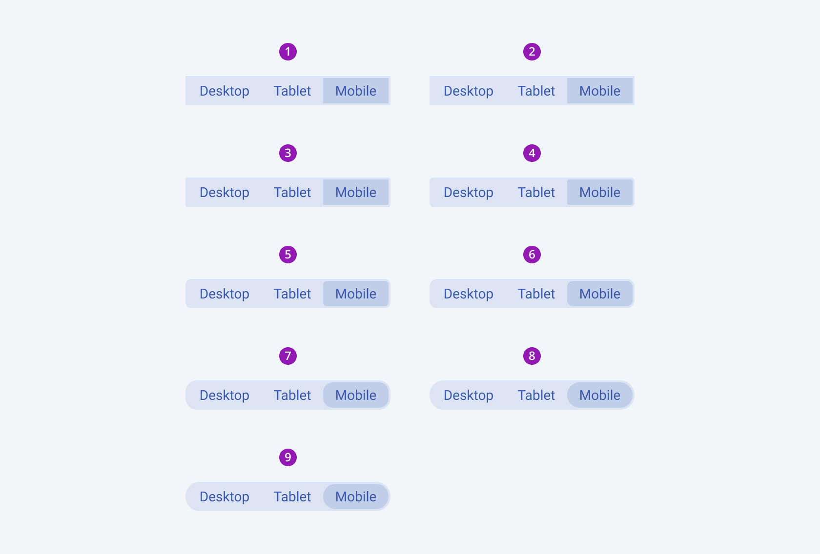
SegmentedControl Overview
A SegmentedControl is a UI component that presents a small set of mutually exclusive options arranged horizontally, allowing users to select exactly one option at a time. Each segment acts like a button, and the currently selected option is visually highlighted to clearly communicate the active state. Selecting a different segment immediately changes the selection and typically updates the content, view, filter, or mode associated with that option.
Appearance
A SegmentedControl typically appears as a horizontal group of connected buttons or segments, each representing an individual option. The segments could be visually separated by subtle dividers, borders, or spacing, but are perceived as part of a single control.
States
Depending on the action you want to imply through its appearance, the segments within the Telerik and Kendo UI SegmentedControl can acquire the following states which you can set by using the following classes:
- A Segment in its normal state appears active, and is usable and clickable.
k-hover—The hover state of a Segment is applied after the user hovers over the component.k-focus—The focus state is triggered after the Segment has been spotlighted with the mouse or the keyboard.k-selected—The selected state of a Segment is activated after the user has selected the component.k-disabled—The disabled state indicates that a segment is temporarily unavailable for interaction—for example, when additional user input is required or a prerequisite condition has not been met. To communicate this unavailability, a segment in the disabled state is typically visually muted, with reduced opacity, diminished contrast, and a subdued text label.k-hover-focus—Indicates that a Segment is both focused (keyboard or accessibility focus) and being hovered over by a pointer.k-hover-selected—Indicates the Segment is both selected and currently hovered over.
Anatomy
A SegmentedControl is a composite UI component made up of multiple connected segments, each representing a selectable option. Its anatomy can be broken down into the following parts:
-
Icon—Segments that display only an icon instead of text. Useful when the action is visually recognizable, saving space and enhancing clarity.
-
Text—Segments that display only text, which clearly communicates the action or option that will be triggered when selected. Best for short, descriptive labels.
-
Icon-and-text—Segments that combine an icon-and-text label, providing both a visual cue and a descriptive label. Ideal when you want to enhance comprehension or reinforce the meaning of the action.

- An icon-only SegmentedControl
- An icon-and-text SegmentedControl
- A text-only SegmentedControl
The next image shows the anatomy of a SegmentedControl and includes the following elements:

- Container
- Segment
- Text Label
- Icon (Optional)
Size
Each segment within the SegmentedControl supports the
sizeconfiguration option, thus enabling you to control how big or small each rendered segment will be. It directly affects usability, readability, and visual prominence. The Telerik and Kendo UI SegmentedControl comes in small, medium, and large sizes, allowing users to choose a size that fits the context and layout of the interface. By default, Segments are medium-sized.sizeprovides the following available options:small—Compact segments with smaller text and icons, ideal for dense layouts, toolbars, or secondary actions where space is limited.medium(default)—Balanced segments with moderate height and padding, perfect for general-purpose controls, filters, and view toggles.large—Taller, more prominent segments with larger text and icons, suitable for primary actions or touch-focused interfaces where visibility and accessibility are key.none—Does not set asizeand allows you to add your own, custom value.

- Small
- Medium (default)
- Large
Border Radius
Each segment within the SegmentedControl supports the
roundedconfiguration option, thus enabling you to control how much border radius will apply to the rendered segment. Segments also provide options for border-radius customization.roundedprovides the following available options:xs—Renders a border radius of 1 px.small—Renders a border radius of 2 px.medium(default)—Renders a border radius of 4 px.large—Renders a border radius of 6 px.xl—Renders a border radius of 8 px.xxl—Renders a border radius of 12 px.xxxl—Renders a border radius of 16 px.full—Renders a border radius of 9999 px.none—Does not set aroundedvalue and allows you to customize the configuration.

- None
- XS
- Small
- Medium (default)
- Large
- XL
- XXL
- XXXL
- Full


