
UI for WinForms
WinForms ChartView
- The WinForms ChartView is a versatile control that offers drawing capabilities, user interaction and real-time updates.
- Part of the Telerik UI for WinForms library along with 165+ professionally-designed UI controls.
- Includes support, documentation, demos, virtual classrooms, Visual Studio Extensions and more!
-
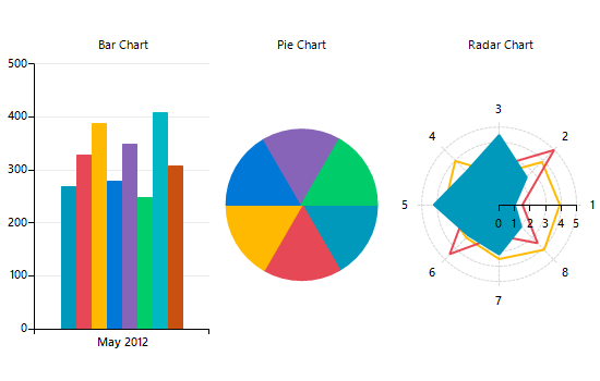
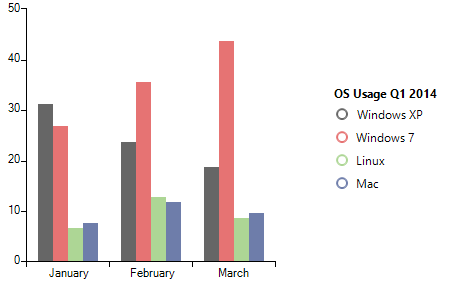
Variety of Series for Data Visualization
Telerik Windows Forms ChartView control facilitates data visualization, achieving stunning visual effects. This chart component sets no limits on your data visualization needs. It can easily turn into Bar, Pie, Line, Area, Polar, Radar and Scatter with only a few clicks at design time. The input data is contained in a set of series classes. Each series have a collection of data points, that is, a data source which it displays according to the series’ type.
-
Most Essential Chart Types
Slick and intuitive, WinForms Chart supports a great variety of chart types:
Bar, Range, RangeBar or Radar chart to compare several data sets
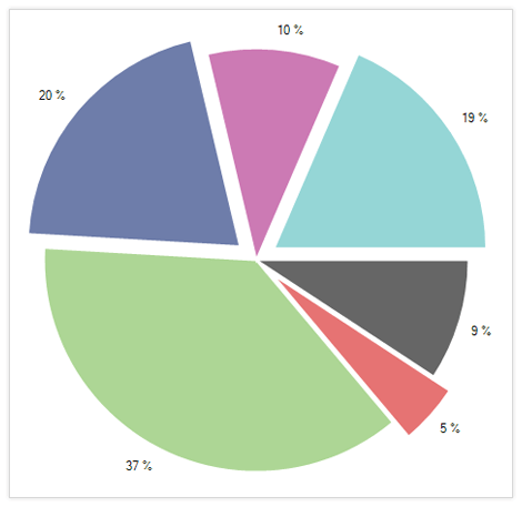
Pie and Donut chart to visualize a piece of data as part of the whole
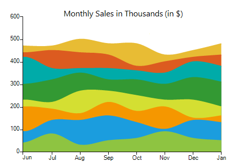
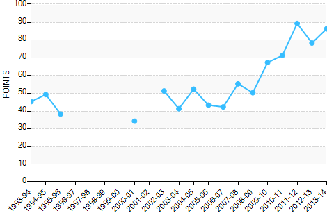
Area, Line, FastLine, Spline and Stepline charts to monitor trends
Scatter, ScatterArea, ScatterLine and Bubble chart to visualize the correlation in a set of engineering data
Polar chart to plot engineering data in a polar coordinate system
Funnel chart to display a single series of data in progressively decreasing or increasing proportions
Waterfall chart to show the cumulative effect of positive or negative values on the starting point
-
Excellent Performance
Easily create live-data experiences with updates as fast as the eye can see.
-
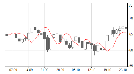
Financial Series Support
Take advantage of the high-low-close (HLC), open-high-low-close chart (OHLC) and CandleStick chart types to visualize data in financial-based applications.
-
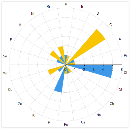
RadarColumn Series Support
The RadarColumn Series is a two-dimensional chart consisting of three or more quantitative variables represented on axes with the same starting point in the ChartView. Radar WinForms Charts, also known as web charts or spider charts are often used to showcase the quality of improvement or status in a few different areas.
See the WinForms ChartView Radar Column Series Support Documentation
-
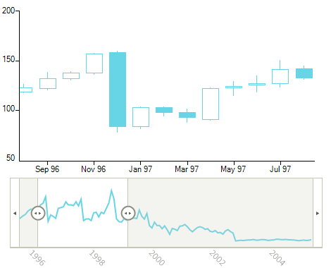
Pan and Zoom
The Pan and Zoom feature enables you to zoom and scroll data displayed over a period of time. With a simple and intuitive move, you can navigate through a large collection of data and focus on the period/category you need. Pan and Zoom works great with RadRangeSelector.Another functionality is the Lasso Selection (zoom to selection), where by selecting a rectangle on the surface of the control the latter will then zoom in automatically based on the selected Cartesian area.
-
Printing Support
Following RadGridView, RadPivotGrid, RadScheduler and RadPdfViewer, RadChartView is yet another control from Telerik UI for WinForms for printing. Using print setting dialogs, your end users are already familiar with, the printing process will be a breeze.
The control has a built-in ExportToImage function to export the control content to an image.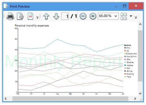
-
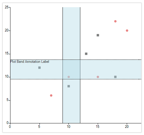
Annotations
GridLine, PlotBand and Marked zone annotations are supported out of the box to help with highlighting an area in the WinForms chart.
-
Drill-Down
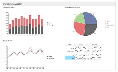
The drill-down functionality of WinForms charts enables users to click on a graphical element representing data (bar, pie segment and the like), to navigate to another view containing different data. The new view usually contains finer-grained data such as yearly to quarterly data, quarterly to monthly and so on. Or, in the case of a retail store, from categories to brands, brands to items and so on.
-
Variety of Axes
The control offers:
- Categorical axes to plot data that contains categorical values
- Categorical and Numerical DateTime axes to plot data with DateTime values sorted chronologically
- Linear axes to plot data containing numerical values
- Logarithmic axis used to plot numerical data where the values of each tick is growing exponentially
- Polar axis rendered as a fixed line in a system of polar coordinates, where polar angle, θ, is measured counter-clockwise
- Categorical and Numerical Radial axis to plot data in a Radar chart
Additionally, RadChartView features different plot modes (on ticks, between ticks), axis alignment and inverse axis.
-
Selection
By default, the WinForms chart supports selecting single and multiple data points. In addition, using the lasso selection.
-
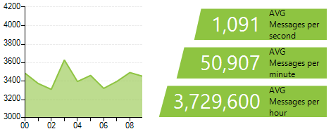
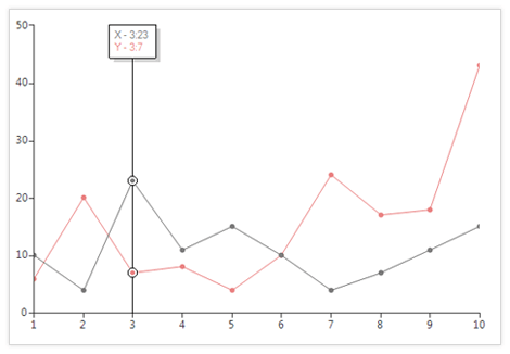
ToolTip and TrackBall
Using tooltips, arbitrary information can be shown when the users hovers over a data point. With the track ball functionality, a vertical line is displayed across the chart plot area, and the area is highlighted wherever the line crosses data points. In addition, additional information can be displayed at those intersections.
See the WinForms ChartView ToolTip and TrackBall Documentation Articles.
-
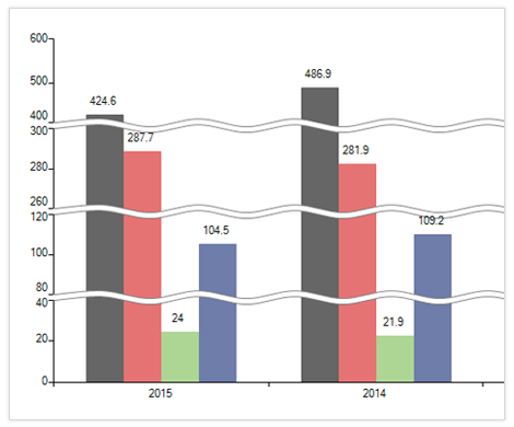
Scale Breaks
The ScaleBreaks feature allows you to "break off" large chunks of the axis, so graphs with large amplitude are easier to read.
-
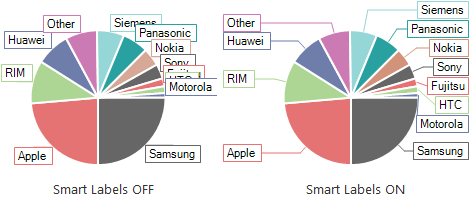
Smart Labels
To better outline the values of your data points, they need labels of their own. However, in the case where there are lots of data points, displaying all the necessary labels to the end-user can be a challenging task. RadChartView solves this problem for you by implementing a smart algorithm that arranges the labels preventing them from overlapping each other while making it clear which label belongs to which data point.
-
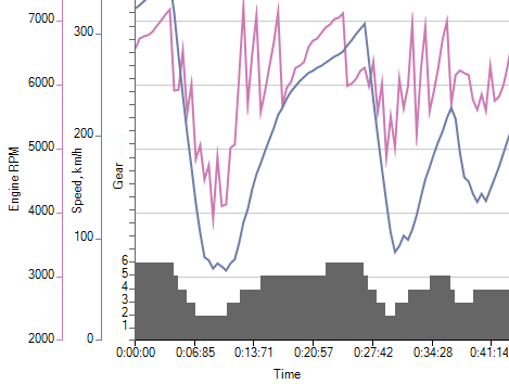
Multiple Axes
RadChartView supports multiple axes on the same chart and allows plotting data of different metric on the same chart. Such visual presentation allows the end-user to understand the relation between the different types of data involved in the same process.
-
Legend
It is important that you not only provide a beautiful piece of data visualization, but also a map to reading it. With RadChartView you also get a slick looking legend to provide context to your data visualization. The RadChartView legend is easily customizable so that you can align it against the chart plot and make sure that it matches your general look and feel.
-
Legends Wrapping
Complexed ChartView scenarios may require a vast number of legend elements that do not always fit in the given legend space. The legends wrapping feature of the Telerik UI for ChartView has got you covered! Once this setting is enabled, the legends will wrap their content when there is not enough space to fit them all.
Visit the Telerik RadChartView for WinForms documentation for more information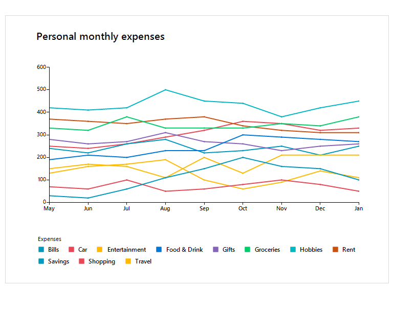
-
Null-Value Support
A feature useful in many business cases, null-value support, enables RadChartView to properly display data with missing records for a given category or date, so your end users don’t confuse the missing records with zero values for those categories/dates.
-
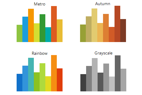
Predefined and Custom Color Palettes
You can choose from one of the 19 predefined color palettes to get a chart look and feel that matches your application design. And if you require something even more custom, the flexible ChartView API will allow you to create your own palettes.
-
Seamless Integration With Other RadControls
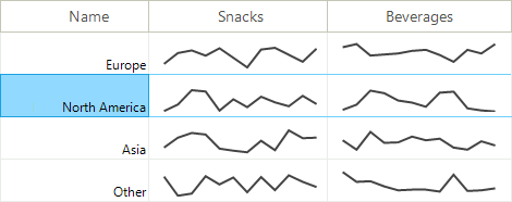
The smartly designed Telerik Presentation Framework allows for embedding ChartView into any of the other RadControls. This feature comes in very handy when you have to display trends in a GridView.
-
Built-in Interactive Themes
RadChartView comes with several ready-to-use Telerik themes out-of-the-box. With the help of the Visual Style Builder tool you can easily customize any existing theme or create new ones. What's more, we armed you with a third option - utilize an intuitive CSS-like syntax allowing you to quickly built new skins by using code. -
Data Binding
Many business applications rely on database data, for example MS SQL, Oracle, MySQL, Access ODBC as well as XML data and business objects in multiple-tier scenarios. RadChartView follows the standard Windows Forms data-binding model. It allows you to bind your charts to any custom business object, database or declarative data source.
-
Extensive VS.NET Design-Time Support
The control can be set up at design time using its Smart Tag or Properties Window, or specifically designed Property Builder.
See the WinForms ChartView Design Time Support Documentation
-
Also Available...
The Chart control is also available for these popular frameworks:
