UI for WinForms
WinForms SlideView
- Telerik UI for WinForms SlideView is a navigation component for transitioning between different views.
- Part of the Telerik UI for WinForms library along with 165+ professionally-designed UI controls.
- Includes support, documentation, demos, virtual classrooms, Visual Studio Extensions and more!
-
Modern Way to Slide Between Different Views
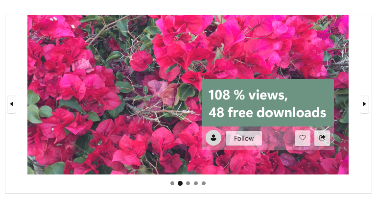
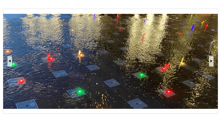
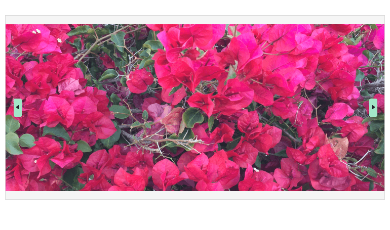
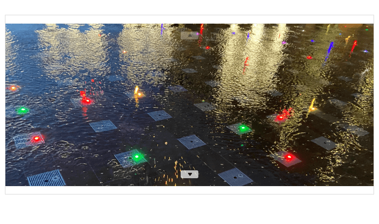
The Telerik UI for WinForms SlideView is a navigation control that offers a simplified UI for transitioning between different views in a linearly paginated collection. A common scenario is browsing images or other items in a collection, such as photos in an album or items in a product details page, one item at a time. Key features include navigation, animation, orientation and customization options.
-
Animations
The SlideView control comes with built-in animations out of the box. You can choose between several animation types – slide, slide over, fade, custom and none. You can further customize the animation by adjusting the frames, interval, and easing type.
-
Navigation Buttons
You can easily switch between views in the WinForms SlideView by clicking the left and right navigation buttons. You can adjust their visibility, position, and style. Additionally, you can set an auto-hide interval, thus hiding the buttons after a click.
See the WinForms SlideView documentation: Navigation buttons
-
Orientation
The Telerik UI for WinForms SlideView allows you to customize how the data will be navigated. The possible options are vertically or horizontally.
-
Design Time Experience
Another notable benefit of the Telerik UI for WinForms SlideView is that you can easily set it up at design time. Use the Smart Tag menu to configure a variety of properties such as orientation, buttons visibility, number of pages, etc.
-
Integration with PipsPager
The SlideView synergizes very well with the PipsPager control. For example, you can use both controls to build a gallery display to show your images and content and navigate through the gallery using both pips and navigation buttons.