UI for WinForms
WinForms DataEntry
- The WinForms DataEntry provides an easy way to display and edit arbitrary business objects in a form layout.
- Part of the Telerik UI for WinForms library along with 165+ professionally-designed UI controls.
- Includes support, documentation, demos, virtual classrooms, Visual Studio Extensions and more!
-
Data Form at Your Fingertips
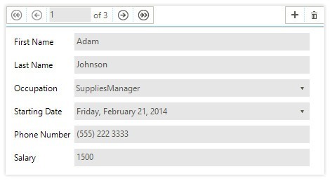
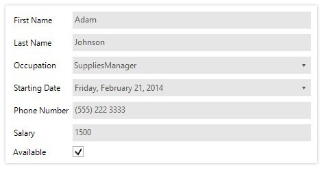
The DataEntry control provides an easy way to display and edit data in a form layout. Built-in editors are generated by default according to the underlying data type, and they provide support for fully operational CRUD operations by simply binding the control to your data.
.png?sfvrsn=f3c9b65_7)
-
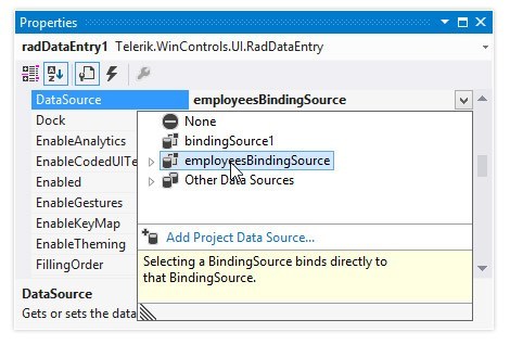
Data-Binding
RadDataEntry can be bound to various data sources—generic lists, Array and ArrayList, IBindingList implementations, DataTable, BindingSource and custom business objects—so you do not have to prepare a special type of source to bind to.
-
Component Arrangement
When bound, RadDataEntry automatically creates and arranges the labels and editors necessary to cover the data source properties. You can define whether the items should be arranged from left to right, right to left, top to bottom or bottom to top. Once everything is arranged automatically, you can make final customizations and tweaks according to your preferences right at Visual Studio design time.
In addition, a convenient API enables you to define item size, auto size functionality and spacing between items.
-
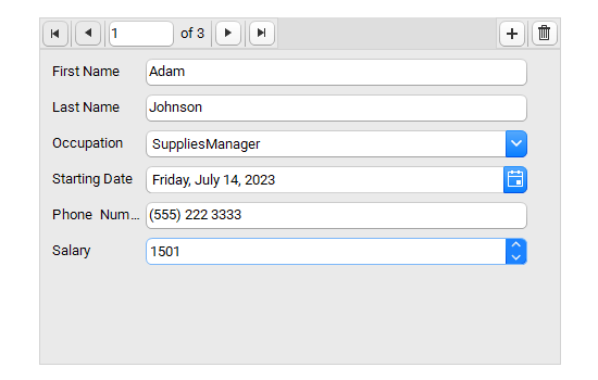
Editors
RadDataEntry detects the type of data fields it should represent and automatically displays the appropriate editors:
-
RadDateTimePicker for date-time data
-
RadCheckBox for Boolean data
-
RadColorBox for color data
-
PictureBox for image data
-
RadDropDownList for enums
-
RadTextBox for text or all other types
-
-
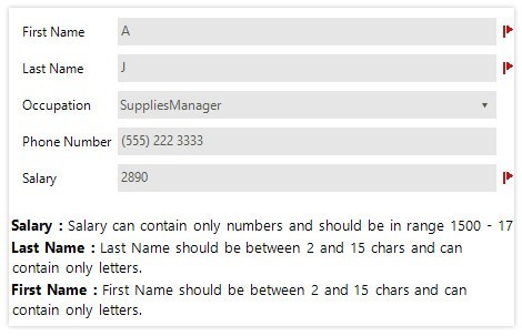
Validation
RadDataEntry offers built-in validation to help users input data. To do so, RadDataEntry uses the standard ErrorProvider you are already familiar with. Besides preventing submission of incorrect data, the control also shows a status panel listing all errors. It also prevents end users from entering incorrect or invalid data.
-
BindingNavigator Integration
In the cases where you have a list of records to display, RadBindingNavigator is a great addition to RadDataEntry as it enables you to traverse through the list. You can also add new records to the RadDataEntry data-source, or delete existing ones.