
UI for WinForms
WinForms DataLayout
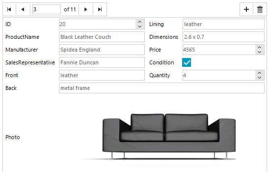
- With the WinForms DataLayout control, you can display data in a customizable layout without creating editors manually.
- Part of the Telerik UI for WinForms library along with 165+ professionally-designed UI controls.
- Includes support, documentation, demos, virtual classrooms, Visual Studio Extensions and more!
-
Flexible Data Forms
The RadDataLayout control offers the vast layout capabilities of RadLayoutControl and further delivers integration with data, by automatically creating items and editors according to data source schema or business object properties. This means you no longer have to add and align labels and editors, or bind the editors yourself—it’s done for you. Once the editors bound, you can rearrange them as needed. Also, your end users can arrange them at runtime however they like.
Review the full set of available features in the RadLayoutControl page.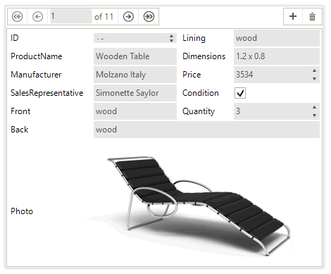
-
Component Arrangement
When bound, RadDataLayout automatically creates and arranges the items and editors necessary to cover the data source properties. You can define whether the items should be arranged from left to right, right to left, top to bottom or bottom to top. Once everything is arranged automatically, you can make final customizations and tweaks according to your preferences right at Visual Studio design time.
In addition, a convenient API lets you define items sizes, auto-size functionality and columns to display the items and spacing between them as you see fit.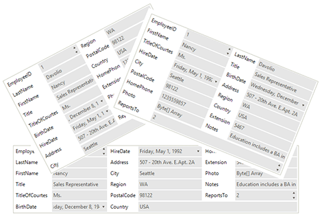
-
Easy Creation of Complex Layouts
Thanks to the underlying RadLayoutControl, you can create complex layouts at design time or at runtime, using drag-and-drop operations in the dedicated customization dialog. The control uses a complex layout algorithm that distributes available space proportionally to items, considering the pre-defined settings.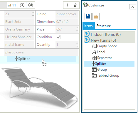
-
Validation
RadDataLayout offers built-in validation to aid your users’ data input. The control uses the standard ErrorProvider you’re already familiar with. Besides preventing submission of incorrect data, the control also displays a status panel listing all errors. It also prevents end-users from entering incorrect or invalid data.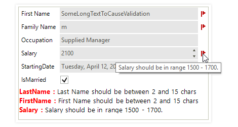
-
Save/Load Layout
You can save all layout customizations in an xml file to restore later. This feature enables you to have multiple layout configurations for your users to choose from, or to save their own preferences. -
BindingNavigator Integration
When you have a list of records to display, RadBindingNavigator is a great addition to RadDataLayout, as it enables you to traverse through the list. You can also add new records to the control’s data source, or delete existing ones.
-
Extensive VS.NET Design-time Support
RadDataLayout features extensive design-time functionality, helping you to build your desired layout, as follows:
- Moving a control over the RadDataLayout bounds will create an overlay window to guide you how the control will be placed
- Because controls in RadDataLayout are hosted in LayoutControlItem, each item in the control features a selection glyph to help you select the host item of your control easily, to work with its properties
- The Customize dialog offers layout arrangement capabilities, as well as the ability to add elements, hide items and rearrange the element’s structure
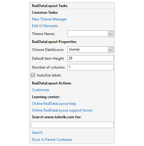
- You can apply themes in design time and easily switch between them; the ThemeName property in the Smart tag automatically detects the present themes
- Visual Style Builder, Element Hierarchy Editor and Shape Editor productivity tools provide full control over the UI
-
Localization
Business globalization requires multi-lingual applications. RadDataLayout supports full localization of its strings. See Localization and Right-to-Left Support for the full list of Windows Forms controls supporting RTL and localization.
All Winforms Components
Data Management
- CardView
- CheckedListBox
- DataEntry
- DataLayout
- FilterView
- GridView Updated
- ListControl
- ListView
- PivotGrid
- PropertyGrid
- TreeMap
- TreeView
- Validation Provider
- VirtualGrid Updated
Office
Data Visualization
- BarCode
- BindingNavigator
- BulletGraph
- ChartView
- Diagram
- HeatMap
- LinearGauge
- Map Updated
- RadialGauge
- RangeSelector
- Sparkline
- TaskBoard
Interactivity & UX
Forms & Dialogs
- AboutBox
- ColorDialog
- DesktopAlert
- File Dialogs
- Flyout
- FontDropDownList
- Form
- MarkupDialog
- MessageBox
- Overlay
- RibbonForm
- ScrollBar
- ShapedForm
- SplashScreen
- StatusStrip
- TabbedForm
- TaskDialog
- TitleBar
- Toast Notification Manager
- ToolbarForm
- Wizard
Scheduling
Editors
Navigation
- ApplicationMenu
- BreadCrumb
- CommandBar
- ContextMenu
- Menu
- NavigationView
- NotifyIcon
- OfficeNavigationBar
- PageView
- Panorama
- PipsPager
- RibbonBar
- SlideView
Layout
Document Processing
Tools
Framework
