
UI for WinForms
WinForms OfficeNavigationBar
- Incorporate modern application navigation paradigms in your WinForms apps with the Telerik UI for WinForms Office Navigation Bar component.
- Part of the Telerik UI for WinForms library along with 165+ professionally-designed UI controls.
- Includes support, documentation, demos, virtual classrooms, Visual Studio Extensions and more!

-
Feature-rich Office Navigation Bar
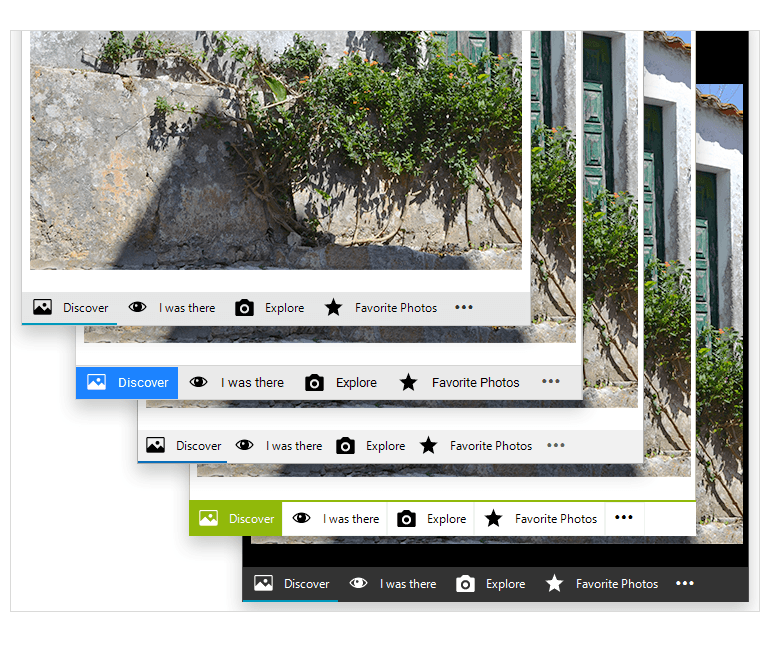
The WinForms Office Navigation Bar control enables you to create intuitive navigation in your Windows Forms applications. Its look and feel mimics the one of Microsoft Outlook, where items with text and/or image are presented to the user to select from. The component also features convenient peek functionality of items with a completely customizable popup that can host any WinForms control, allowing users to either take action or be presented with useful information.
-
View Modes
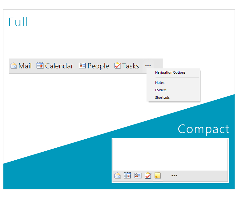
The Navigation Bar comes with two view modes you can toggle between. Compact is a text-only or image-only view for minimal designs and tight spaces, whereas Full mode combines both text and image for each navigation item. A single property allows you to choose the view mode that best fits the layout of your WinForms application.
-
Peek Window
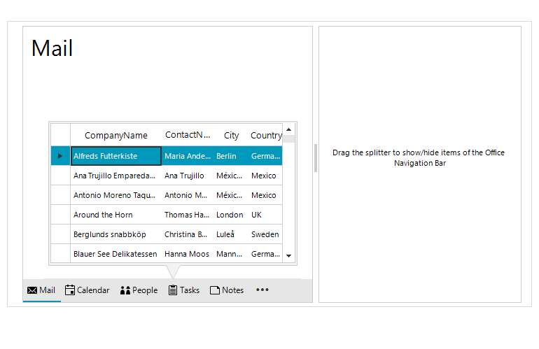
The Navigation Bar Peek Window allows hosting any WinForms control in it – for example one can show a Calendar for the user to select a date, or a list of meetings, or form to search for a contact – just host the needed control and it will be shown when the user hovers the item.
-
Overflow Item
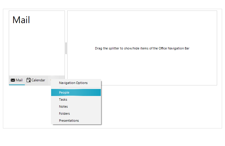
Depending on the size of the control and the layout of the application, there could be cases where not all the items that you have in the Navigation Bar can be displayed. This is where the overflow functionality comes into play. The items that don’t fit the designated area will be automatically moved into the overflow menu. The user can access the menu with a single click and select from the overflowed items.
-
Navigation Options Dialog
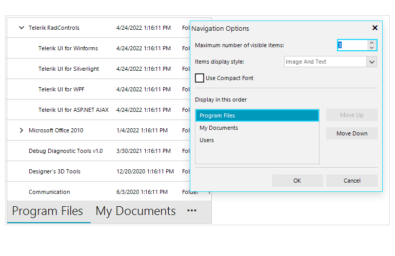
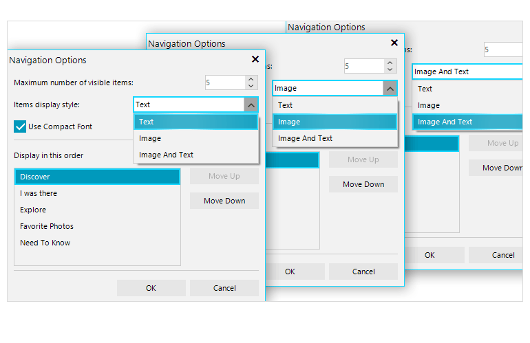
In the overflow menu, there is a convenient Navigation Options Dialog where the user can configure the number of visible items, the mode of the control (Compact or Full) and also to rearrange the items in the control.
-
Design Time
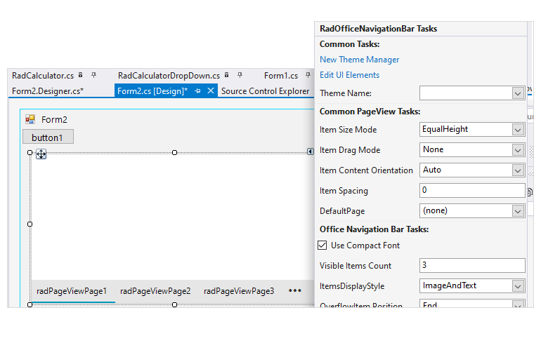
The RadOfficeNavigationBar features an easy way to set up the component in the application right at design time. Utilizing just its Smart Tag, developers can set up:
- The control Smart Tag exposes links to the most common control features such as View mode, Item display style, Overflow menu visibility and position, Navigation options and Peek window.
- It’s easy to apply themes in design time and switch between them. The ThemeName property in the Smart tag automatically detects the present themes.
- Visual Style Builder, Element Hierarchy Editor and Shape Editor productivity tools provide full control over the UI.
- Options to search the forums or open the control online documentation are also available in the Smart Tag.
-
Localization
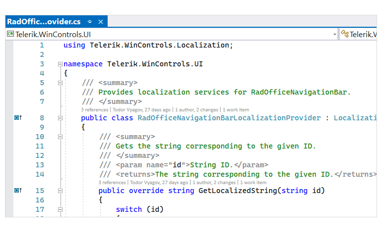
Business globalization requires multi-lingual applications. RadOfficeNavigationBar features a convenient localization provider, allowing full localization of its strings.
-
Touch Support
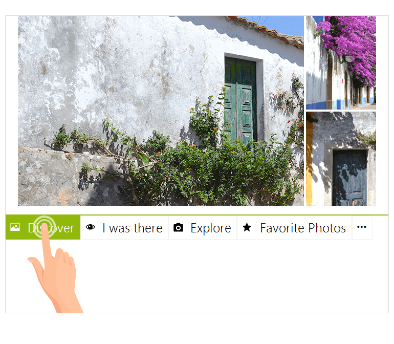
The component has full touch support, which means it can be used on devices such as tablets or kiosks where touch input is enabled.
-
Appearance
The control is shipped with a rich set of themes that allow you to easily build sleek interfaces with the look-and-feel of some of the latest Windows and Office versions. You can easily switch between the themes using a single property.
Our framework also features support for custom themes, that can be built from scratch to fit your exact visual demands by using the Visual Style Builder productivity tool.
All Winforms Components
Data Management
- CardView
- CheckedListBox
- DataEntry
- DataLayout
- FilterView
- GridView Updated
- ListControl
- ListView
- PivotGrid
- PropertyGrid
- TreeMap
- TreeView
- Validation Provider
- VirtualGrid Updated
Office
Data Visualization
- BarCode
- BindingNavigator
- BulletGraph
- ChartView
- Diagram
- HeatMap
- LinearGauge
- Map Updated
- RadialGauge
- RangeSelector
- Sparkline
- TaskBoard
Interactivity & UX
Forms & Dialogs
- AboutBox
- ColorDialog
- DesktopAlert
- File Dialogs
- Flyout
- FontDropDownList
- Form
- MarkupDialog
- MessageBox
- Overlay
- RibbonForm
- ScrollBar
- ShapedForm
- SplashScreen
- StatusStrip
- TabbedForm
- TaskDialog
- TitleBar
- Toast Notification Manager
- ToolbarForm
- Wizard
Scheduling
Editors
Navigation
- ApplicationMenu
- BreadCrumb
- CommandBar
- ContextMenu
- Menu
- NavigationView
- NotifyIcon
- OfficeNavigationBar
- PageView
- Panorama
- PipsPager
- RibbonBar
- SlideView
Layout
Document Processing
Tools
Framework
