
Build Better JavaScript
Apps Faster
The ultimate collection of JavaScript UI components with libraries for jQuery, Angular, React, and Vue. Quickly build eye-catching, high-performance, responsive web applications—regardless of your JavaScript framework choice.
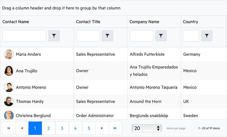
$("#grid").kendoGrid({
  dataSource: {
    type: "odata",
    transport: {
      read:
        "https://demos.telerik.com/kendo-ui/service/Northwind.svc/Customers",
    },
    pageSize: 20,
  },
  height: 550,
  groupable: true,
  sortable: true,
  pageable: {
    refresh: true,
    pageSizes: true,
    buttonCount: 5,
  },
  columns: [
    {
      template:
        "<div class='customer-photo'" +
        "style='background-image: url(../content/web/Customers/#:data.CustomerID#.jpg);'></div>" +
        "<div class='customer-name'>#: ContactName #</div>",
      field: "ContactName",
      title: "Contact Name",
      width: 240,
    },
    {
      field: "ContactTitle",
      title: "Contact Title",
    },
    {
      field: "CompanyName",
      title: "Company Name",
    },
    {
      field: "Country",
      width: 150,
    },
  ],
});
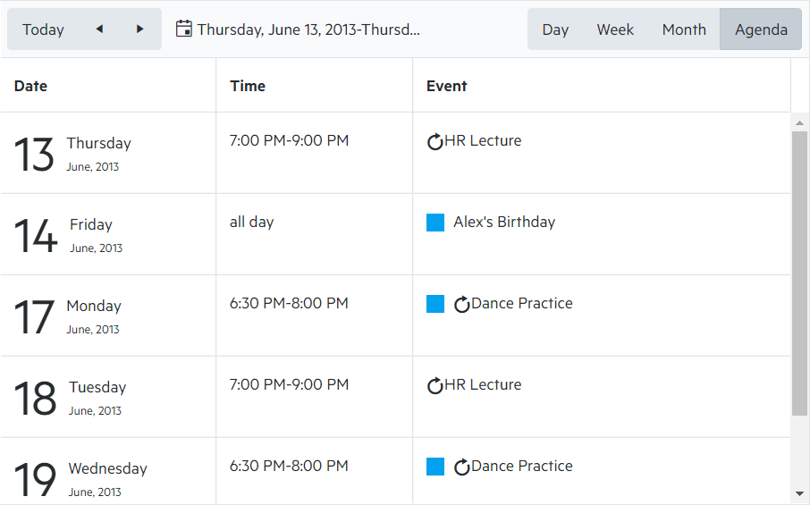
$("#scheduler").kendoScheduler({
  date: new Date("2013/6/13"),
  startTime: new Date("2013/6/13 07:00 AM"),
  height: 600,
  views: [
    "day",
    { type: "workWeek", selected: true },
    "week",
    "month",
    "agenda",
    { type: "timeline", eventHeight: 50 },
  ],
  timezone: "Etc/UTC",
  dataSource: {
    batch: true,
    transport: {
      read: {
        url: "https://demos.telerik.com/kendo-ui/service/tasks",
        dataType: "jsonp",
      },
      update: {
        url: "https://demos.telerik.com/kendo-ui/service/tasks/update",
        dataType: "jsonp",
      },
      create: {
        url: "https://demos.telerik.com/kendo-ui/service/tasks/create",
        dataType: "jsonp",
      },
      destroy: {
        url: "https://demos.telerik.com/kendo-ui/service/tasks/destroy",
        dataType: "jsonp",
      },
      parameterMap: function (options, operation) {
        if (operation !== "read" && options.models) {
          return { models: kendo.stringify(options.models) };
        }
      },
    },
    schema: {
      model: {
        id: "taskId",
        fields: {
          taskId: { from: "TaskID", type: "number" },
          title: {
            from: "Title",
            defaultValue: "No title",
            validation: { required: true },
          },
          start: { type: "date", from: "Start" },
          end: { type: "date", from: "End" },
          startTimezone: { from: "StartTimezone" },
          endTimezone: { from: "EndTimezone" },
          description: { from: "Description" },
          recurrenceId: { from: "RecurrenceID" },
          recurrenceRule: { from: "RecurrenceRule" },
          recurrenceException: { from: "RecurrenceException" },
          ownerId: { from: "OwnerID", defaultValue: 1 },
          isAllDay: { type: "boolean", from: "IsAllDay" },
        },
      },
    },
    filter: {
      logic: "or",
      filters: [
        { field: "ownerId", operator: "eq", value: 1 },
        { field: "ownerId", operator: "eq", value: 2 },
      ],
    },
  },
  resources: [
    {
      field: "ownerId",
      title: "Owner",
      dataSource: [
        { text: "Alex", value: 1, color: "#f8a398" },
        { text: "Bob", value: 2, color: "#51a0ed" },
        { text: "Charlie", value: 3, color: "#56ca85" },
      ],
    },
  ],
});
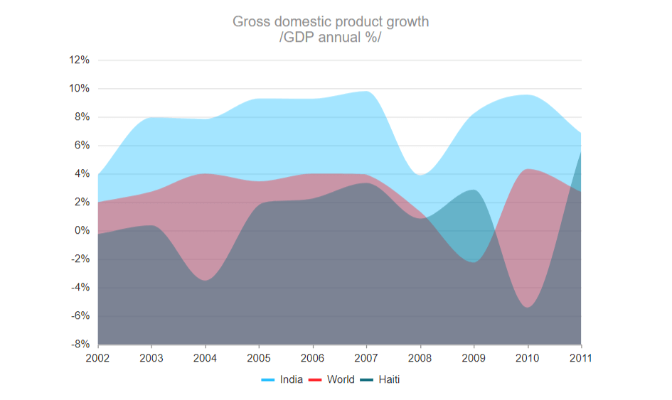
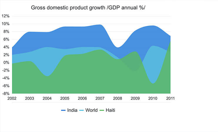
$("#chart").kendoChart({
  title: {
    text: "Gross domestic product growth \n /GDP annual %/"
  },
    legend: {
    position: "bottom"
  },
    seriesDefaults: {
    type: "area",
    area: {
     line: {
      style: "smooth"
     }
    }
  },
  series: [{
    name: "India",
    data: [3.907, 7.943, 7.848, 9.284, 9.263, 9.801, 3.890, 8.238, 9.552, 6.855]
  }, {
    name: "World",
    data: [1.988, 2.733, 3.994, 3.464, 4.001, 3.939, 1.333, -2.245, 4.339, 2.727]
  }, {
    name: "Haiti",
    data: [-0.253, 0.362, -3.519, 1.799, 2.252, 3.343, 0.843, 2.877, -5.416, 5.590]
  }],
  valueAxis: {
    labels: {
      format: "{0}%"
    },
    line: {
      visible: false
    },
    axisCrossingValue: -10
  },
  categoryAxis: {
    categories: [2002, 2003, 2004, 2005, 2006, 2007, 2008, 2009, 2010, 2011],
    majorGridLines: {
     visible: false
    },
    labels: {
     rotation: "auto"
    }
  },
  tooltip: {
    visible: true,
    format: "{0}%",
    template: "#= series.name #: #= value #"
  }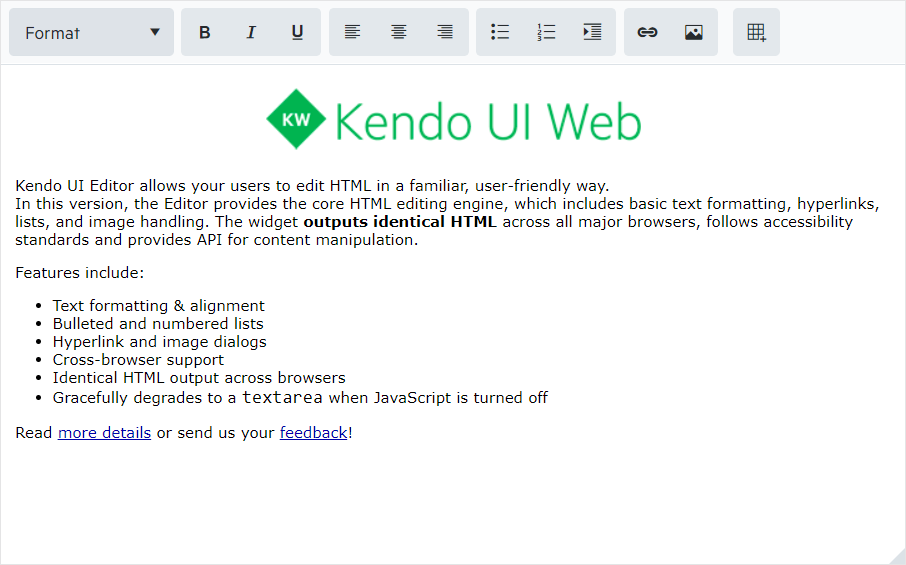
});$("#editor").kendoEditor({
resizable: {
content: true,
toolbar: true,
},
});
Looking for a set of UI components to enhance your jQuery application? Check our detailed jQuery documentation and demos. Start with the resources for the jQuery UI DatePicker or a more niche component like the jQuery TileLayout!
import { Component } from '@angular/core';
import { customers } from './customers';

@Component({
  selector: 'my-app',
  template: `
        <kendo-grid [kendoGridBinding]="gridData" [height]="410"
          [pageable]="{
            buttonCount: buttonCount,
            info: info,
            type: type,
            pageSizes: [5, 10, 20],
            previousNext: previousNext
          }"
          [sortable]="true"
          [groupable]="true"
          [filterable]="true"
          [pageSize]="10">
          <kendo-grid-column field="ContactName">
            <ng-template kendoGridCellTemplate let-dataItem>
              <div class="customer-photo"
               [ngStyle]="{ backgroundImage: getUrl(dataItem.CustomerID) }"></div>
        <div class="customer-name">
            {{ dataItem.ContactName }}
        </div>
            </ng-template>
          </kendo-grid-column>
          <kendo-grid-column field="ContactTitle"></kendo-grid-column>
          <kendo-grid-column field="CompanyName"></kendo-grid-column>
          <kendo-grid-column field="Country"></kendo-grid-column>
        </kendo-grid>
    `,
  styles: [`
      .customer-photo {
        display: inline-block;
        width: 32px;
        height: 32px;
        border-radius: 50%;
        background-size: 32px 35px;
        background-position: center center;
        vertical-align: middle;
        line-height: 32px;
        box-shadow: inset 0 0 1px #999, inset 0 0 10px rgba(0,0,0,.2);
        margin-left: 5px;
      }

      .customer-name {
          display: inline-block;
          vertical-align: middle;
          line-height: 32px;
          padding-left: 3px;
      }
    `]
})

export class AppComponent {
  public gridData: any[] = customers;

  constructor() {}

  public getUrl(id: string) {
    return `url('https://demos.telerik.com/kendo-ui/content/web/Customers/${id}.jpg')`;
  }
}
import { Component } from '@angular/core';
@Component({
selector: 'my-app',
template: `
<kendo-chart
[title]="chartOptions.title"
[legend]="chartOptions.legend"
[seriesDefaults]="chartOptions.seriesDefaults"
[series]="chartOptions.series"
[valueAxis]="chartOptions.valueAxis"
[categoryAxis]="chartOptions.categoryAxis"
[tooltip]="chartOptions.tooltip">
</kendo-chart>
`
})
export class AppComponent {
public chartOptions = {
title: {
text: "Gross domestic product growth /GDP annual %/"
},
legend: {
position: "bottom"
},
seriesDefaults: {
type: "area",
area: {
line: {
style: "smooth"
}
}
},
series: [{
name: "India",
data: [3.907, 7.943, 7.848, 9.284, 9.263, 9.801, 3.890, 8.238, 9.552, 6.855]
}, {
name: "World",
data: [1.988, 2.733, 3.994, 3.464, 4.001, 3.939, 1.333, -2.245, 4.339, 2.727]
}, {
name: "Haiti",
data: [-0.253, 0.362, -3.519, 1.799, 2.252, 3.343, 0.843, 2.877, -5.416, 5.590]
}],
valueAxis: {
labels: {
format: "{0}%"
},
line: {
visible: false
},
axisCrossingValue: -10
},
categoryAxis: {
categories: [2002, 2003, 2004, 2005, 2006, 2007, 2008, 2009, 2010, 2011],
majorGridLines: {
visible: false
},
labels: {
rotation: "auto"
}
},
tooltip: {
visible: true,
format: "{0}%"
}
}
}import { Component } from '@angular/core';
@Component({
selector: 'my-app',
template: `
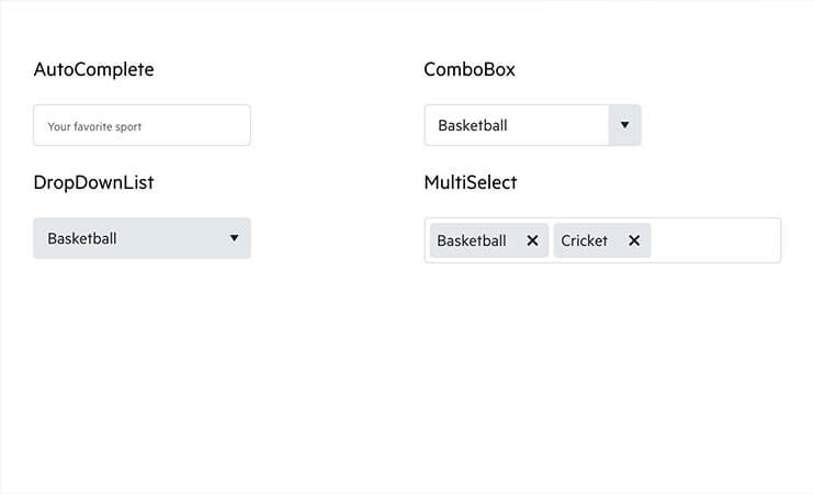
<div class="row">
<div class="col-6">
<p>AutoComplete</p>
<kendo-autocomplete [data]="listItems" [placeholder]="'Your favorite sport'">
</kendo-autocomplete>
</div>
<div class="col-6">
<p>ComboBox</p>
<kendo-combobox [data]="listItems" [value]="'Basketball'">
</kendo-combobox>
</div>
<div class="col-6">
<p>DropDownList</p>
<kendo-dropdownlist [data]="listItems" [value]="'Basketball'">
</kendo-dropdownlist>
</div>
<div class="col-6">
<p>MultiSelect</p>
<kendo-multiselect [data]="listItems" [value]="value" [placeholder]="'Your favorite sports'"></kendo-multiselect>
</div>
</div>
`
})
export class AppComponent {
public listItems: Array < string > = [
'Baseball', 'Basketball', 'Cricket', 'Field Hockey',
'Football', 'Table Tennis', 'Tennis', 'Volleyball'
];
public value = ['Basketball', 'Cricket'];
}
Need to take your Angular application to the next level? Take a look at our Angular components and documentation as well as sign up for a free trial to get access to dedicate support!
import React from "react";
import ReactDOM from "react-dom";

import { process } from "@progress/kendo-data-query";
import { Grid, GridColumn } from "@progress/kendo-react-grid";

import { data } from "./data";

const contactNameCell = (props) => {
  return props.rowType === "data" ? (
    <td role="gridcell">
      <div
        className="customer-photo"
        style={{
          backgroundImage: `url("https://demos.telerik.com/kendo-ui/content/web/Customers/${props.dataItem.CustomerID}.jpg")`,
        }}
      ></div>
      <div className="customer-name">{props.dataItem.ContactName}</div>
    </td>
  ) : null;
};

class App extends React.Component {
  state = {
    dataState: {
      skip: 0,
      take: 20,
    },
  };
  render() {
    return (
      <Grid
        filterable
        groupable
        sortable
        pageable={{ pageSizes: true, buttonCount: 5 }}
        expandField="expanded"
        data={process(data, this.state.dataState)}
        onDataStateChange={this.handleDataStateChange}
        onExpandChange={this.handleExpandChange}
        {...this.state.dataState}
      >
        <GridColumn
          field="ContactName"
          title="Contact Name"
          cell={contactNameCell}
          width="240px"
        />
        <GridColumn field="ContactTitle" title="Contact Title" />
        <GridColumn field="CompanyName" title="Company Name" />
        <GridColumn field="Country" title="Country" width="150px" />
      </Grid>
    );
  }

  handleDataStateChange = (event) => {
    this.setState({ dataState: event.data });
  };
}

ReactDOM.render(<App />, document.getElementById("demo-react-grid"));
import React from "react";
import ReactDOM from "react-dom";

import {
  Chart,
  ChartTitle,
  ChartLegend,
  ChartSeries,
  ChartSeriesItem,
  ChartCategoryAxis,
  ChartCategoryAxisItem,
  ChartValueAxisItem,
  ChartValueAxis,
} from "@progress/kendo-react-charts";

class App extends React.Component {
  categories = [2002, 2003, 2004, 2005, 2006, 2007, 2008, 2009, 2010, 2011];
  series = [
    {
      name: "India",
      data: [3.907, 7.943, 7.848, 9.284, 9.263, 9.801, 3.89, 8.238, 9.552, 6.855],
    },
    {
      name: "World",
      data: [1.988, 2.733, 3.994, 3.464, 4.001, 3.939, 1.333, -2.245, 4.339, 2.727],
    },
    {
      name: "Haiti",
      data: [-0.253, 0.362, -3.519, 1.799, 2.252, 3.343, 0.843, 2.877, -5.416, 5.59],
    },
  ];
  render() {
    return (
      <Chart>
        <ChartTitle text="Gross domestic product growth /GDP annual %/" />
        <ChartLegend position="bottom" />

        <ChartCategoryAxis>
          <ChartCategoryAxisItem categories={this.categories} />
          <ChartCategoryAxisItem />
        </ChartCategoryAxis>

        <ChartValueAxis>
          <ChartValueAxisItem
            labels={{ format: "{0}%" }}
            line={{ visible: false }}
            axisCrossingValue={-10}
          />
        </ChartValueAxis>

        <ChartSeries>
          {this.series.map((item, idx) => (
            <ChartSeriesItem
              key={idx}
              type="area"
              line={{
                style: "smooth",
              }}
              data={item.data}
              name={item.name}
            />
          ))}
        </ChartSeries>
      </Chart>
    );
  }
}

ReactDOM.render(<App />, document.getElementById("demo-react-charts"));
import React from "react";
import ReactDOM from "react-dom";

import {
  AutoComplete,
  ComboBox,
  DropDownList,
  MultiSelect,
} from "@progress/kendo-react-dropdowns";

class AppComponent extends React.Component {
  sports = ["Baseball", "Basketball", "Cricket", "Field Hockey", "Football", "Table Tennis", "Tennis", "Volleyball"];

  render() {
    return (
      <div className="row">
        <div className="col-6 ">
          <p>AutoComplete</p>
          <AutoComplete data={this.sports} placeholder="Your favorite sport" />
        </div>
        <div className="col-6 ">
          <p>ComboBox</p>
          <ComboBox data={this.sports} defaultValue="Basketball" />
        </div>
        <div className="col-6">
          <p>DropDownList</p>
          <DropDownList data={this.sports} defaultValue="Basketball" />
        </div>
        <div className="col-6 ">
          <p>MultiSelect</p>
          <MultiSelect
            data={this.sports}
            defaultValue={["Basketball", "Cricket"]}
          />
        </div>
      </div>
    );
  }
}

ReactDOM.render(
  <AppComponent />,
  document.getElementById("demo-react-dropdowns")
);
Not getting enough from your UI in React? Augment any React application by adding in our native React components. Use the buttons below to look at our React demos and sign up for a free trial to get access to our support ticketing system!
new Vue({
  el: "#vueapp",
  template: `<kendo-grid :data-source="localDataSource">
      <kendo-grid-column :field="'ContactName'"
                         :template="contactNameTemplate"
                         :title="'Contact Name'"
                         :width="240"></kendo-grid-column>
      <kendo-grid-column :field="'ContactTitle'"
                         :title="'Contact Title'"
                         :width="120"></kendo-grid-column>
      <kendo-grid-column :field="'CompanyName'"
                         :title="'Company Name'"
                         :width="120"></kendo-grid-column>
      <kendo-grid-column :field="'Country'" :width="120"></kendo-grid-column>
  </kendo-grid>`,
  data: {
    contactNameTemplate: `<div class='customer-photo'
                           style='background-image: url("https://demos.telerik.com/kendo-ui/content/web/Customers/#:CustomerID#.jpg");'></div>
                           <div class='customer-name'>#: ContactName #</div>`,
    localDataSource: localData,
  },
});
new Vue({
 el: '#vueapp',
 template: ` <kendo-scheduler :data-source="localDataSource"
                     :date="date"
                     :height="600"
                     :timezone="'Etc/UTC'">
      <kendo-scheduler-view :type="'day'"></kendo-scheduler-view>
      <kendo-scheduler-view :type="'week'"></kendo-scheduler-view>
      <kendo-scheduler-view :type="'month'"></kendo-scheduler-view>
      <kendo-scheduler-view :type="'agenda'"></kendo-scheduler-view>
    </kendo-scheduler>`,
 data: {
  date: new Date('2018/6/6'),
  localDataSource: [{
    id: 1,
    start: new Date("2018/6/6 08:00 AM"),
    end: new Date("2018/6/6 09:00 AM"),
    title: "Interview"
   },
   {
    id: 2,
    start: new Date("2018/6/6 08:00 AM"),
    end: new Date("2018/6/6 09:00 AM"),
    title: "Meeting"
   }
  ]
 }
})
new Vue({
el: '#vueapp',
template: `<kendo-chart
:title-text="'Gross domestic product growth /GDP annual %/'"
:legend-position="'bottom'"
:legend-position="'horizontal'"
:series-defaults-type="'area'"
:series="series"
:category-axis-categories="categories">
</kendo-chart>`,
data: {
date: new Date('2018/6/6'),
series: [{
name: "India",
data: [3.907, 7.943, 7.848, 9.284, 9.263, 9.801, 3.890, 8.238, 9.552, 6.855]
}, {
name: "Russian Federation",
data: [4.743, 7.295, 7.175, 6.376, 8.153, 8.535, 5.247, -7.832, 4.3, 4.3]
}, {
name: "Germany",
data: [0.010, -0.375, 1.161, 0.684, 3.7, 3.269, 1.083, -5.127, 3.690, 2.995]
}, {
name: "World",
data: [1.988, 2.733, 3.994, 3.464, 4.001, 3.939, 1.333, -2.245, 4.339, 2.727]
}],
categories: [2002, 2003, 2004, 2005, 2006, 2007, 2008, 2009, 2010, 2011]
}
})new Vue({
el: '#vueapp',
template: ` <kendo-editor :resizable-content="true"
:resizable-toolbar="true"
:value="htmlText"
style="height:280px"
rows="10"
cols="30">
</kendo-editor>`,
data() {
return {
htmlText: "<p>Some sample text.</p>"
}
}
})
Architect your next app with Vue components designed to deliver high-performance and rich user experiences
How Does Kendo UI Cut
Development Time?
Kendo UI delivers everything you need to build modern, beautiful, responsive apps.
Decreases
time-to-market
Easily add advanced UI components into your existing designs or take advantage of our comprehensive library in new design starts. Kendo UI lets you save time by integrating components to handle all the key functionality you need in a UI, letting you focus your development efforts on your proprietary features.
Provides advanced UI features
We give you solutions with advanced data grid components, charts, spreadsheets, schedulers, and many more. Kendo UI lets you quickly and easily add advanced functionality to your app by integrating our configurable components. Customizable themes enable you to effortlessly deploy a consistent look and feel across your apps.
Supports popular frameworks
Built from the ground up to support each framework, Kendo UI offers the best UI performance when developing with popular current technology including jQuery, Angular, React and Vue. Kendo UI drops right into your environment so you don’t have to waste time on integration.
Reduces
design risk
Kendo UI is a proven library that is in widespread use. Our own internal QA process coupled with world-class support teams and a large user community means that our components will always work the way they’re supposed to—guaranteed.

Telerik and Kendo UI Earns Multiple TrustRadius Best of Development 2021 awards
Kendo UI has won Best Feature Set , Best Customer Support and Best Usability.

Kendo UI Earned TrustRadius' Top Rated 2021 award
Progress Kendo UI has earned TrustRadius’ Top Rated Award for Software Components.


All Kendo UI Components
TOP COMPONENTS
Conversational UI
Data Management
Editors
- AutoComplete
- Captcha
- ColorPicker
- Checkbox
- CheckboxGroup
- ComboBox
- DateInput
- DatePicker
- DateRangePicker
- DateTimePicker
- DropDownList
- DropDownTree
- Editor
- Image Editor
- ListBox
- MaskedTextBox
- MultiComboColumnBox
- MultiSelect
- NumericTextBox
- Rating
- RadioButton
- RadioGroup
- RangeSlider
- Slider
- Switch
- TextArea
- TextBox
- TimePicker
- Upload
- Validator
Framework
Interactivity & UX
MEDIA
NAVIGATION
SCHEDULING
TOP COMPONENTS
CHARTS
Editor
COMMON FEATURES
CONVERSATIONAL UI
TREELIST
LISTVIEW
DATE INPUTS
LABELS
SCHEDULER
GAUGES
GRIDS
UPLOAD
INPUTS
Notifications
Pager
Progress Bars
Animation
Common Utilities
Conversational UI
Data Grid
Data Query
Date Math
Drawing
Dropdowns
Editor
Excel Export
File Manager
File Saver
Gantt Chart
Inputs
Labels
Layout
ListBox
ListView
Notification
PDF Processing
PivotGrid
Popup
Progress Bars
Ripple
Scheduler
ScrollView
Sortable
TreeList
TreeView
Upload
CONVERSATIONAL UI
DATA MANAGEMENT
INTERACTIVITY & UX
FRAMEWORK
GAUGES
MEDIA
SCHEDULING
Working with Designers?
We Got You Covered!
Kendo UI® Kits for Figma
Highly customizable design files that are perfect representations of the Kendo UI web components. Work easily with designers and speed up UI development cycles with the ready-to-use Design Kits for Figma that match the themes you get out of the box with the web product: Material, Bootstrap and Default.
Learn More
Interested in server-side options? Check out our UI libraries for these frameworks:

Trusted by NASA, HP and
Millions More
Uncompromised quality comes from a 15-year track record of helping millions of developers create beautiful user experiences for mission-critical applications. The same developers who built our controls will provide your support so you can deliver your projects on time. We live with your daily challenges, striving to solve them with the best products, three predictable release cycles per year and support within hours.
Flexible Packaging Tailored to Your Needs
Buy Kendo UI individually or as part of the DevCraft bundle—a complete bundle of .NET controls, Kendo UI JavaScript components, reporting, automated testing and productivity tools.
Kendo UI
- JavaScript UI components for jQuery, Angular, React and Vue
- Flexible pricing options, based on your support needs
Lite Support
Priority Support
Ultimate Support
10 support incidents 24h response time
Unlimited number of support incidents Everything in Priority Support
Phone support
Remote web assistance

$ 999
per developer
DevCraft UI
- Everything in Kendo UI
- .NET UI components for web, desktop and mobile
- Document processing libraries
Lite Support
72h response time
10 support incidents
$ 1,299
per developer
DevCraft Complete
- Everything in DevCraft UI
- Embedded reporting for web and desktop
- Mocking solution for rapid unit testing
Priority Support
24h response time
Unlimited number of support incidents
$ 1,499
per developer
DevCraft Ultimate
- Everything in DevCraft Complete
- Automated testing tool for developers
- End-to-end report management solution
Ultimate Support
Everything in Priority Support
Phone support
Remote web assistance
$ 2,199
per developer

